Join us at FabCon Vienna from September 15-18, 2025
The ultimate Fabric, Power BI, SQL, and AI community-led learning event. Save €200 with code FABCOMM.
Get registered- Power BI forums
- Get Help with Power BI
- Desktop
- Service
- Report Server
- Power Query
- Mobile Apps
- Developer
- DAX Commands and Tips
- Custom Visuals Development Discussion
- Health and Life Sciences
- Power BI Spanish forums
- Translated Spanish Desktop
- Training and Consulting
- Instructor Led Training
- Dashboard in a Day for Women, by Women
- Galleries
- Data Stories Gallery
- Themes Gallery
- Contests Gallery
- Quick Measures Gallery
- Notebook Gallery
- Translytical Task Flow Gallery
- TMDL Gallery
- R Script Showcase
- Webinars and Video Gallery
- Ideas
- Custom Visuals Ideas (read-only)
- Issues
- Issues
- Events
- Upcoming Events
Enhance your career with this limited time 50% discount on Fabric and Power BI exams. Ends September 15. Request your voucher.
- Power BI forums
- Forums
- Get Help with Power BI
- Desktop
- Clustered Chart - Count Column, and % complete of ...
- Subscribe to RSS Feed
- Mark Topic as New
- Mark Topic as Read
- Float this Topic for Current User
- Bookmark
- Subscribe
- Printer Friendly Page
- Mark as New
- Bookmark
- Subscribe
- Mute
- Subscribe to RSS Feed
- Permalink
- Report Inappropriate Content
Clustered Chart - Count Column, and % complete of each value counted
Hi, apologies if this has been answered in another thread, perhaps I am not phrasing my question correctly.
I have data that looks like this (each row is a 'job'):
| Region | Status | Status Key |
| West Midlands | Complete | 1 |
| West Midlands | Complete | 1 |
| West Midlands | Not Complete | 0 |
| East Midlands | Complete | 1 |
| East Midlands | Complete | 1 |
| East Midlands | Complete | 1 |
| North East | Not Complete | 0 |
| North East | Not Complete | 0 |
| North East | Complete | 1 |
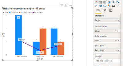
On a clustered chart, I want to show the Region on the Axis, and the Status as the legend.
For each region, I want to know the total no. of Jobs in that region, and then beside it the % complete.
Can anyone help please?
Solved! Go to Solution.
- Mark as New
- Bookmark
- Subscribe
- Mute
- Subscribe to RSS Feed
- Permalink
- Report Inappropriate Content
Hi @Aimeeclaird ,
Based on your description, you can create these two measures:
Total = COUNTROWS('Table')
Percentage =
VAR _complete =
    CALCULATE ( COUNT ( 'Table'[Region] ), 'Table'[Status] = "Complete" )
RETURN
    _complete / [Total]
Attached a sample file in the below, hopes to help you.
Best Regards,
Yingjie Li
If this post helps then please consider Accept it as the solution to help the other members find it more quickly.
Helpful resources
| User | Count |
|---|---|
| 57 | |
| 54 | |
| 53 | |
| 47 | |
| 31 |
| User | Count |
|---|---|
| 175 | |
| 88 | |
| 69 | |
| 48 | |
| 47 |


