FabCon is coming to Atlanta
Join us at FabCon Atlanta from March 16 - 20, 2026, for the ultimate Fabric, Power BI, AI and SQL community-led event. Save $200 with code FABCOMM.
Register now!- Power BI forums
- Get Help with Power BI
- Desktop
- Service
- Report Server
- Power Query
- Mobile Apps
- Developer
- DAX Commands and Tips
- Custom Visuals Development Discussion
- Health and Life Sciences
- Power BI Spanish forums
- Translated Spanish Desktop
- Training and Consulting
- Instructor Led Training
- Dashboard in a Day for Women, by Women
- Galleries
- Data Stories Gallery
- Themes Gallery
- Contests Gallery
- Quick Measures Gallery
- Notebook Gallery
- Translytical Task Flow Gallery
- TMDL Gallery
- R Script Showcase
- Webinars and Video Gallery
- Ideas
- Custom Visuals Ideas (read-only)
- Issues
- Issues
- Events
- Upcoming Events
Calling all Data Engineers! Fabric Data Engineer (Exam DP-700) live sessions are back! Starting October 16th. Sign up.
- Power BI forums
- Forums
- Get Help with Power BI
- Desktop
- Changing of Ranges of X- Axis and Y - Axis based o...
- Subscribe to RSS Feed
- Mark Topic as New
- Mark Topic as Read
- Float this Topic for Current User
- Bookmark
- Subscribe
- Printer Friendly Page
- Mark as New
- Bookmark
- Subscribe
- Mute
- Subscribe to RSS Feed
- Permalink
- Report Inappropriate Content
Changing of Ranges of X- Axis and Y - Axis based on values selected between ranges
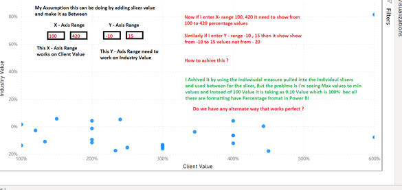
Hi I have the below data set, which i'm able to create a below report but going farward the data will be updated in table anill get more higher and negative values ing higher Positive and Negative Percentage values.
Below now im showing some sample data.
| Industry Value | Client Value | Capability |
| 0.34% | 442.86% | Budget Management |
| -2.69% | 120.00% | Business Management |
| 5.74% | 150.00% | Business Strategy |
| 100.00% | Carpentry | |
| -15.18% | 250.00% | Contract Management |
| -9.40% | 200.00% | Cybersecurity |
| 1.61% | 100.00% | Electrical and Mechanical Labor |
| 4.26% | 400.00% | Engineering Management |
| -14.62% | 300.00% | Engineering Practices |
| 100.00% | Environmental Geology | |
| 5.27% | 240.00% | Environmental Work |
| -7.71% | 600.00% | Estimating |
| -12.07% | 400.00% | Financial Reporting |
| -10.87% | 133.33% | Financial Risk Management |
| -13.63% | 100.00% | General Marketing |
| 81.57% | 600.00% | General Sales |
| -1.29% | 200.00% | Key Performance Indicators |
| 4.26% | 200.00% | Leadership and Management |
| -16.01% | 300.00% | Occupational Health and Safety |
| -13.39% | 300.00% | Oil Wells |
| -6.41% | 400.00% | Operations Management |
| -11.55% | 200.00% | Performance Management |
| -17.77% | 450.00% | Procurement |
| -3.78% | 345.45% | Project Management |
| -17.41% | 233.33% | Quality Assurance and Control |
| -6.42% | 400.00% | Scheduling |
| -13.22% | 300.00% | Systems Administration |
| 200.00% | Water Testing and Treatment |
My Requirment is I need to have a two slicers values where i need to control the range of X - Axis and Y - Axis,
by default the graphs axis will be dynamic if lets say Y axis has 800, -900 values then it will plot Y axis from -900 to 0 to 800
Now i want a control after ploting the dynamic range, i need to have a control to select any value between -900 to 800
Ex: i can select -200 (least range) and 400 ( highest range) now the graph for Y - aixs will update with -200 to 0 to 400
Simillary the same i need to have in X - Axis.
Created the below report in Power BI ( For time being i have done ) please help me out it can be doable in better way.
Thanks,
Rams
Solved! Go to Solution.
- Mark as New
- Bookmark
- Subscribe
- Mute
- Subscribe to RSS Feed
- Permalink
- Report Inappropriate Content
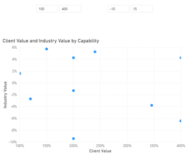
Hi @ramshoney1225 ,
Create two calculated column as slicer.
Client = 'Table'[Client Value]*100

Industry = 'Table'[Industry Value]*100
Pbix as attached.
Best Regards,
Jay
- Mark as New
- Bookmark
- Subscribe
- Mute
- Subscribe to RSS Feed
- Permalink
- Report Inappropriate Content
HI @ramshoney1225 ,
I found a similar thread for this as follows:
https://community.powerbi.com/t5/Desktop/Dynamic-change-in-X-Axis/td-p/86167
If this helps and resolves the issue, appreciate a Kudos and mark it as a Solution! 🙂
Thanks,
Pragati
- Mark as New
- Bookmark
- Subscribe
- Mute
- Subscribe to RSS Feed
- Permalink
- Report Inappropriate Content
Hi @Pragati11 ,
Actually i gone through this, but in my case all the 3 columns are present in one table
- Mark as New
- Bookmark
- Subscribe
- Mute
- Subscribe to RSS Feed
- Permalink
- Report Inappropriate Content
- Mark as New
- Bookmark
- Subscribe
- Mute
- Subscribe to RSS Feed
- Permalink
- Report Inappropriate Content
HI Jay,
How to achive that ?
- Mark as New
- Bookmark
- Subscribe
- Mute
- Subscribe to RSS Feed
- Permalink
- Report Inappropriate Content
Hi @ramshoney1225 ,
Create two calculated column as slicer.
Client = 'Table'[Client Value]*100

Industry = 'Table'[Industry Value]*100
Pbix as attached.
Best Regards,
Jay
- Mark as New
- Bookmark
- Subscribe
- Mute
- Subscribe to RSS Feed
- Permalink
- Report Inappropriate Content
Hi @Anonymous
Yes Exactly, i want the one which you showing. 🙂
Thanks,
Rams
Helpful resources

FabCon Global Hackathon
Join the Fabric FabCon Global Hackathon—running virtually through Nov 3. Open to all skill levels. $10,000 in prizes!

Power BI Monthly Update - September 2025
Check out the September 2025 Power BI update to learn about new features.


