FabCon is coming to Atlanta
Join us at FabCon Atlanta from March 16 - 20, 2026, for the ultimate Fabric, Power BI, AI and SQL community-led event. Save $200 with code FABCOMM.
Register now!- Power BI forums
- Get Help with Power BI
- Desktop
- Service
- Report Server
- Power Query
- Mobile Apps
- Developer
- DAX Commands and Tips
- Custom Visuals Development Discussion
- Health and Life Sciences
- Power BI Spanish forums
- Translated Spanish Desktop
- Training and Consulting
- Instructor Led Training
- Dashboard in a Day for Women, by Women
- Galleries
- Data Stories Gallery
- Themes Gallery
- Contests Gallery
- QuickViz Gallery
- Quick Measures Gallery
- Visual Calculations Gallery
- Notebook Gallery
- Translytical Task Flow Gallery
- TMDL Gallery
- R Script Showcase
- Webinars and Video Gallery
- Ideas
- Custom Visuals Ideas (read-only)
- Issues
- Issues
- Events
- Upcoming Events
The Power BI Data Visualization World Championships is back! Get ahead of the game and start preparing now! Learn more
- Power BI forums
- Forums
- Get Help with Power BI
- Desktop
- Changing legend based on how I filter my line grap...
- Subscribe to RSS Feed
- Mark Topic as New
- Mark Topic as Read
- Float this Topic for Current User
- Bookmark
- Subscribe
- Printer Friendly Page
- Mark as New
- Bookmark
- Subscribe
- Mute
- Subscribe to RSS Feed
- Permalink
- Report Inappropriate Content
Changing legend based on how I filter my line graph
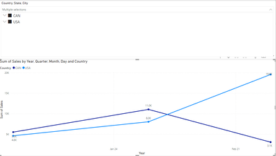
Hello! I have a line graph that shows sales and can be filtered by Country, State, and City. I have created one filter than can filter first by Country, then by State, and then by City.
image 1:
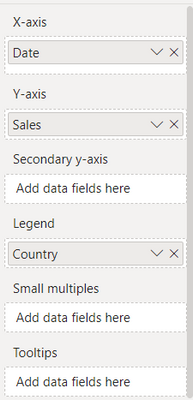
My line graph has the following filters:
image 2:
These are the filters being used on the slicer for my line graph:
image 3:
The way it works now is, if i select a countries or multiple countries, I can see the sales for multiple countries at a time and it will show the results on different lines. This works as it should (see first image).
Now, let us say I click the drop down on Canada and select Quebec and Ontario, the graph combines the sales for the 2 states/provinces and shows them one line (see image 4). How can I get Quebec and Ontario on separate lines and have the legend reflect Quebec and Ontario instead of it showing Canada still?
Image 4:
Essentially, when I select just countries I would like the legend to show the countries, when I select states, I want to see the states, and when I select the cities I want the legend to show the cities.
The other thing that is happening is, lets say I select AZ from USA and Quebec from Canada. The graph will show me the results for these two states/provinces but the legend will continue to say USA and Canada instead of AZ and Quebec (see image 5).
image 5:
Any tips would be appreciated!
Solved! Go to Solution.
- Mark as New
- Bookmark
- Subscribe
- Mute
- Subscribe to RSS Feed
- Permalink
- Report Inappropriate Content
Hey @allora ,
you can achieve what you are looking for by using the Field parameters feature: Let report readers use field parameters to change visuals (preview) - Power BI | Microsoft Learn
But at the current moment, it is a bit tricky to "simulate" the hierarchy. Maybe you can adapt the solution posted by @otravers here: Field Parameter - Hierarchy - Microsoft Power BI Community
Hopefully, this provides an idea of how to tackle your challenge.
Regards,
Tom
Did I answer your question? Mark my post as a solution, this will help others!
Proud to be a Super User!
I accept Kudos 😉
Hamburg, Germany
Helpful resources

Power BI Monthly Update - November 2025
Check out the November 2025 Power BI update to learn about new features.

Fabric Data Days
Advance your Data & AI career with 50 days of live learning, contests, hands-on challenges, study groups & certifications and more!


