FabCon is coming to Atlanta
Join us at FabCon Atlanta from March 16 - 20, 2026, for the ultimate Fabric, Power BI, AI and SQL community-led event. Save $200 with code FABCOMM.
Register now!- Power BI forums
- Get Help with Power BI
- Desktop
- Service
- Report Server
- Power Query
- Mobile Apps
- Developer
- DAX Commands and Tips
- Custom Visuals Development Discussion
- Health and Life Sciences
- Power BI Spanish forums
- Translated Spanish Desktop
- Training and Consulting
- Instructor Led Training
- Dashboard in a Day for Women, by Women
- Galleries
- Data Stories Gallery
- Themes Gallery
- Contests Gallery
- QuickViz Gallery
- Quick Measures Gallery
- Visual Calculations Gallery
- Notebook Gallery
- Translytical Task Flow Gallery
- TMDL Gallery
- R Script Showcase
- Webinars and Video Gallery
- Ideas
- Custom Visuals Ideas (read-only)
- Issues
- Issues
- Events
- Upcoming Events
The Power BI Data Visualization World Championships is back! Get ahead of the game and start preparing now! Learn more
- Power BI forums
- Forums
- Get Help with Power BI
- Desktop
- Changing bar colors in bar chart based on more tha...
- Subscribe to RSS Feed
- Mark Topic as New
- Mark Topic as Read
- Float this Topic for Current User
- Bookmark
- Subscribe
- Printer Friendly Page
- Mark as New
- Bookmark
- Subscribe
- Mute
- Subscribe to RSS Feed
- Permalink
- Report Inappropriate Content
Changing bar colors in bar chart based on more than one criteria.
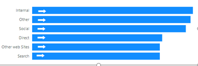
Hi. I have a bar chart here. The arrows indicate if the value in the bar chart has changed positively, negatively or both, from the last time period.
If Positive, arrow right, if negative, arrow left and if now change, no arrow.
How do i get the colors in the bars to change depending on the same criteria? Easy to do if the only thing is checking the value of the bar, but what if the color is dependent not on just the value of the bar but whether or not it change +,- or neutral?
Right now I also have the arrows on top of each chart item, but of course that's not going to work when an item is added orr removed. Is there a way to include the arrow as part of the bar itself?
Any help is appreciated.
Thanks, Steven.
Solved! Go to Solution.
- Mark as New
- Bookmark
- Subscribe
- Mute
- Subscribe to RSS Feed
- Permalink
- Report Inappropriate Content
@Anonymous , You can use measure for the previous period like below, assuming you are using date table
//previous period
Same Date range last period =
var _diff = datediff(MIN('Date'[date]),max('Date'[date]),DAY)
var _p_st_date = MINX('Date',DATEADD('Date'[date],-1*_diff,Day))-1
var _p_end_date = MAXX('Date',DATEADD('Date'[date],-1*_diff,Day))-1
Return
CALCULATE(sum(Sales[Sales Amount]),all('Date'[date]),'Date'[date]>=_p_st_date && 'Date'[date]<= _p_end_date
)
Same Date range last period =
var _diff = datediff(MIN('Date'[date]),max('Date'[date]),DAY)
var _p_st_date = MINX('Date',DATEADD('Date'[date],-1*_diff,Day))-1
var _p_end_date = MAXX('Date',DATEADD('Date'[date],-1*_diff,Day))-1
Return
CALCULATE(sum(Sales[Sales Amount]),dateadd('Date'[date],-1*_diff,Day)
//previous period month
Same Date range last period =
var _diff = datediff(MIN('Date'[date]),max('Date'[date]),Month)+1
var _p_st_date = MINX('Date',DATEADD('Date'[date],-1*_diff,Month))-1
var _p_end_date = MAXX('Date',DATEADD('Date'[date],-1*_diff,Month))-1
Return
CALCULATE(sum(Sales[Sales Amount]),all('Date'[date]),'Date'[date]>=_p_st_date && 'Date'[date]<= _p_end_date
)
Then you can use color measure
/////Arrow Color
Arrow color =
var _change =[This period]-[Same Date range last period]
return
SWITCH (
TRUE(),
_change > 0, "green",
_change = 0, "blue",
_change < 0, "red"
)
You can make the measure complex by using additional conditions. Use it in conditional formatting using field value option
For arrow, you can use label customization, this feature has been enhanced after i shared this video, but you can get icon with color
Measure driven data labels| How to use a different measure on label| Some interesting visuals: https://www.youtube.com/watch?v=Y6G1Rj_O7XE
Learn Power BI Advance - PowerBI Abstract Thesis:
How to do conditional formatting by measure and apply it on pie?
https://www.youtube.com/watch?v=RqBb5eBf_I4&list=PLPaNVDMhUXGYo50Ajmr4SgSV9HIQLxc8L
https://community.powerbi.com/t5/Community-Blog/Power-BI-Conditional-formatting-the-Pie-Visual/ba-p/1682539
https://amitchandak.medium.com/power-bi-where-is-the-conditional-formatting-option-in-new-format-pane-66e0afcb15f3
- Mark as New
- Bookmark
- Subscribe
- Mute
- Subscribe to RSS Feed
- Permalink
- Report Inappropriate Content
Thanks for responding. That part I'm aware of doing.
The challenge is that I have to compare it against a previous value of the same date range (ex. 1 month earlier), so what I have to do is to calculation the % as you have it, then also compare it to the previous value of the same thing.
ex. user choses 30 day range. So the bar chart must show the difference and whether it went up or down; if up green, if down red, and if unchanged, another color.
That's where my challenge is.
- Mark as New
- Bookmark
- Subscribe
- Mute
- Subscribe to RSS Feed
- Permalink
- Report Inappropriate Content
@Anonymous , You can use measure for the previous period like below, assuming you are using date table
//previous period
Same Date range last period =
var _diff = datediff(MIN('Date'[date]),max('Date'[date]),DAY)
var _p_st_date = MINX('Date',DATEADD('Date'[date],-1*_diff,Day))-1
var _p_end_date = MAXX('Date',DATEADD('Date'[date],-1*_diff,Day))-1
Return
CALCULATE(sum(Sales[Sales Amount]),all('Date'[date]),'Date'[date]>=_p_st_date && 'Date'[date]<= _p_end_date
)
Same Date range last period =
var _diff = datediff(MIN('Date'[date]),max('Date'[date]),DAY)
var _p_st_date = MINX('Date',DATEADD('Date'[date],-1*_diff,Day))-1
var _p_end_date = MAXX('Date',DATEADD('Date'[date],-1*_diff,Day))-1
Return
CALCULATE(sum(Sales[Sales Amount]),dateadd('Date'[date],-1*_diff,Day)
//previous period month
Same Date range last period =
var _diff = datediff(MIN('Date'[date]),max('Date'[date]),Month)+1
var _p_st_date = MINX('Date',DATEADD('Date'[date],-1*_diff,Month))-1
var _p_end_date = MAXX('Date',DATEADD('Date'[date],-1*_diff,Month))-1
Return
CALCULATE(sum(Sales[Sales Amount]),all('Date'[date]),'Date'[date]>=_p_st_date && 'Date'[date]<= _p_end_date
)
Then you can use color measure
/////Arrow Color
Arrow color =
var _change =[This period]-[Same Date range last period]
return
SWITCH (
TRUE(),
_change > 0, "green",
_change = 0, "blue",
_change < 0, "red"
)
You can make the measure complex by using additional conditions. Use it in conditional formatting using field value option
For arrow, you can use label customization, this feature has been enhanced after i shared this video, but you can get icon with color
Measure driven data labels| How to use a different measure on label| Some interesting visuals: https://www.youtube.com/watch?v=Y6G1Rj_O7XE
Learn Power BI Advance - PowerBI Abstract Thesis:
How to do conditional formatting by measure and apply it on pie?
https://www.youtube.com/watch?v=RqBb5eBf_I4&list=PLPaNVDMhUXGYo50Ajmr4SgSV9HIQLxc8L
https://community.powerbi.com/t5/Community-Blog/Power-BI-Conditional-formatting-the-Pie-Visual/ba-p/1682539
https://amitchandak.medium.com/power-bi-where-is-the-conditional-formatting-option-in-new-format-pane-66e0afcb15f3
- Mark as New
- Bookmark
- Subscribe
- Mute
- Subscribe to RSS Feed
- Permalink
- Report Inappropriate Content
Thanks, I will check out what you provided. Thank you.
- Mark as New
- Bookmark
- Subscribe
- Mute
- Subscribe to RSS Feed
- Permalink
- Report Inappropriate Content
Hi @Anonymous ,
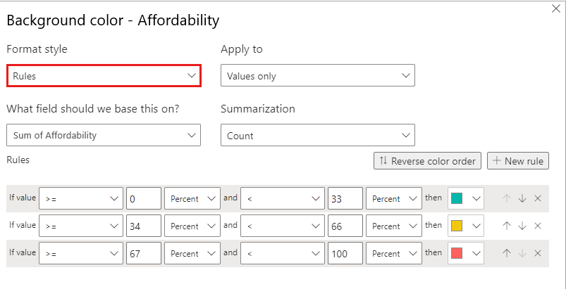
Please try to use conditional format.You can adjust their background color based on negative and positive numbers as well as 0 pairs.
More details: Apply conditional table formatting in Power BI - Power BI | Microsoft Learn
How to Get Your Question Answered Quickly - Microsoft Fabric Community
If it does not help, please provide more details with your desired output and pbix file without privacy information (or some sample data) .
Best Regards
Community Support Team _ Rongtie
If this post helps, then please consider Accept it as the solution to help the other members find it more quickly.
Helpful resources

Power BI Monthly Update - November 2025
Check out the November 2025 Power BI update to learn about new features.

Fabric Data Days
Advance your Data & AI career with 50 days of live learning, contests, hands-on challenges, study groups & certifications and more!

| User | Count |
|---|---|
| 58 | |
| 45 | |
| 42 | |
| 21 | |
| 18 |
| User | Count |
|---|---|
| 172 | |
| 107 | |
| 92 | |
| 54 | |
| 46 |


