This time we’re going bigger than ever. Fabric, Power BI, SQL, AI and more. We're covering it all. You won't want to miss it.
Learn moreLevel up your Power BI skills this month - build one visual each week and tell better stories with data! Get started
Hello everyone.
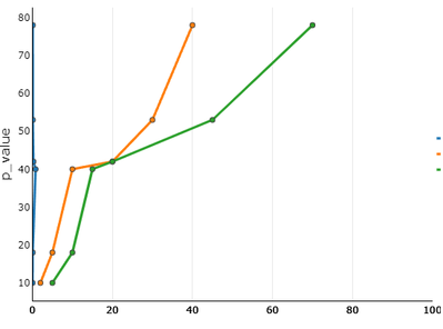
I have a doubt I am wanting to make a graph of line or areas but where my axis "y" is a specific one, when making the graph only gives me the option to give the axis and this axis is placed on the axis "x" in my case are the "p_values" I want these values to be on the axis "y", and not on the x-axis as it comes out by default.
Can this be done? Thank you for your comments and help beforehand
Hi @Anonymous
Is this similar to what you were looking for?
Vertical line chart with PBIVizEdit.com
Download link for the custom visual file in this page
https://pbivizedit.com/gallery/vertical_line_chart
This was made with our Custom Visual creator tool PBIVizEdit.com. With this tool,
Give this a shot and let us know if you face any problem/errors.
You can use the editor to modify your visual further (some modifications cannot be done in Power BI window and have to be in editor).
thanks,
AsitM (PBIVizEdit)
@Syndicate_Admin , We do not have a vertical line visual.
But you can check to scatter visuals.
Check out the April 2026 Power BI update to learn about new features.
Sign up to receive a private message when registration opens and key events begin.
If you have recently started exploring Fabric, we'd love to hear how it's going. Your feedback can help with product improvements.
| User | Count |
|---|---|
| 36 | |
| 29 | |
| 29 | |
| 21 | |
| 18 |
| User | Count |
|---|---|
| 69 | |
| 39 | |
| 33 | |
| 24 | |
| 23 |