FabCon is coming to Atlanta
Join us at FabCon Atlanta from March 16 - 20, 2026, for the ultimate Fabric, Power BI, AI and SQL community-led event. Save $200 with code FABCOMM.
Register now!- Power BI forums
- Get Help with Power BI
- Desktop
- Service
- Report Server
- Power Query
- Mobile Apps
- Developer
- DAX Commands and Tips
- Custom Visuals Development Discussion
- Health and Life Sciences
- Power BI Spanish forums
- Translated Spanish Desktop
- Training and Consulting
- Instructor Led Training
- Dashboard in a Day for Women, by Women
- Galleries
- Data Stories Gallery
- Themes Gallery
- Contests Gallery
- QuickViz Gallery
- Quick Measures Gallery
- Visual Calculations Gallery
- Notebook Gallery
- Translytical Task Flow Gallery
- TMDL Gallery
- R Script Showcase
- Webinars and Video Gallery
- Ideas
- Custom Visuals Ideas (read-only)
- Issues
- Issues
- Events
- Upcoming Events
The Power BI Data Visualization World Championships is back! Get ahead of the game and start preparing now! Learn more
- Power BI forums
- Forums
- Get Help with Power BI
- Desktop
- Change column data type
- Subscribe to RSS Feed
- Mark Topic as New
- Mark Topic as Read
- Float this Topic for Current User
- Bookmark
- Subscribe
- Printer Friendly Page
- Mark as New
- Bookmark
- Subscribe
- Mute
- Subscribe to RSS Feed
- Permalink
- Report Inappropriate Content
Change column data type
Hi all, this power BI newbie needs help with a challenging doosy.
I have a data source file with a list of people associated with a question and several choice answers: =choice
However, instead of making the question a column with the choices to chose from, each =choice was made into separate columns with "checked"/"unchecked" as the data type (see partial screen shot), and I imagine that "check" means yes, as =choice to the question.
When trying to creat a columns visual to determine how many individuals are associated with each of the = "choices", all I get is a count of ALL the "checked"/"unchecked" lumped together.
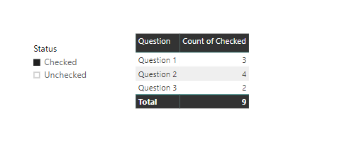
The only way I've been able to get indivicual counts has been creating single Card visual for each of the =choices and clicking and selecting the "checked" (see sample).
Is there any way I can place all the =choices into a single column of choices? AND associate those choices with the "checked" that people chose in response to the question?
- Mark as New
- Bookmark
- Subscribe
- Mute
- Subscribe to RSS Feed
- Permalink
- Report Inappropriate Content
- Mark as New
- Bookmark
- Subscribe
- Mute
- Subscribe to RSS Feed
- Permalink
- Report Inappropriate Content
Thank you for the prompt response and sample solution prateekraina!
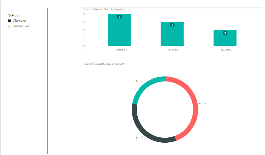
If you try running a report and change the table to a bar graph as the visual, whether you choose check or unchecked as the status, you get a "count of checked", although the count varies, it's still shown as count of checked.
the second png, are the questions separated indivually, so for each question, if I click the "checked", I get an actual count of responses to for that question, but I want to show a graph that compares count of ALL the responses at the same time in a bar, or pie or circle graph. Hope I'm explaining myself correctly.
- Mark as New
- Bookmark
- Subscribe
- Mute
- Subscribe to RSS Feed
- Permalink
- Report Inappropriate Content
Hi @Anonymous,
Would it be possible for you to draw what result you expect in Excel or Paint. I am a bit confused.
Is it something like below?
Prateek Raina
- Mark as New
- Bookmark
- Subscribe
- Mute
- Subscribe to RSS Feed
- Permalink
- Report Inappropriate Content
Hi prateekraina,
see attached files, hopefull will explain a bit more.
I also created a pbix sample file. How can I share that with you?

- Mark as New
- Bookmark
- Subscribe
- Mute
- Subscribe to RSS Feed
- Permalink
- Report Inappropriate Content
Hi @Anonymous
A simple file will be really appreciated.
You could upload the file by choosing files to the attachments below, or upload file to OneDrive, and then share me with the link.
Best Regards
Maggie
- Mark as New
- Bookmark
- Subscribe
- Mute
- Subscribe to RSS Feed
- Permalink
- Report Inappropriate Content
HI Maggie,
haven't heard back from you.
May I send you a sample file directly?
Erick
- Mark as New
- Bookmark
- Subscribe
- Mute
- Subscribe to RSS Feed
- Permalink
- Report Inappropriate Content
Hi @Anonymous
Could you see this when you reply?
Yes, you can send email to me directly.
Best Regards
Maggie
- Mark as New
- Bookmark
- Subscribe
- Mute
- Subscribe to RSS Feed
- Permalink
- Report Inappropriate Content
No Maggie,
I don't have that option when I reply or anywhere on my screen. Is it a subscription level thing maybe?
- Mark as New
- Bookmark
- Subscribe
- Mute
- Subscribe to RSS Feed
- Permalink
- Report Inappropriate Content
Hi Maggie,
thank you so much for your reply and wanting to help, but there's no option to upload a file that I can see here. Please advice
- Mark as New
- Bookmark
- Subscribe
- Mute
- Subscribe to RSS Feed
- Permalink
- Report Inappropriate Content
Hi and thanks again. I’ll do as soon as I have a chance
Helpful resources

Power BI Dataviz World Championships
The Power BI Data Visualization World Championships is back! Get ahead of the game and start preparing now!

| User | Count |
|---|---|
| 38 | |
| 36 | |
| 33 | |
| 33 | |
| 29 |
| User | Count |
|---|---|
| 134 | |
| 96 | |
| 78 | |
| 67 | |
| 65 |


