- Subscribe to RSS Feed
- Mark Topic as New
- Mark Topic as Read
- Float this Topic for Current User
- Bookmark
- Subscribe
- Printer Friendly Page
- Mark as New
- Bookmark
- Subscribe
- Mute
- Subscribe to RSS Feed
- Permalink
- Report Inappropriate Content

Change Y Axis Value
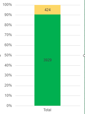
Hi gang, maybe it's because it's late, or maybe it's because I've gotten too many notes back, but does anyone know how to change the y-axis value on a Stacked Column Chart? I want it to look like this:
Instead it's giving me the thousands count on the left rather than the two numbers equalling 100%.
Thanks, and feel free to insult me for this.
Solved! Go to Solution.
- Mark as New
- Bookmark
- Subscribe
- Mute
- Subscribe to RSS Feed
- Permalink
- Report Inappropriate Content

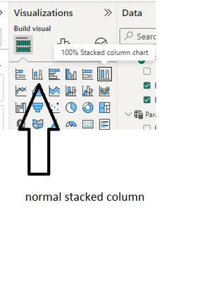
You can use the 100% stacked column chart and slap on some data labels for the actual amount
- Mark as New
- Bookmark
- Subscribe
- Mute
- Subscribe to RSS Feed
- Permalink
- Report Inappropriate Content

Hi @Cobalt58_9 ,
Your solution is great, @vicky_ . It worked like a charm! Here I have another idea in mind, and I would like to share it for reference.
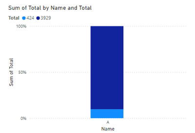
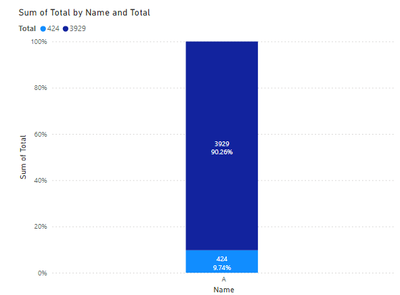
I create a visual as you mentioned.
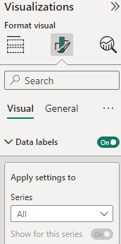
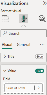
You can also open the Data labels and Value. It will show you what you want.
Best Regards
Yilong Zhou
If this post helps, then please consider Accept it as the solution to help the other members find it more quickly.
- Mark as New
- Bookmark
- Subscribe
- Mute
- Subscribe to RSS Feed
- Permalink
- Report Inappropriate Content

You can use the 100% stacked column chart and slap on some data labels for the actual amount
- Mark as New
- Bookmark
- Subscribe
- Mute
- Subscribe to RSS Feed
- Permalink
- Report Inappropriate Content

Good grief, that did the trick. Thank you so much.
Helpful resources
| Subject | Author | Posted | |
|---|---|---|---|
| 12-18-2023 11:50 AM | |||
| 09-08-2024 12:36 AM | |||
| 09-16-2024 07:44 PM | |||
| 10-08-2024 04:24 PM | |||
| 10-21-2024 04:28 PM |
| User | Count |
|---|---|
| 127 | |
| 99 | |
| 82 | |
| 51 | |
| 46 |
