European Microsoft Fabric Community Conference
The ultimate Microsoft Fabric, Power BI, Azure AI, and SQL learning event: Join us in Stockholm, September 24-27, 2024.
Save €200 with code MSCUST on top of early bird pricing!
- Power BI forums
- Updates
- News & Announcements
- Get Help with Power BI
- Desktop
- Service
- Report Server
- Power Query
- Mobile Apps
- Developer
- DAX Commands and Tips
- Custom Visuals Development Discussion
- Health and Life Sciences
- Power BI Spanish forums
- Translated Spanish Desktop
- Training and Consulting
- Instructor Led Training
- Dashboard in a Day for Women, by Women
- Galleries
- Community Connections & How-To Videos
- COVID-19 Data Stories Gallery
- Themes Gallery
- Data Stories Gallery
- R Script Showcase
- Webinars and Video Gallery
- Quick Measures Gallery
- 2021 MSBizAppsSummit Gallery
- 2020 MSBizAppsSummit Gallery
- 2019 MSBizAppsSummit Gallery
- Events
- Ideas
- Custom Visuals Ideas
- Issues
- Issues
- Events
- Upcoming Events
- Community Blog
- Power BI Community Blog
- Custom Visuals Community Blog
- Community Support
- Community Accounts & Registration
- Using the Community
- Community Feedback
Find everything you need to get certified on Fabric—skills challenges, live sessions, exam prep, role guidance, and more. Get started
- Power BI forums
- Forums
- Get Help with Power BI
- Desktop
- Re: Centered 100% stacked bar chart
- Subscribe to RSS Feed
- Mark Topic as New
- Mark Topic as Read
- Float this Topic for Current User
- Bookmark
- Subscribe
- Printer Friendly Page
- Mark as New
- Bookmark
- Subscribe
- Mute
- Subscribe to RSS Feed
- Permalink
- Report Inappropriate Content
Centered 100% stacked bar chart
Hello,
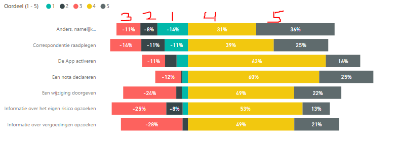
I want to create a 100% stacked bar chart with a centered center. The data contains satisfaction figures and I would like to make it clear at a glance which components are good and which ones do not. Below is an example of how I like it. Only the legend is not sorted correctly.
I hope somebody here has a solution.
Thank you very much!
Greetings, Tiemen
- Mark as New
- Bookmark
- Subscribe
- Mute
- Subscribe to RSS Feed
- Permalink
- Report Inappropriate Content
Have you been able to find a fix for this issue? I'm able to center the chart, however the sorting for the negative values is reversed.
- Mark as New
- Bookmark
- Subscribe
- Mute
- Subscribe to RSS Feed
- Permalink
- Report Inappropriate Content
Hi @RMO ,
Are you using a column to have the legend on your values or are they separate measures?
If you are using different measures your need to place them in the order you need so the sorting is correct. If you have a column that you use for legend you need to add an additional column to sort them out and your chart will be correct.
Regards
Miguel Félix
Did I answer your question? Mark my post as a solution!
Proud to be a Super User!
Check out my blog: Power BI em Português- Mark as New
- Bookmark
- Subscribe
- Mute
- Subscribe to RSS Feed
- Permalink
- Report Inappropriate Content
Thanks for the response. The issue isn't with the legend not sorting, because that's sorting correctly. It's the chart itself. If you look at OP's first image, the negative values in the chart are 3,2,1 when they should be 1,2,3. It's essentially correct because the values are ordered (-11 < -14) but we're looking for a workaround that reverses the order without taking the absolute value.
- Mark as New
- Bookmark
- Subscribe
- Mute
- Subscribe to RSS Feed
- Permalink
- Report Inappropriate Content
Hi @RMO ,
The questions is also regarding the legend, since the legend presents the order how your values are.
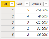
I just did a simple column with 3 values:
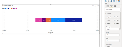
If I do the chart without using the Sort column to sort the category you get the result below:
If you do the sorting you can see that the chart and the legend changes:
Has you can see the sorting is important and should be done.
Regards
Miguel Félix
Did I answer your question? Mark my post as a solution!
Proud to be a Super User!
Check out my blog: Power BI em Português- Mark as New
- Bookmark
- Subscribe
- Mute
- Subscribe to RSS Feed
- Permalink
- Report Inappropriate Content
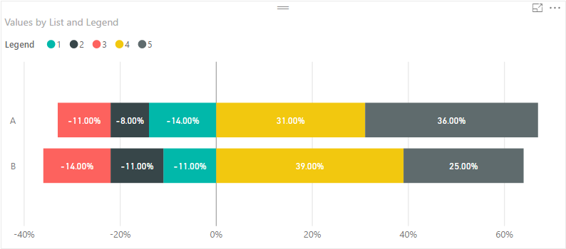
Yes, all this works fine when the standard 100% stacked chart is used as it is. What we're doing is centering the chart on the middle value, which is how we end up with the negative and positive values. If you review OP's previous responses, they explain it all there.
- Mark as New
- Bookmark
- Subscribe
- Mute
- Subscribe to RSS Feed
- Permalink
- Report Inappropriate Content
Hi @RMO ,
If this is a question about centering you need to set the maximum values of the axis with same value in this case I have made 100% and -100% but if the chart goes above those values you will loose information.
Regards
Miguel Félix
Did I answer your question? Mark my post as a solution!
Proud to be a Super User!
Check out my blog: Power BI em Português- Mark as New
- Bookmark
- Subscribe
- Mute
- Subscribe to RSS Feed
- Permalink
- Report Inappropriate Content
@gopichilla @Greg_Deckler @MFelix
Thank you for your response! To further illustrate my robleem, I have further developed the example. If I use the 100% stacked bar chart, I get the following without any adjustments. It is not as clear as to which parts the assessment is good or very good.
After a small adjustment (the negative and neutral ratings give a -1 score) I get the following bar chart.
However, in the bar chart I want to start the order of the reviews to start with very bad instead of neutral as is the case now. In addition, I want to show the scores as a positive number. So at the first part, 11% 7% and 14% instead of -11% -7% and -14%. I hope this explanation makes my problem clearer.
- Mark as New
- Bookmark
- Subscribe
- Mute
- Subscribe to RSS Feed
- Permalink
- Report Inappropriate Content
Not sure what metric you are using in that graph but you should be able to wrap it in an ABS in order to always return a positive value.
Follow on LinkedIn
@ me in replies or I'll lose your thread!!!
Instead of a Kudo, please vote for this idea
Become an expert!: Enterprise DNA
External Tools: MSHGQM
YouTube Channel!: Microsoft Hates Greg
Latest book!: The Definitive Guide to Power Query (M)
DAX is easy, CALCULATE makes DAX hard...
- Mark as New
- Bookmark
- Subscribe
- Mute
- Subscribe to RSS Feed
- Permalink
- Report Inappropriate Content
- Mark as New
- Bookmark
- Subscribe
- Mute
- Subscribe to RSS Feed
- Permalink
- Report Inappropriate Content
Can you go to this way it will help you I hope?
Go to data view panel ->modling ->sort columns (ASC/DSC).
Thanks
- Mark as New
- Bookmark
- Subscribe
- Mute
- Subscribe to RSS Feed
- Permalink
- Report Inappropriate Content
Maybe a custom visual like Table Sorter or Tornado?
https://app.powerbi.com/visuals/
Follow on LinkedIn
@ me in replies or I'll lose your thread!!!
Instead of a Kudo, please vote for this idea
Become an expert!: Enterprise DNA
External Tools: MSHGQM
YouTube Channel!: Microsoft Hates Greg
Latest book!: The Definitive Guide to Power Query (M)
DAX is easy, CALCULATE makes DAX hard...
- Mark as New
- Bookmark
- Subscribe
- Mute
- Subscribe to RSS Feed
- Permalink
- Report Inappropriate Content
Hi @Anonymous,
Not sure if I'm understanding your question correctly, when I make a table with the information that I see on the image you posted, I get the exact image as you have it.
Do you want to highlight the center values? Do you want to have your information in a diffent order?
Sorry for the questions but as you can see I achieve the same as you.
MFelix
Regards
Miguel Félix
Did I answer your question? Mark my post as a solution!
Proud to be a Super User!
Check out my blog: Power BI em PortuguêsHelpful resources

Europe’s largest Microsoft Fabric Community Conference
Join the community in Stockholm for expert Microsoft Fabric learning including a very exciting keynote from Arun Ulag, Corporate Vice President, Azure Data.

Power BI Monthly Update - July 2024
Check out the July 2024 Power BI update to learn about new features.

| User | Count |
|---|---|
| 112 | |
| 112 | |
| 69 | |
| 46 | |
| 43 |
| User | Count |
|---|---|
| 186 | |
| 85 | |
| 76 | |
| 74 | |
| 56 |


