FabCon is coming to Atlanta
Join us at FabCon Atlanta from March 16 - 20, 2026, for the ultimate Fabric, Power BI, AI and SQL community-led event. Save $200 with code FABCOMM.
Register now!- Power BI forums
- Get Help with Power BI
- Desktop
- Service
- Report Server
- Power Query
- Mobile Apps
- Developer
- DAX Commands and Tips
- Custom Visuals Development Discussion
- Health and Life Sciences
- Power BI Spanish forums
- Translated Spanish Desktop
- Training and Consulting
- Instructor Led Training
- Dashboard in a Day for Women, by Women
- Galleries
- Data Stories Gallery
- Themes Gallery
- Contests Gallery
- QuickViz Gallery
- Quick Measures Gallery
- Visual Calculations Gallery
- Notebook Gallery
- Translytical Task Flow Gallery
- TMDL Gallery
- R Script Showcase
- Webinars and Video Gallery
- Ideas
- Custom Visuals Ideas (read-only)
- Issues
- Issues
- Events
- Upcoming Events
The Power BI Data Visualization World Championships is back! Get ahead of the game and start preparing now! Learn more
- Power BI forums
- Forums
- Get Help with Power BI
- Desktop
- Catching Correct Value Issue with Hovering Functio...
- Subscribe to RSS Feed
- Mark Topic as New
- Mark Topic as Read
- Float this Topic for Current User
- Bookmark
- Subscribe
- Printer Friendly Page
- Mark as New
- Bookmark
- Subscribe
- Mute
- Subscribe to RSS Feed
- Permalink
- Report Inappropriate Content
Catching Correct Value Issue with Hovering Functionality in Line Chart
Hi Everyone,
I have an issue about showing values correctly on the line chart. X-axis includes date-time values and y-axis includes values.
When we move the mouse on values, it means that we are not hovering on the points, we are hovering on the line since we changed the colors of the lines as white.
We can see an example below not corresponds to 0 value but equals approximately to 1,024.
The same issue is continuing even if we narrow down both date and values sliders as is seen from below screenshot.
Even though the points seem there is only one value on it, there can be more than one values look like one point.
That's why when we are hovering the line (bc actually not the point), we are selecting the wrong point.
Finally, if we make a filter by creating a slider with ‘value’ column, we can see the correct values on chart as shown in below. However, I am looking for a better solution by not creating another visual to see correct value and points when hovering the mouse on them.
As a note, I am using Azure Synapse connection on Power BI with DirectQuery to get live data from database.
Is there any idea about how can it be fixed?
Many thanks in advance!
- Mark as New
- Bookmark
- Subscribe
- Mute
- Subscribe to RSS Feed
- Permalink
- Report Inappropriate Content
Hi
I think your X Axis has a lot of items (you define your time at unit of second), so when you hover, maye system will define wrong line.
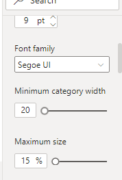
try to edit Width in X Axis to create space that you can hover right line.
Any way, you narrow the Y axis scale, that mean it only show items belong to scale, but other items still be in chart but invisiable. Only you add new slicer, that is true filter.
Helpful resources

Power BI Dataviz World Championships
The Power BI Data Visualization World Championships is back! Get ahead of the game and start preparing now!

| User | Count |
|---|---|
| 40 | |
| 35 | |
| 34 | |
| 31 | |
| 27 |
| User | Count |
|---|---|
| 135 | |
| 102 | |
| 67 | |
| 65 | |
| 56 |


