FabCon is coming to Atlanta
Join us at FabCon Atlanta from March 16 - 20, 2026, for the ultimate Fabric, Power BI, AI and SQL community-led event. Save $200 with code FABCOMM.
Register now!- Power BI forums
- Get Help with Power BI
- Desktop
- Service
- Report Server
- Power Query
- Mobile Apps
- Developer
- DAX Commands and Tips
- Custom Visuals Development Discussion
- Health and Life Sciences
- Power BI Spanish forums
- Translated Spanish Desktop
- Training and Consulting
- Instructor Led Training
- Dashboard in a Day for Women, by Women
- Galleries
- Data Stories Gallery
- Themes Gallery
- Contests Gallery
- QuickViz Gallery
- Quick Measures Gallery
- Visual Calculations Gallery
- Notebook Gallery
- Translytical Task Flow Gallery
- TMDL Gallery
- R Script Showcase
- Webinars and Video Gallery
- Ideas
- Custom Visuals Ideas (read-only)
- Issues
- Issues
- Events
- Upcoming Events
Learn from the best! Meet the four finalists headed to the FINALS of the Power BI Dataviz World Championships! Register now
- Power BI forums
- Forums
- Get Help with Power BI
- Desktop
- Card chart
- Subscribe to RSS Feed
- Mark Topic as New
- Mark Topic as Read
- Float this Topic for Current User
- Bookmark
- Subscribe
- Printer Friendly Page
- Mark as New
- Bookmark
- Subscribe
- Mute
- Subscribe to RSS Feed
- Permalink
- Report Inappropriate Content
Card chart
Hi everyone
I was wondering if there is any kind of graph or card just to show the exisitng applied filters, I mean, I have a Dashboard with year and month filters and I would like to have a visual just showing the filters that are already applied.
Something like the multi-row card but in horizontal or just a card showing the year for example, but If I try to use the simple card with years always do the summarize even if I change the "default summarization", so it doesnt work.
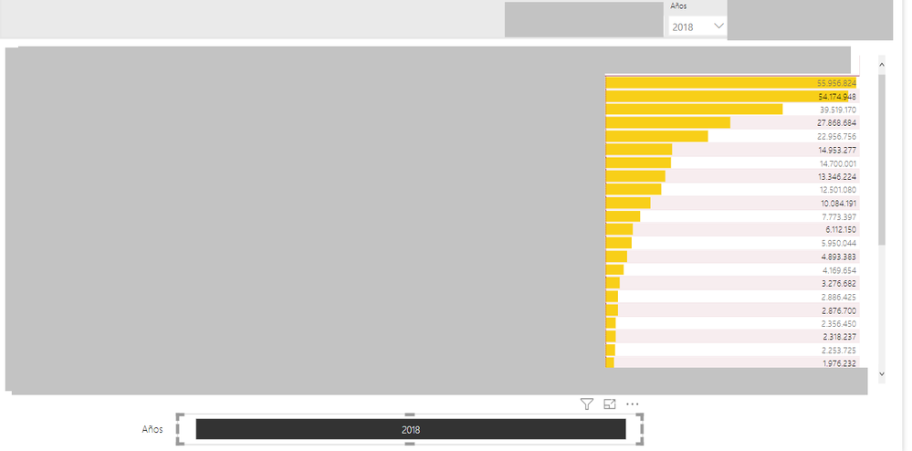
I have something like this
What I have now is another filter at the bottom and shows what year is selected on the top filters, what I would like is that info on a non-interactive card like now, cause the filter at the bottom is still a filter and customers can interact with it.
Hopefully someone can help me!! Any Idea would be really appreciate it.
Kind regards
ICR.
Solved! Go to Solution.
- Mark as New
- Bookmark
- Subscribe
- Mute
- Subscribe to RSS Feed
- Permalink
- Report Inappropriate Content
Hi @ICRdatalover ,
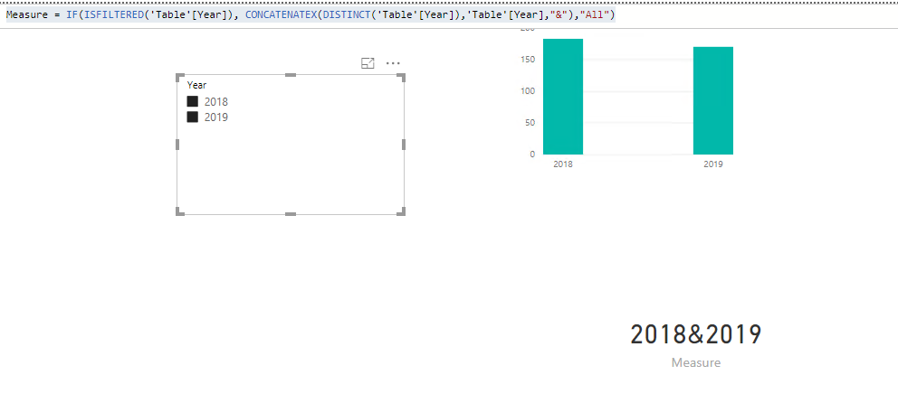
Pleae check my sample as below. Here I created a measure to display the values we seleted in the slicer.
Measure = IF(ISFILTERED('Table'[Year]), CONCATENATEX(DISTINCT('Table'[Year]),'Table'[Year],"&"),"All")
Also please find the pbix as attached.
Regards,
Frank
If this post helps, then please consider Accept it as the solution to help the others find it more quickly.
- Mark as New
- Bookmark
- Subscribe
- Mute
- Subscribe to RSS Feed
- Permalink
- Report Inappropriate Content
Hi @v-frfei-msft,
Thanks for the fast reply.
It is exactly what I was looking for. Im so grateful!
Kind regards,
ICR
Helpful resources

Join our Fabric User Panel
Share feedback directly with Fabric product managers, participate in targeted research studies and influence the Fabric roadmap.

Power BI Monthly Update - February 2026
Check out the February 2026 Power BI update to learn about new features.

| User | Count |
|---|---|
| 51 | |
| 47 | |
| 29 | |
| 15 | |
| 14 |
| User | Count |
|---|---|
| 88 | |
| 73 | |
| 39 | |
| 26 | |
| 24 |


