New Offer! Become a Certified Fabric Data Engineer
Check your eligibility for this 50% exam voucher offer and join us for free live learning sessions to get prepared for Exam DP-700.
Get Started- Power BI forums
- Get Help with Power BI
- Desktop
- Service
- Report Server
- Power Query
- Mobile Apps
- Developer
- DAX Commands and Tips
- Custom Visuals Development Discussion
- Health and Life Sciences
- Power BI Spanish forums
- Translated Spanish Desktop
- Training and Consulting
- Instructor Led Training
- Dashboard in a Day for Women, by Women
- Galleries
- Community Connections & How-To Videos
- COVID-19 Data Stories Gallery
- Themes Gallery
- Data Stories Gallery
- R Script Showcase
- Webinars and Video Gallery
- Quick Measures Gallery
- 2021 MSBizAppsSummit Gallery
- 2020 MSBizAppsSummit Gallery
- 2019 MSBizAppsSummit Gallery
- Events
- Ideas
- Custom Visuals Ideas
- Issues
- Issues
- Events
- Upcoming Events
Don't miss out! 2025 Microsoft Fabric Community Conference, March 31 - April 2, Las Vegas, Nevada. Use code MSCUST for a $150 discount. Prices go up February 11th. Register now.
- Power BI forums
- Forums
- Get Help with Power BI
- Desktop
- Re: Can X -axis (bins) dynamically vary
- Subscribe to RSS Feed
- Mark Topic as New
- Mark Topic as Read
- Float this Topic for Current User
- Bookmark
- Subscribe
- Printer Friendly Page
- Mark as New
- Bookmark
- Subscribe
- Mute
- Subscribe to RSS Feed
- Permalink
- Report Inappropriate Content
Can X -axis (bins) dynamically vary
Hi
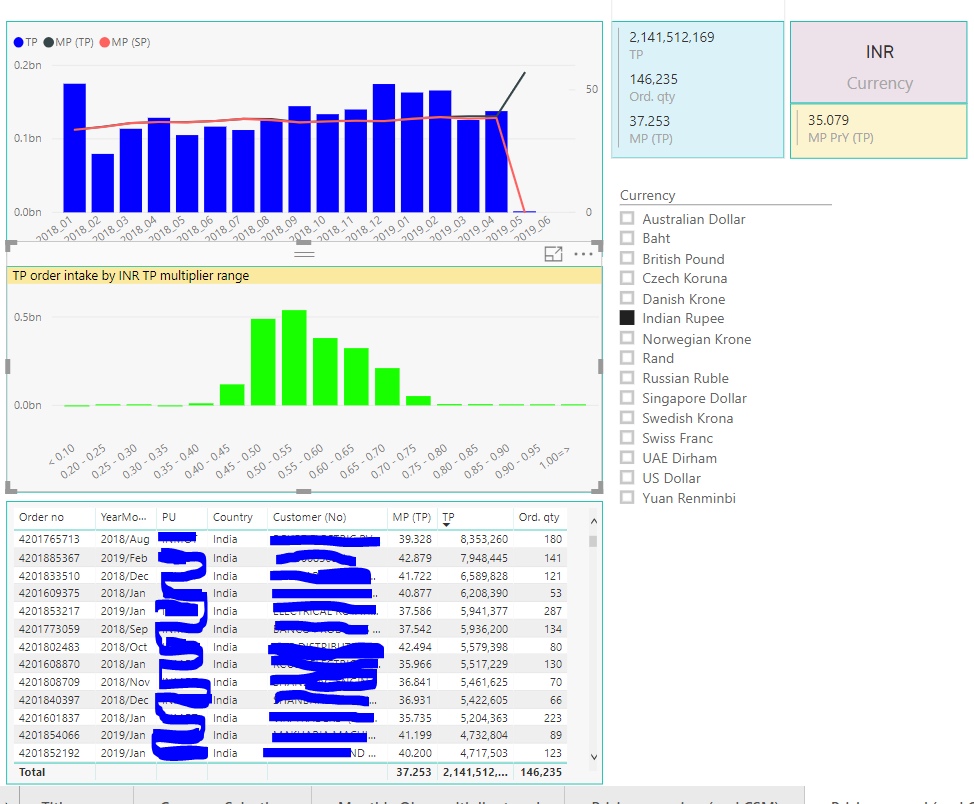
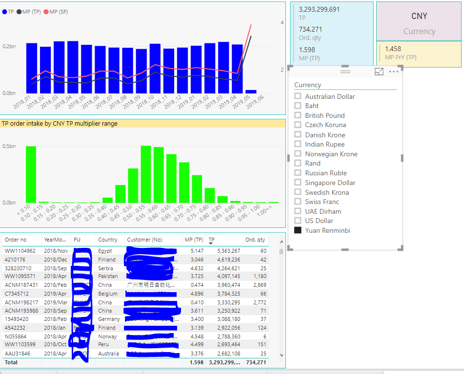
I have a orders data in which there is a measure MP(TP) where it varries based on currency selection.Initially I created histogram chart based on the values of the measure.this is hard coded with values when US currency is selected.Now the requirement is when any currency selected other than US the x axis should varry accordingly.
I am trying to create bins on measure MP(TP) but I am not succusfull.
For ex. if I select the US currency MP(TP ) values vary from 0.1 to >1. and if i select INR currency MP(TP) value vary in between 30 to 45 above. this I need to show in the histogram chart.
IS there any way to change the axis dynamically.
- Mark as New
- Bookmark
- Subscribe
- Mute
- Subscribe to RSS Feed
- Permalink
- Report Inappropriate Content
Hi there,
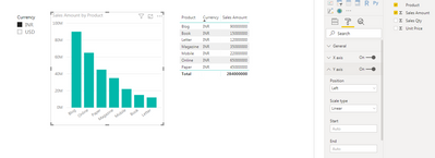
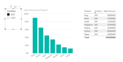
Is there a reason why you don't leave the start and end as auto then it would dynamically scale the axis? If they are blank then the chart will auto-sale the Y axis according to the currency? Apologies if I am missing something obvious!
- Mark as New
- Bookmark
- Subscribe
- Mute
- Subscribe to RSS Feed
- Permalink
- Report Inappropriate Content
Hi James,
Initially MP(TP) values were calculated according to US currency so most of the values are within the range of 0.1 to 1.So Y Axis was hard coded with in these values. Now MP(TP) values change based on other currecy. Is it possible to change values on currency selection in a calculated column.
Helpful resources
| User | Count |
|---|---|
| 117 | |
| 75 | |
| 62 | |
| 50 | |
| 44 |
| User | Count |
|---|---|
| 174 | |
| 125 | |
| 60 | |
| 60 | |
| 57 |
