- Power BI forums
- Updates
- News & Announcements
- Get Help with Power BI
- Desktop
- Service
- Report Server
- Power Query
- Mobile Apps
- Developer
- DAX Commands and Tips
- Custom Visuals Development Discussion
- Health and Life Sciences
- Power BI Spanish forums
- Translated Spanish Desktop
- Power Platform Integration - Better Together!
- Power Platform Integrations (Read-only)
- Power Platform and Dynamics 365 Integrations (Read-only)
- Training and Consulting
- Instructor Led Training
- Dashboard in a Day for Women, by Women
- Galleries
- Community Connections & How-To Videos
- COVID-19 Data Stories Gallery
- Themes Gallery
- Data Stories Gallery
- R Script Showcase
- Webinars and Video Gallery
- Quick Measures Gallery
- 2021 MSBizAppsSummit Gallery
- 2020 MSBizAppsSummit Gallery
- 2019 MSBizAppsSummit Gallery
- Events
- Ideas
- Custom Visuals Ideas
- Issues
- Issues
- Events
- Upcoming Events
- Community Blog
- Power BI Community Blog
- Custom Visuals Community Blog
- Community Support
- Community Accounts & Registration
- Using the Community
- Community Feedback
Register now to learn Fabric in free live sessions led by the best Microsoft experts. From Apr 16 to May 9, in English and Spanish.
- Power BI forums
- Forums
- Get Help with Power BI
- Desktop
- Calculated Column (From Month Values to Average Qu...
- Subscribe to RSS Feed
- Mark Topic as New
- Mark Topic as Read
- Float this Topic for Current User
- Bookmark
- Subscribe
- Printer Friendly Page
- Mark as New
- Bookmark
- Subscribe
- Mute
- Subscribe to RSS Feed
- Permalink
- Report Inappropriate Content
Calculated Column (From Month Values to Average Quarter Values)
Dear Power BI-Community
Following problem to solve:
Let's assume this table:
Rating for Products
| Product | Month | Rating (Monthly) | Quarter | AVG Rating (Quarterly) |
| A | 01.01.2022 | 4.5 | 1 | |
| A | 01.02.2022 | 4.6 | 1 | |
| A | 01.03.2022 | 4.7 | 1 | 4.6 |
| A | 01.04.2022 | 4.4 | 2 | |
| A | 01.05.2022 | 4.2 | 2 | |
| A | 01.06.2022 | 3.8 | 2 | 4.1 |
| B | 01.01.2022 | 2.5 | 1 | |
| B | 01.02.2022 | 2.9 | 1 | |
| B | 01.03.2022 | 2.4 | 1 | 2.6 |
| B | 01.04.2022 | 2.7 | 2 | |
| B | 01.05.2022 | 2.2 | 2 | |
| B | 01.06.2022 | 1.9 | 2 | 2.3 |
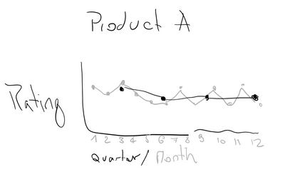
Do you guys know a way to add a calculated column in Power BI which calculates the quaterly average?
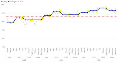
Finally I would like to create such a visual (Montly and AVG Quarterly combined)
Thank you very much for your contribution
Cheers
qwertzuiop
Solved! Go to Solution.
- Mark as New
- Bookmark
- Subscribe
- Mute
- Subscribe to RSS Feed
- Permalink
- Report Inappropriate Content
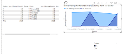
Would you like to try with Bar Chart ?
For comparision Bar can be a good option here
With line it can give a false picture
Regards,
Ritesh
Mark my post as a solution if it helped you| Munde and Kudis (Ladies and Gentlemen) I like your Kudos!! !!
My YT Channel Dancing With Data !! Connect on Linkedin !! PL 300 Certification Series
- Mark as New
- Bookmark
- Subscribe
- Mute
- Subscribe to RSS Feed
- Permalink
- Report Inappropriate Content
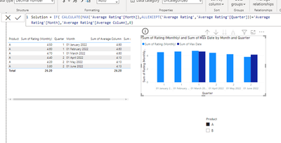
hi @qwertzuiop
try like:
- Mark as New
- Bookmark
- Subscribe
- Mute
- Subscribe to RSS Feed
- Permalink
- Report Inappropriate Content
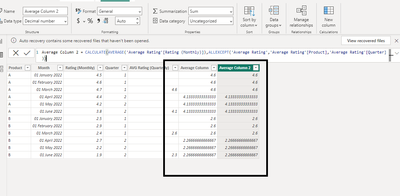
Please use this DAX
- Mark as New
- Bookmark
- Subscribe
- Mute
- Subscribe to RSS Feed
- Permalink
- Report Inappropriate Content
Thank you so much for your support @ribisht17
I will accept your answer as solution.
Maybe you can help me out a bit more.
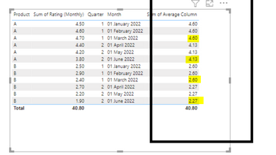
Is there a way to set all the non marked cell to blank.
In this case i would only have one value per quarter
As an example
Don't like that Quarter has also 3 values per Month
Cheers
qwertzuiop
- Mark as New
- Bookmark
- Subscribe
- Mute
- Subscribe to RSS Feed
- Permalink
- Report Inappropriate Content
Would you like to try with Bar Chart ?
For comparision Bar can be a good option here
With line it can give a false picture
Regards,
Ritesh
Mark my post as a solution if it helped you| Munde and Kudis (Ladies and Gentlemen) I like your Kudos!! !!
My YT Channel Dancing With Data !! Connect on Linkedin !! PL 300 Certification Series
Helpful resources

Microsoft Fabric Learn Together
Covering the world! 9:00-10:30 AM Sydney, 4:00-5:30 PM CET (Paris/Berlin), 7:00-8:30 PM Mexico City

Power BI Monthly Update - April 2024
Check out the April 2024 Power BI update to learn about new features.

| User | Count |
|---|---|
| 112 | |
| 99 | |
| 82 | |
| 70 | |
| 63 |
| User | Count |
|---|---|
| 145 | |
| 111 | |
| 104 | |
| 84 | |
| 64 |
