Fabric Data Days starts November 4th!
Advance your Data & AI career with 50 days of live learning, dataviz contests, hands-on challenges, study groups & certifications and more!
Get registered- Power BI forums
- Get Help with Power BI
- Desktop
- Service
- Report Server
- Power Query
- Mobile Apps
- Developer
- DAX Commands and Tips
- Custom Visuals Development Discussion
- Health and Life Sciences
- Power BI Spanish forums
- Translated Spanish Desktop
- Training and Consulting
- Instructor Led Training
- Dashboard in a Day for Women, by Women
- Galleries
- Data Stories Gallery
- Themes Gallery
- Contests Gallery
- QuickViz Gallery
- Quick Measures Gallery
- Visual Calculations Gallery
- Notebook Gallery
- Translytical Task Flow Gallery
- TMDL Gallery
- R Script Showcase
- Webinars and Video Gallery
- Ideas
- Custom Visuals Ideas (read-only)
- Issues
- Issues
- Events
- Upcoming Events
Get Fabric Certified for FREE during Fabric Data Days. Don't miss your chance! Request now
- Power BI forums
- Forums
- Get Help with Power BI
- Desktop
- Calculate data for Rules Based on Field and Drill ...
- Subscribe to RSS Feed
- Mark Topic as New
- Mark Topic as Read
- Float this Topic for Current User
- Bookmark
- Subscribe
- Printer Friendly Page
- Mark as New
- Bookmark
- Subscribe
- Mute
- Subscribe to RSS Feed
- Permalink
- Report Inappropriate Content
Calculate data for Rules Based on Field and Drill Through
Still a newbie with Power BI and trying to get some help.
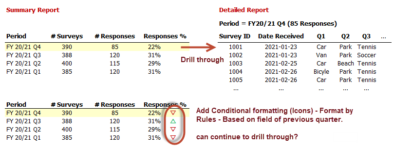
My Survey has a Summary Report and allows users to drill through to open the Detailed Report. The model is simple with just Survey Fact and Date Dimension tables. The Survey Fact table contains all the surveys (1 survey per row), has the Measures: # Survey, # Responses, Responses % etc. I am able to create both reports successfully.
My next task is to add Icons (arrow Up/Down) to indicate Responses % compared to previous quarter.
How can I calculate and use the Conditional formatting (Icons) with Rules Based on Field to create the arrow Up/Down?
Can I also assume users can continue to drill through to open Details Report with the arrow Up/Down in the report?
Thank you in advance for any suggestion you may have to help me.
- Mark as New
- Bookmark
- Subscribe
- Mute
- Subscribe to RSS Feed
- Permalink
- Report Inappropriate Content
Hey @Anonymous ,
you can add a new measure that comparing your measure to the previous quarter measure.
Then you can say if it's greater the symbol should the arrow up, otherwise the arrow down symbol.
To get that with the right colors is a little tricky, check the following tutorial for that:
Adding Up and Down Arrows to KPIs in Power BI | Tessellation (tessellationtech.io)
- Mark as New
- Bookmark
- Subscribe
- Mute
- Subscribe to RSS Feed
- Permalink
- Report Inappropriate Content
Hello @Anonymous ,
did it work eventually with the tutorial I posted?
I'm curious if you could solve this issue 🙂
Helpful resources

Power BI Monthly Update - November 2025
Check out the November 2025 Power BI update to learn about new features.

Fabric Data Days
Advance your Data & AI career with 50 days of live learning, contests, hands-on challenges, study groups & certifications and more!


