Fabric Data Days starts November 4th!
Advance your Data & AI career with 50 days of live learning, dataviz contests, hands-on challenges, study groups & certifications and more!
Get registered- Power BI forums
- Get Help with Power BI
- Desktop
- Service
- Report Server
- Power Query
- Mobile Apps
- Developer
- DAX Commands and Tips
- Custom Visuals Development Discussion
- Health and Life Sciences
- Power BI Spanish forums
- Translated Spanish Desktop
- Training and Consulting
- Instructor Led Training
- Dashboard in a Day for Women, by Women
- Galleries
- Data Stories Gallery
- Themes Gallery
- Contests Gallery
- QuickViz Gallery
- Quick Measures Gallery
- Visual Calculations Gallery
- Notebook Gallery
- Translytical Task Flow Gallery
- TMDL Gallery
- R Script Showcase
- Webinars and Video Gallery
- Ideas
- Custom Visuals Ideas (read-only)
- Issues
- Issues
- Events
- Upcoming Events
Get Fabric Certified for FREE during Fabric Data Days. Don't miss your chance! Request now
- Power BI forums
- Forums
- Get Help with Power BI
- Desktop
- Burnup chart with variable scope line accross all ...
- Subscribe to RSS Feed
- Mark Topic as New
- Mark Topic as Read
- Float this Topic for Current User
- Bookmark
- Subscribe
- Printer Friendly Page
- Mark as New
- Bookmark
- Subscribe
- Mute
- Subscribe to RSS Feed
- Permalink
- Report Inappropriate Content
Burnup chart with variable scope line accross all sprint days
Hi All(),
I´ve seen this video https://www.youtube.com/watch?v=uq5PQg_hZro (BI Ellite) on how to build an effective Burndown Chart. After some changes, I´ve set up what I think I had to build my own Burnup chart.
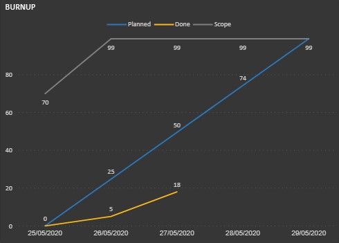
So, given the following Burnp chart already started in PowerBI:
And these assumptions:
- Sprint starts on May 25th and ends on May 31th.
- 'Scope' means planned story points. If story points are added into the sprint at least 1 day after its start, the chart should display the increase/decrease in scope (the actual scope).
- 'Planned' stands for the total amount of actual story points scope divided for each sprint day. It is a measure of how many story points the team should get done every day
- 'Done' Is the actual pace.
To address the scope line I have this DAX Measure:
Burnup (Scope) =
------
The Problem:
Given the values for initial and actual scope I have to date:
 Burnup chart scope data
The above table means in May,27th 29 story points were added into the sprint. So I want the grey line (scope) to show these values for each date:
25/05/2020 = 70 Ok
26/05/2020 = 70 instead of 99 that is being shown.
27/05/2020 = 99 Ok
According to the above list, how can I make this values to show properly?
- Mark as New
- Bookmark
- Subscribe
- Mute
- Subscribe to RSS Feed
- Permalink
- Report Inappropriate Content
Helpful resources

Fabric Data Days
Advance your Data & AI career with 50 days of live learning, contests, hands-on challenges, study groups & certifications and more!

Power BI Monthly Update - October 2025
Check out the October 2025 Power BI update to learn about new features.


