FabCon is coming to Atlanta
Join us at FabCon Atlanta from March 16 - 20, 2026, for the ultimate Fabric, Power BI, AI and SQL community-led event. Save $200 with code FABCOMM.
Register now!- Power BI forums
- Get Help with Power BI
- Desktop
- Service
- Report Server
- Power Query
- Mobile Apps
- Developer
- DAX Commands and Tips
- Custom Visuals Development Discussion
- Health and Life Sciences
- Power BI Spanish forums
- Translated Spanish Desktop
- Training and Consulting
- Instructor Led Training
- Dashboard in a Day for Women, by Women
- Galleries
- Data Stories Gallery
- Themes Gallery
- Contests Gallery
- Quick Measures Gallery
- Notebook Gallery
- Translytical Task Flow Gallery
- TMDL Gallery
- R Script Showcase
- Webinars and Video Gallery
- Ideas
- Custom Visuals Ideas (read-only)
- Issues
- Issues
- Events
- Upcoming Events
Calling all Data Engineers! Fabric Data Engineer (Exam DP-700) live sessions are back! Starting October 16th. Sign up.
- Power BI forums
- Forums
- Get Help with Power BI
- Desktop
- Build histogram showing count of unique records ac...
- Subscribe to RSS Feed
- Mark Topic as New
- Mark Topic as Read
- Float this Topic for Current User
- Bookmark
- Subscribe
- Printer Friendly Page
- Mark as New
- Bookmark
- Subscribe
- Mute
- Subscribe to RSS Feed
- Permalink
- Report Inappropriate Content
Build histogram showing count of unique records across different sales buckets
Hello!
I've come close to solving this challenge but have yet to find a fully working solution. I'm hopeful someone else may have more luck than I have.
Goal: Build a histogram (column chart) where the values (on the y-axis) are the count of unique Product_IDs across buckets. The buckets, meanwhile, are defined based on the total sales for each Product_ID. This matters because there are more than one row for each Product_ID (since each record is a transaction). In addition, I need a solution that works in conjunction with the slicers -- which woudl be used to filter the records (transactions) that are included in the considered dataset.
Example data (simplified as there are other fields):
| Product_ID | Sales |
| 0001A | $20 |
| 0001B | $5 |
| 0002A | $15 |
| 0003A | $8 |
| 0004A | $12 |
| 0005A | ($2) |
| 0001B | $15 |
| 0002A | $10 |
Based on this, the distinct count of Product_ID would be 6.
Then you'd get the following histogram inputs based on these three buckets:
| Buckets (Sum of Sales $) | Distinct Count |
| <=5 | 2 |
| 5 < x <=20 | 3 |
| >20 | 1 |
How can I go about creating a measure that would calculate the values in the second column of the table above?
Thanks for your help!
Steven
- Mark as New
- Bookmark
- Subscribe
- Mute
- Subscribe to RSS Feed
- Permalink
- Report Inappropriate Content
Hi!
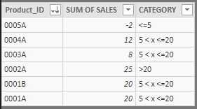
Well, for your case, i've created an aggregated table with SUMMARIZE DAX FUNCTION,
if you have the "table_data" with "product_ID" and "Sales" columns, the sintax for aggregated table is:
IF('table_data_AGGREGATED'[SUM OF SALES]<=20 , "5 < x <=20" , ">20"))


- Mark as New
- Bookmark
- Subscribe
- Mute
- Subscribe to RSS Feed
- Permalink
- Report Inappropriate Content
Thank you! Working with this now. Two follow-up questions:
1. Can I create the aggregated table as a Measure or is there another approach I need to do so?
2. Will using the calculated column method allow for the result to change as I filter the data? For instance, if my data set is for the past year, but I decide I only want to look at the past 30 days and use a slicer to limit the records, will the calculated column "re-calculate" or will it include data from the full year because that's what was used when the column was created?
Helpful resources

FabCon Global Hackathon
Join the Fabric FabCon Global Hackathon—running virtually through Nov 3. Open to all skill levels. $10,000 in prizes!

Power BI Monthly Update - September 2025
Check out the September 2025 Power BI update to learn about new features.

