- Power BI forums
- Get Help with Power BI
- Desktop
- Service
- Report Server
- Power Query
- Mobile Apps
- Developer
- DAX Commands and Tips
- Custom Visuals Development Discussion
- Health and Life Sciences
- Power BI Spanish forums
- Translated Spanish Desktop
- Training and Consulting
- Instructor Led Training
- Dashboard in a Day for Women, by Women
- Galleries
- Community Connections & How-To Videos
- COVID-19 Data Stories Gallery
- Themes Gallery
- Data Stories Gallery
- R Script Showcase
- Webinars and Video Gallery
- Quick Measures Gallery
- 2021 MSBizAppsSummit Gallery
- 2020 MSBizAppsSummit Gallery
- 2019 MSBizAppsSummit Gallery
- Events
- Ideas
- Custom Visuals Ideas
- Issues
- Issues
- Events
- Upcoming Events
- Community Blog
- Power BI Community Blog
- Power BI 中文博客
- Community Support
- Community Accounts & Registration
- Using the Community
- Community Feedback
Get certified in Microsoft Fabric—for free! For a limited time, the Microsoft Fabric Community team will be offering free DP-600 exam vouchers. Prepare now
- Power BI forums
- Forums
- Get Help with Power BI
- Desktop
- Bookmark navigatior display bug?
- Subscribe to RSS Feed
- Mark Topic as New
- Mark Topic as Read
- Float this Topic for Current User
- Bookmark
- Subscribe
- Printer Friendly Page
- Mark as New
- Bookmark
- Subscribe
- Mute
- Subscribe to RSS Feed
- Permalink
- Report Inappropriate Content
Bookmark navigatior display bug?
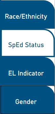
So I really like the new page and bookmark navigation features as they'll clean up report navigation tremendously for my organization. However, I found a small bug on the bookmark navigatior buttons where a button remains in the selected state after another button is selected. The selected state clears once the user hovers over the original button again, but I'm seeing this as a potential point of confusion for most of my userbase. This behavior is present both on the desktop and published server version.
I know I can have the selected and unselected versions look identical, but I feel that defeats the purpose of the feature. Any insight on how to correct this would be greatly appreciated.
- Mark as New
- Bookmark
- Subscribe
- Mute
- Subscribe to RSS Feed
- Permalink
- Report Inappropriate Content
Hi @JR-DCPS ,
Not very clear about the situation you described. Can you please show some screenshots?
Best Regards,
Jay
If this post helps, then please consider Accept it as the solution to help the other members find it.
- Mark as New
- Bookmark
- Subscribe
- Mute
- Subscribe to RSS Feed
- Permalink
- Report Inappropriate Content
It's a bit tricky to show this without creating an animated gif, but the end result of clicking is something along the lines of this:
- Mark as New
- Bookmark
- Subscribe
- Mute
- Subscribe to RSS Feed
- Permalink
- Report Inappropriate Content
Im facing the same issue. If you select a bookmark, the default format is to go black, if you select another bookmark on the navigator, that goes black too, but the original button does not revert back to white. I also see this in both desktop and in the service
Helpful resources

Power BI Monthly Update - October 2024
Check out the October 2024 Power BI update to learn about new features.

Microsoft Fabric & AI Learning Hackathon
Learn from experts, get hands-on experience, and win awesome prizes.

| User | Count |
|---|---|
| 113 | |
| 96 | |
| 91 | |
| 82 | |
| 69 |
| User | Count |
|---|---|
| 159 | |
| 125 | |
| 116 | |
| 111 | |
| 95 |

