- Subscribe to RSS Feed
- Mark Topic as New
- Mark Topic as Read
- Float this Topic for Current User
- Bookmark
- Subscribe
- Printer Friendly Page
- Mark as New
- Bookmark
- Subscribe
- Mute
- Subscribe to RSS Feed
- Permalink
- Report Inappropriate Content

Best method to visually show "Case file resolution" time
Hello,
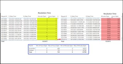
I have built a report for a call center to track case files time to resolution (created date/time - Resolved date/time). I am having some trouble visually displaying this because there is such a wide range of time to resolution. Specfically there are signific cases in which the case file is resolved in less than 1 hour and there are some that are resolved in hundreads of hours. This creates an issue for displaying "average' time to resolution.
Any ideas on how to better display a visual in this situation? Is there a way to exclude the top 20% and bottom 20% in the calculation to trim off the cases that remain open extremely long times or that are closed in less than X minutes?
Solved! Go to Solution.
- Mark as New
- Bookmark
- Subscribe
- Mute
- Subscribe to RSS Feed
- Permalink
- Report Inappropriate Content

There are a number of ways you can down this "statistics" rabbit hole.
Median may be a better measure than average when you have a wide variance.
A custom "Box and Whisker" visual is one that I have used as well when I encounter a situation such as yours.
Yes, I'm sure there is a way to exclude "outliers", but someone with more expertise will have to help you with that.
Hope this helps.
Regards,
- Mark as New
- Bookmark
- Subscribe
- Mute
- Subscribe to RSS Feed
- Permalink
- Report Inappropriate Content

There are a number of ways you can down this "statistics" rabbit hole.
Median may be a better measure than average when you have a wide variance.
A custom "Box and Whisker" visual is one that I have used as well when I encounter a situation such as yours.
Yes, I'm sure there is a way to exclude "outliers", but someone with more expertise will have to help you with that.
Hope this helps.
Regards,
- Mark as New
- Bookmark
- Subscribe
- Mute
- Subscribe to RSS Feed
- Permalink
- Report Inappropriate Content

Thanks for the suggestion on the Box and Whiskers visual.... I am going to use that for now.
It would be nice to be able to overlay a KPI/Target into the Box and Whiskers visual..
- Mark as New
- Bookmark
- Subscribe
- Mute
- Subscribe to RSS Feed
- Permalink
- Report Inappropriate Content

You can try to add your KPI to the Tooltips, or create your own custom Tooltip page.
Lots of videos on the subject....have at it.
Regards,
P.S. Please give Kudos if you like a response provided to you. Thx.
Helpful resources
| Subject | Author | Posted | |
|---|---|---|---|
| 08-01-2024 11:48 AM | |||
| 06-18-2024 07:59 PM | |||
| 08-13-2024 07:27 AM | |||
|
Anonymous
| 09-04-2024 06:13 AM | ||
| 12-28-2023 08:50 AM |
| User | Count |
|---|---|
| 108 | |
| 89 | |
| 80 | |
| 54 | |
| 46 |


