Become a Certified Power BI Data Analyst!
Join us for an expert-led overview of the tools and concepts you'll need to pass exam PL-300. The first session starts on June 11th. See you there!
Get registered- Power BI forums
- Get Help with Power BI
- Desktop
- Service
- Report Server
- Power Query
- Mobile Apps
- Developer
- DAX Commands and Tips
- Custom Visuals Development Discussion
- Health and Life Sciences
- Power BI Spanish forums
- Translated Spanish Desktop
- Training and Consulting
- Instructor Led Training
- Dashboard in a Day for Women, by Women
- Galleries
- Webinars and Video Gallery
- Data Stories Gallery
- Themes Gallery
- Contests Gallery
- Quick Measures Gallery
- Notebook Gallery
- Translytical Task Flow Gallery
- R Script Showcase
- Ideas
- Custom Visuals Ideas (read-only)
- Issues
- Issues
- Events
- Upcoming Events
Power BI is turning 10! Let’s celebrate together with dataviz contests, interactive sessions, and giveaways. Register now.
- Power BI forums
- Forums
- Get Help with Power BI
- Desktop
- Barchart - each bar is a subset of the previous on...
- Subscribe to RSS Feed
- Mark Topic as New
- Mark Topic as Read
- Float this Topic for Current User
- Bookmark
- Subscribe
- Printer Friendly Page
- Mark as New
- Bookmark
- Subscribe
- Mute
- Subscribe to RSS Feed
- Permalink
- Report Inappropriate Content
Barchart - each bar is a subset of the previous one
Hello,
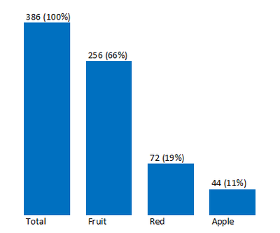
I'm trying to create a bar chart where each bar on the chart gets filtered down, so that each bar is a sub-set of the previous one.
As an example, if I have a table as follows:
| Type | Color | Name | Quantity |
| Fruit | Red | Apple | 44 |
| Fruit | Yellow | Banana | 42 |
| Fruit | Green | Grape | 21 |
| Fruit | Orance | Orange | 10 |
| Fruit | Yellow | Mango | 27 |
| Fruit | Green | Kiwi | 37 |
| Fruit | Yellow | Pineapple | 47 |
| Fruit | Red | Strawberry | 28 |
| Vegetable | Orange | Carrot | 21 |
| Vegetable | Green | Cucumber | 42 |
| Vegetable | Yellow | Potato | 31 |
| Vegetable | Red | Onion | 23 |
| Vegetable | Green | Spinach | 13 |
I am trying to generate a graph like this:
How could I generate something like this? I'd really appreciate any help.
Solved! Go to Solution.
- Mark as New
- Bookmark
- Subscribe
- Mute
- Subscribe to RSS Feed
- Permalink
- Report Inappropriate Content
Hi @vicky_ ,
Unfortunately it needs to be a bar chart. I figured it out though. I created a calculated table where each row was summarize based on the color, type, name and then use those.
- Mark as New
- Bookmark
- Subscribe
- Mute
- Subscribe to RSS Feed
- Permalink
- Report Inappropriate Content
Does it have to be a column chart? Maybe a visual like the decomposition tree would better suit your needs.
- Mark as New
- Bookmark
- Subscribe
- Mute
- Subscribe to RSS Feed
- Permalink
- Report Inappropriate Content
Hi @vicky_ ,
Unfortunately it needs to be a bar chart. I figured it out though. I created a calculated table where each row was summarize based on the color, type, name and then use those.
Helpful resources
| User | Count |
|---|---|
| 84 | |
| 73 | |
| 67 | |
| 42 | |
| 35 |
| User | Count |
|---|---|
| 109 | |
| 56 | |
| 52 | |
| 45 | |
| 43 |


