Join us at the 2025 Microsoft Fabric Community Conference
Microsoft Fabric Community Conference 2025, March 31 - April 2, Las Vegas, Nevada. Use code MSCUST for a $150 discount.
Register now- Power BI forums
- Get Help with Power BI
- Desktop
- Service
- Report Server
- Power Query
- Mobile Apps
- Developer
- DAX Commands and Tips
- Custom Visuals Development Discussion
- Health and Life Sciences
- Power BI Spanish forums
- Translated Spanish Desktop
- Training and Consulting
- Instructor Led Training
- Dashboard in a Day for Women, by Women
- Galleries
- Webinars and Video Gallery
- Data Stories Gallery
- Themes Gallery
- Contests Gallery
- Quick Measures Gallery
- R Script Showcase
- COVID-19 Data Stories Gallery
- Community Connections & How-To Videos
- 2021 MSBizAppsSummit Gallery
- 2020 MSBizAppsSummit Gallery
- 2019 MSBizAppsSummit Gallery
- Events
- Ideas
- Custom Visuals Ideas
- Issues
- Issues
- Events
- Upcoming Events
The Power BI DataViz World Championships are on! With four chances to enter, you could win a spot in the LIVE Grand Finale in Las Vegas. Show off your skills.
- Power BI forums
- Forums
- Get Help with Power BI
- Desktop
- Re: Bar chart percentage of total
- Subscribe to RSS Feed
- Mark Topic as New
- Mark Topic as Read
- Float this Topic for Current User
- Bookmark
- Subscribe
- Printer Friendly Page
- Mark as New
- Bookmark
- Subscribe
- Mute
- Subscribe to RSS Feed
- Permalink
- Report Inappropriate Content
Bar chart percentage of total
Hi,
I know there must be a quick fix but I'm new to this (feel free to laugh!)
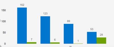
Blue bar = Count of Total Cases Opened
Green bar = Count of Total Cases Opened where the Due Date is not Blank (I created this column using a measure)
Problem is I want to show the green bar as a percentage of the blue bar.
Thanks for your help!
Solved! Go to Solution.
- Mark as New
- Bookmark
- Subscribe
- Mute
- Subscribe to RSS Feed
- Permalink
- Report Inappropriate Content
Hi @Carrhill ,
You can define a measure, calculating the percentage and then format the measure as a percentage.
Then from the formatting pane of the visual, you can turn on the data labels and in the values section change the display units to none.
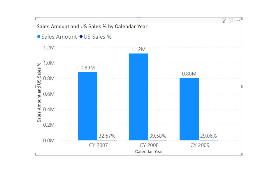
Ideally, I would not recommend having percentages and actual values in the same visual as they will not show the acutal bar, since percentages are mere decimals compared to the whole value and I do not think that you can have Numbers and Percentages both as data labels.
Here is an example:
Even though the sales are nearly 30 %, they only show a small line compared to the whole bar.
Hope this helps and if it does please kudo it and mark it as the solution as it helps others reach the solution faster.
Thank you,
Vishesh Jain
If yes, then please mark my post as a solution!
Thank you,
Vishesh Jain
Proud to be a Super User!
- Mark as New
- Bookmark
- Subscribe
- Mute
- Subscribe to RSS Feed
- Permalink
- Report Inappropriate Content
Hi @Carrhill ,
You just need to create a % to total calculated measure and pull it to the bar chart.
PFA .pbix with solution.
You just need to replace the calculated measure here with appropriate column/measure name from your report.
Give a Thumbs Up if this post helped you in any way and Mark This Post as Solution if it solved your query !!! Proud To Be a Super User !!! |
- Mark as New
- Bookmark
- Subscribe
- Mute
- Subscribe to RSS Feed
- Permalink
- Report Inappropriate Content
Hi @Carrhill ,
You can define a measure, calculating the percentage and then format the measure as a percentage.
Then from the formatting pane of the visual, you can turn on the data labels and in the values section change the display units to none.
Ideally, I would not recommend having percentages and actual values in the same visual as they will not show the acutal bar, since percentages are mere decimals compared to the whole value and I do not think that you can have Numbers and Percentages both as data labels.
Here is an example:
Even though the sales are nearly 30 %, they only show a small line compared to the whole bar.
Hope this helps and if it does please kudo it and mark it as the solution as it helps others reach the solution faster.
Thank you,
Vishesh Jain
If yes, then please mark my post as a solution!
Thank you,
Vishesh Jain
Proud to be a Super User!
Helpful resources

Join us at the Microsoft Fabric Community Conference
March 31 - April 2, 2025, in Las Vegas, Nevada. Use code MSCUST for a $150 discount!

Join our Community Sticker Challenge 2025
If you love stickers, then you will definitely want to check out our Community Sticker Challenge!

| User | Count |
|---|---|
| 126 | |
| 78 | |
| 78 | |
| 59 | |
| 51 |
| User | Count |
|---|---|
| 165 | |
| 83 | |
| 68 | |
| 68 | |
| 59 |


