Join us at the 2025 Microsoft Fabric Community Conference
March 31 - April 2, 2025, in Las Vegas, Nevada. Use code MSCUST for a $150 discount! Early bird discount ends December 31.
Register Now- Power BI forums
- Get Help with Power BI
- Desktop
- Service
- Report Server
- Power Query
- Mobile Apps
- Developer
- DAX Commands and Tips
- Custom Visuals Development Discussion
- Health and Life Sciences
- Power BI Spanish forums
- Translated Spanish Desktop
- Training and Consulting
- Instructor Led Training
- Dashboard in a Day for Women, by Women
- Galleries
- Community Connections & How-To Videos
- COVID-19 Data Stories Gallery
- Themes Gallery
- Data Stories Gallery
- R Script Showcase
- Webinars and Video Gallery
- Quick Measures Gallery
- 2021 MSBizAppsSummit Gallery
- 2020 MSBizAppsSummit Gallery
- 2019 MSBizAppsSummit Gallery
- Events
- Ideas
- Custom Visuals Ideas
- Issues
- Issues
- Events
- Upcoming Events
Be one of the first to start using Fabric Databases. View on-demand sessions with database experts and the Microsoft product team to learn just how easy it is to get started. Watch now
- Power BI forums
- Forums
- Get Help with Power BI
- Desktop
- Re: Bar/Cluster Chart with horizontal target area ...
- Subscribe to RSS Feed
- Mark Topic as New
- Mark Topic as Read
- Float this Topic for Current User
- Bookmark
- Subscribe
- Printer Friendly Page
- Mark as New
- Bookmark
- Subscribe
- Mute
- Subscribe to RSS Feed
- Permalink
- Report Inappropriate Content
Bar/Cluster Chart with horizontal target area bar
Hi Community
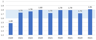
I have a requirement to build a bar/cluster chart that displays quarterly data and a target range
Example visual (built in Excel using Combo Chart of Cluster and Stacked chart)
Data set is
Qtr Val Target Low Target Range
1Q20 1.48 1.6 0.2
1Q21 1.73 1.6 0.2
1Q22 1.76 1.6 0.2
2Q20 1.8 1.6 0.2
2Q21 1.73 1.6 0.2
3Q20 1.79 1.6 0.2
3Q21 1.79 1.6 0.2
4Q20 1.72 1.6 0.2
4Q21 1.81 1.6 0.2
Anybody any pointers on how to achieve this in PBI?
Cheers
Telstar
Solved! Go to Solution.
- Mark as New
- Bookmark
- Subscribe
- Mute
- Subscribe to RSS Feed
- Permalink
- Report Inappropriate Content
@amitchandak - thanks for your suggestions/assitance on this.
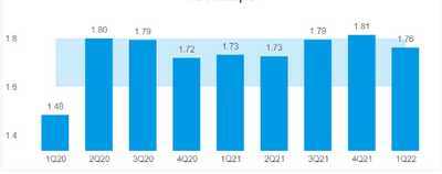
After 'playing' about with the line and cluster column graph visual I got to an acceptable solution
Thanks again
Cheers
Telstar
- Mark as New
- Bookmark
- Subscribe
- Mute
- Subscribe to RSS Feed
- Permalink
- Report Inappropriate Content
@Telstar , You have error bar features, that can help
refer
https://www.youtube.com/watch?v=HXgnGkflkjQ
At the Microsoft Analytics Community Conference, global leaders and influential voices are stepping up to share their knowledge and help you master the latest in Microsoft Fabric, Copilot, and Purview. ✨
️ November 12th-14th, 2024
Online Event
Register Here
- Mark as New
- Bookmark
- Subscribe
- Mute
- Subscribe to RSS Feed
- Permalink
- Report Inappropriate Content
@amitchandak - thanks for your suggestions/assitance on this.
After 'playing' about with the line and cluster column graph visual I got to an acceptable solution
Thanks again
Cheers
Telstar
- Mark as New
- Bookmark
- Subscribe
- Mute
- Subscribe to RSS Feed
- Permalink
- Report Inappropriate Content
Hi amitchandak
Thanks for the quick response
Unfortunately the error bar > error band analytic option is not available on a Clustered Bar visual :(, only on Line graphs as in the video you shared
Cheers
Terry
- Mark as New
- Bookmark
- Subscribe
- Mute
- Subscribe to RSS Feed
- Permalink
- Report Inappropriate Content
@Telstar , I can see that in Bar visual under the analytics pane.
OR do it on line and change to Bar
At the Microsoft Analytics Community Conference, global leaders and influential voices are stepping up to share their knowledge and help you master the latest in Microsoft Fabric, Copilot, and Purview. ✨
️ November 12th-14th, 2024
Online Event
Register Here
- Mark as New
- Bookmark
- Subscribe
- Mute
- Subscribe to RSS Feed
- Permalink
- Report Inappropriate Content
@amitchandak
Hi - unfrotuntely when I select Cluster Column Chart I do not get the Error Band option like i do when I select Line - this is what i see for Cluster Chart (I am using July 22 release)
Changing from Line to Cluster does not work, disappointingly 😞
Cheers
Telstar
Helpful resources

Join us at the Microsoft Fabric Community Conference
March 31 - April 2, 2025, in Las Vegas, Nevada. Use code MSCUST for a $150 discount!

We want your feedback!
Your insights matter. That’s why we created a quick survey to learn about your experience finding answers to technical questions.

Microsoft Fabric Community Conference 2025
Arun Ulag shares exciting details about the Microsoft Fabric Conference 2025, which will be held in Las Vegas, NV.

| User | Count |
|---|---|
| 119 | |
| 88 | |
| 73 | |
| 67 | |
| 49 |
| User | Count |
|---|---|
| 199 | |
| 141 | |
| 97 | |
| 79 | |
| 68 |


