- Power BI forums
- Updates
- News & Announcements
- Get Help with Power BI
- Desktop
- Service
- Report Server
- Power Query
- Mobile Apps
- Developer
- DAX Commands and Tips
- Custom Visuals Development Discussion
- Health and Life Sciences
- Power BI Spanish forums
- Translated Spanish Desktop
- Power Platform Integration - Better Together!
- Power Platform Integrations (Read-only)
- Power Platform and Dynamics 365 Integrations (Read-only)
- Training and Consulting
- Instructor Led Training
- Dashboard in a Day for Women, by Women
- Galleries
- Community Connections & How-To Videos
- COVID-19 Data Stories Gallery
- Themes Gallery
- Data Stories Gallery
- R Script Showcase
- Webinars and Video Gallery
- Quick Measures Gallery
- 2021 MSBizAppsSummit Gallery
- 2020 MSBizAppsSummit Gallery
- 2019 MSBizAppsSummit Gallery
- Events
- Ideas
- Custom Visuals Ideas
- Issues
- Issues
- Events
- Upcoming Events
- Community Blog
- Power BI Community Blog
- Custom Visuals Community Blog
- Community Support
- Community Accounts & Registration
- Using the Community
- Community Feedback
Register now to learn Fabric in free live sessions led by the best Microsoft experts. From Apr 16 to May 9, in English and Spanish.
- Power BI forums
- Forums
- Get Help with Power BI
- Desktop
- Average Line using Line and Stacked Column Chart &...
- Subscribe to RSS Feed
- Mark Topic as New
- Mark Topic as Read
- Float this Topic for Current User
- Bookmark
- Subscribe
- Printer Friendly Page
- Mark as New
- Bookmark
- Subscribe
- Mute
- Subscribe to RSS Feed
- Permalink
- Report Inappropriate Content
Average Line using Line and Stacked Column Chart & Trellis chart option in Power BI
Hi,
I am working on Sportfire to Power BI migration project where I could see bit challenges interms of average lines/trellis chart option in Power BI, which Sportfire/Tableau could do those.
Is it possible to use Average line from analytics tab for Line & Stacked columns chart?
I could see analytics is enabled only for clustered column & clustered bar chart so far. (for bar chart related).
I have a requrement to show average line for Line & Stacked column chart. Is there a chance that this feature is going
to be enabled in next releases?
please respond to me with appropriate workaround or Update for next release.
Regards
Harsha Vardhan
- Mark as New
- Bookmark
- Subscribe
- Mute
- Subscribe to RSS Feed
- Permalink
- Report Inappropriate Content
Hi @Anonymous
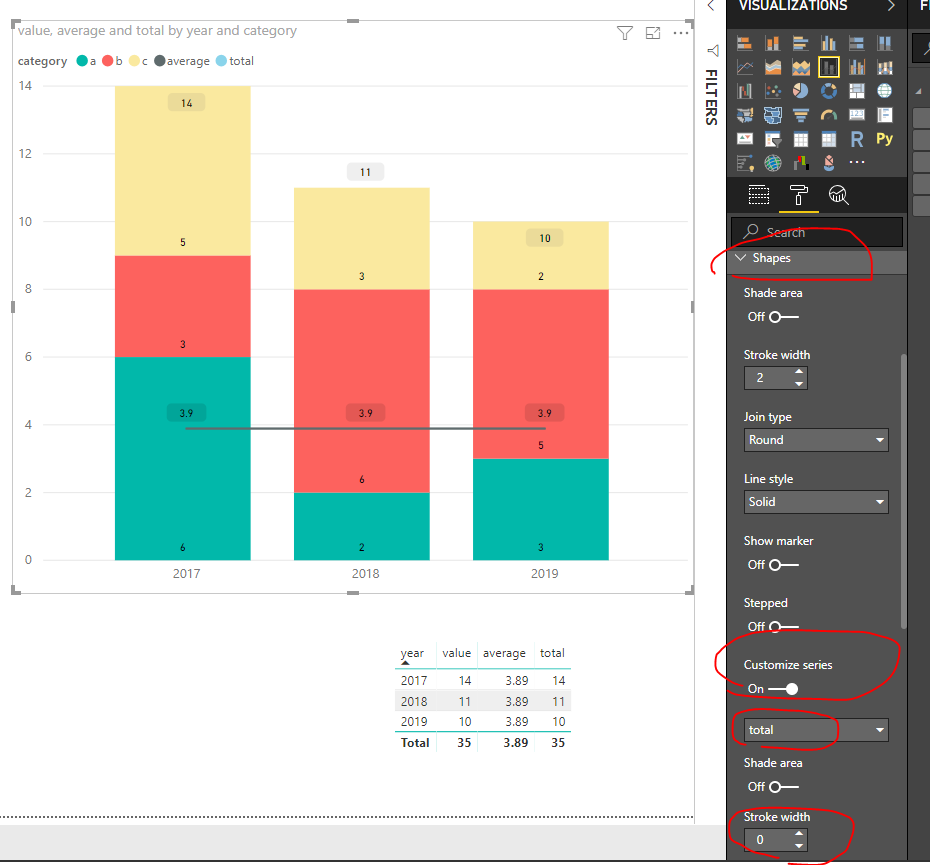
Please look at my workaround.
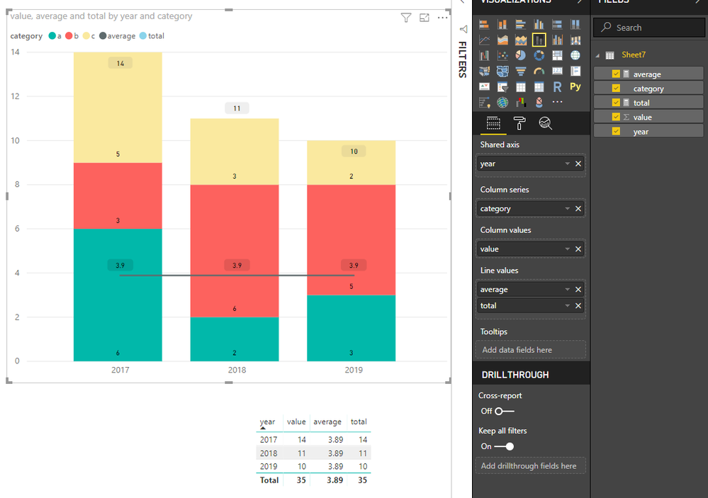
Add two measures in the line field,
change the stroke width for "total" measure to 0 under Shapes.
Best Regards
Maggie
Community Support Team _ Maggie Li
If this post helps, then please consider Accept it as the solution to help the other members find it more quickly.
- Mark as New
- Bookmark
- Subscribe
- Mute
- Subscribe to RSS Feed
- Permalink
- Report Inappropriate Content
Hi,
I tried that before but the value in the average is repeating at every data point as 3.9. I want it to be one time as Average: 3.9. I have used 2 cards and mentioned average and value but that's static when the real average changes card position won't change.
Regards
Harsha
- Mark as New
- Bookmark
- Subscribe
- Mute
- Subscribe to RSS Feed
- Permalink
- Report Inappropriate Content
Hey,
I'm not aware if this will be coming with one of the next updates of Power BI Desktop.
A workaround could be to create a measure that calculates the avarage of the stacked segments, then this measure can be used for the line chart.
Regards,
Tom
Did I answer your question? Mark my post as a solution, this will help others!
Proud to be a Super User!
I accept Kudos 😉
Hamburg, Germany
- Mark as New
- Bookmark
- Subscribe
- Mute
- Subscribe to RSS Feed
- Permalink
- Report Inappropriate Content
Hi,
I have created average for the stacked segment and used in Line values which shows avg value in every data point repitetively and in secondary axis I had turned show values off. The average line is pops up but with not proper label.
At the same time I should show totals on Stacked bar, for this again i should use same measure in line values and made stroke width under Shapes as 0. This is causing hiding avg line but labels are repeating.
@Trellis chart: Any chart in Power BI satisfies Trellis chart requirements?
- Mark as New
- Bookmark
- Subscribe
- Mute
- Subscribe to RSS Feed
- Permalink
- Report Inappropriate Content
Hey,
the custom visual "Infographic Designer" support some kind of trellis charts.
Regards,
Tom
Did I answer your question? Mark my post as a solution, this will help others!
Proud to be a Super User!
I accept Kudos 😉
Hamburg, Germany
- Mark as New
- Bookmark
- Subscribe
- Mute
- Subscribe to RSS Feed
- Permalink
- Report Inappropriate Content
Hey,
Thanks for the sugession.
I tried using Infographic designer chart,I don't see Stacked bar option using Infographics chart and labels on bars.
Is there any workaround to show Stacked bar using infographics and show labels as well?
Helpful resources

Microsoft Fabric Learn Together
Covering the world! 9:00-10:30 AM Sydney, 4:00-5:30 PM CET (Paris/Berlin), 7:00-8:30 PM Mexico City

Power BI Monthly Update - April 2024
Check out the April 2024 Power BI update to learn about new features.

| User | Count |
|---|---|
| 98 | |
| 97 | |
| 81 | |
| 77 | |
| 66 |
| User | Count |
|---|---|
| 126 | |
| 105 | |
| 103 | |
| 81 | |
| 72 |


