FabCon is coming to Atlanta
Join us at FabCon Atlanta from March 16 - 20, 2026, for the ultimate Fabric, Power BI, AI and SQL community-led event. Save $200 with code FABCOMM.
Register now!- Power BI forums
- Get Help with Power BI
- Desktop
- Service
- Report Server
- Power Query
- Mobile Apps
- Developer
- DAX Commands and Tips
- Custom Visuals Development Discussion
- Health and Life Sciences
- Power BI Spanish forums
- Translated Spanish Desktop
- Training and Consulting
- Instructor Led Training
- Dashboard in a Day for Women, by Women
- Galleries
- Data Stories Gallery
- Themes Gallery
- Contests Gallery
- QuickViz Gallery
- Quick Measures Gallery
- Visual Calculations Gallery
- Notebook Gallery
- Translytical Task Flow Gallery
- TMDL Gallery
- R Script Showcase
- Webinars and Video Gallery
- Ideas
- Custom Visuals Ideas (read-only)
- Issues
- Issues
- Events
- Upcoming Events
The Power BI Data Visualization World Championships is back! Get ahead of the game and start preparing now! Learn more
- Power BI forums
- Forums
- Get Help with Power BI
- Desktop
- Arc GIS maps for Power Bi - map point colour by ca...
- Subscribe to RSS Feed
- Mark Topic as New
- Mark Topic as Read
- Float this Topic for Current User
- Bookmark
- Subscribe
- Printer Friendly Page
- Mark as New
- Bookmark
- Subscribe
- Mute
- Subscribe to RSS Feed
- Permalink
- Report Inappropriate Content
Arc GIS maps for Power Bi - map point colour by category
I've got Red, Green and Amber categories for map points that i'm trying to have coloured in the same way on the map. I can't seem to get this to work though. When i set the map to Size and Colour and drag the field into 'Colour', it treats this as a numeric field, and suggests a colour ramp for it (i'm presuming it's doing a count of 'Green' etc). I just want to set the text value 'Green' to a green colour.
Any help? Driving me crazy...
Solved! Go to Solution.
- Mark as New
- Bookmark
- Subscribe
- Mute
- Subscribe to RSS Feed
- Permalink
- Report Inappropriate Content
Hi, @GlassShark1
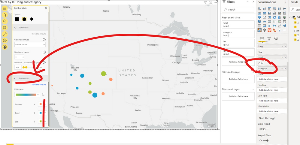
The field dragged into 'Colour' shoud be "Category".
And then you can set color you want for each category in "Symbol color" .
Please check my pbix file for more details.
If I misunderstand, please let me know.
Best Regards,
Community Support Team _ Eason
If this post helps, then please consider Accept it as the solution to help the other members find it more quickly.
- Mark as New
- Bookmark
- Subscribe
- Mute
- Subscribe to RSS Feed
- Permalink
- Report Inappropriate Content
Thanks - i'll mark this as the solution as it's confirmed i'm doing it the right way. It hasn't solved my problem though, as when i put on a slicer for a category it still shows point for all 3 colours. I'm working with dummy data though (with duplicates), so i'm guessing the problem is with the data - likely showing a record as being both one category and another, so it is just showing each in turn when i apply a filter. Thanks again - at least i can see i've approached it the right way 🙂
Helpful resources

Power BI Dataviz World Championships
The Power BI Data Visualization World Championships is back! Get ahead of the game and start preparing now!

| User | Count |
|---|---|
| 39 | |
| 38 | |
| 38 | |
| 28 | |
| 27 |
| User | Count |
|---|---|
| 124 | |
| 88 | |
| 73 | |
| 66 | |
| 65 |


