Fabric Data Days starts November 4th!
Advance your Data & AI career with 50 days of live learning, dataviz contests, hands-on challenges, study groups & certifications and more!
Get registered- Power BI forums
- Get Help with Power BI
- Desktop
- Service
- Report Server
- Power Query
- Mobile Apps
- Developer
- DAX Commands and Tips
- Custom Visuals Development Discussion
- Health and Life Sciences
- Power BI Spanish forums
- Translated Spanish Desktop
- Training and Consulting
- Instructor Led Training
- Dashboard in a Day for Women, by Women
- Galleries
- Data Stories Gallery
- Themes Gallery
- Contests Gallery
- QuickViz Gallery
- Quick Measures Gallery
- Visual Calculations Gallery
- Notebook Gallery
- Translytical Task Flow Gallery
- TMDL Gallery
- R Script Showcase
- Webinars and Video Gallery
- Ideas
- Custom Visuals Ideas (read-only)
- Issues
- Issues
- Events
- Upcoming Events
Get Fabric Certified for FREE during Fabric Data Days. Don't miss your chance! Request now
- Power BI forums
- Forums
- Get Help with Power BI
- Desktop
- Applying a tooltip for different quarters
- Subscribe to RSS Feed
- Mark Topic as New
- Mark Topic as Read
- Float this Topic for Current User
- Bookmark
- Subscribe
- Printer Friendly Page
- Mark as New
- Bookmark
- Subscribe
- Mute
- Subscribe to RSS Feed
- Permalink
- Report Inappropriate Content
Applying a tooltip for different quarters
Hi everyone,
I'm trying to add a tooltip (either as the default hover text globe, or as an additional report page).
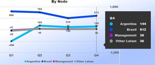
I have a line chart with 4 Quarter (Q1, Q2...) and 4 lines (one for each budget)
I want to hover over and also get a comment for each Q, but for some reason all I get is always the first comment (Q1).
Maybe it has to do with how I have my data for the comments (a table with 3 columns: Budget, Quarter, Comment). But I'm not sure what I'm doing wrong.
Thanks for any advice.
- Mark as New
- Bookmark
- Subscribe
- Mute
- Subscribe to RSS Feed
- Permalink
- Report Inappropriate Content
@daledale how you want to see the comments to be?
Subscribe to the @PowerBIHowTo YT channel for an upcoming video on List and Record functions in Power Query!!
Learn Power BI and Fabric - subscribe to our YT channel - Click here: @PowerBIHowTo
If my solution proved useful, I'd be delighted to receive Kudos. When you put effort into asking a question, it's equally thoughtful to acknowledge and give Kudos to the individual who helped you solve the problem. It's a small gesture that shows appreciation and encouragement! ❤
Did I answer your question? Mark my post as a solution. Proud to be a Super User! Appreciate your Kudos 🙂
Feel free to email me with any of your BI needs.
- Mark as New
- Bookmark
- Subscribe
- Mute
- Subscribe to RSS Feed
- Permalink
- Report Inappropriate Content
Something like this:
By using this slot to apply the comments:
The issue that I'm having is that is showing the same comment for each quarter, always the one for Q1.
It respects the budget if I change it with a slicer/filter, but the comment is always the one for Q1.
My comment table has Budget/Quarter/comment.
I belive that the issue is that when I go to Model, I need to stablish a relationship between the Quarter in my Comments Table and the table with the data for the graph.. But I'm not sure...
- Mark as New
- Bookmark
- Subscribe
- Mute
- Subscribe to RSS Feed
- Permalink
- Report Inappropriate Content
HI @daledale ,
If you drag column on tooltip field, it will force enabled summary mode, first/last/count on it to handle aggregate records. I'd like to suggest you write a message with CONCATENATEX function and use on tooltip fields to display all related items:
Measure = CONCATENATEX(VALUES('Table'[CType]),[CType],",")Regards,
Xiaoxin Sheng
- Mark as New
- Bookmark
- Subscribe
- Mute
- Subscribe to RSS Feed
- Permalink
- Report Inappropriate Content
Thanks,
The text is dispalyed correctly, but the problem is that displays the same for each quarter.
- Mark as New
- Bookmark
- Subscribe
- Mute
- Subscribe to RSS Feed
- Permalink
- Report Inappropriate Content
HI @daledale,
Can you please share some dummy data with the expected results for test and coding formula?
How to Get Your Question Answered Quickly
Regards,
Xiaoxin Sheng
Helpful resources

Power BI Monthly Update - November 2025
Check out the November 2025 Power BI update to learn about new features.

Fabric Data Days
Advance your Data & AI career with 50 days of live learning, contests, hands-on challenges, study groups & certifications and more!

| User | Count |
|---|---|
| 98 | |
| 72 | |
| 50 | |
| 48 | |
| 42 |


