- Subscribe to RSS Feed
- Mark Topic as New
- Mark Topic as Read
- Float this Topic for Current User
- Bookmark
- Subscribe
- Printer Friendly Page
- Mark as New
- Bookmark
- Subscribe
- Mute
- Subscribe to RSS Feed
- Permalink
- Report Inappropriate Content

Animated line chart
Hi everyone,
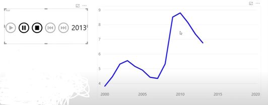
I have an animated dashboard, showing the development of the world population, fertility rate and life expectancy per year from 1960 till 2019. A have a visual which shows those values in a scatter chart for one year. I also want to have a line chart of the world population which shows the development over time. It should be like the blue line chart shows below, but in fact, I have one blue dot. I thought I could solve this with an IF-statement and a Max(date[date)-statement, but this didn't work.
What measure do I need that will solve this?
PS: I think a new table with distinct values of year and create a measure for this, doesn't work. Because I know that I need that column from that new table in the visual play axis, but my other visuals won't work anymore in that case.
- Mark as New
- Bookmark
- Subscribe
- Mute
- Subscribe to RSS Feed
- Permalink
- Report Inappropriate Content

hi,
this should be possible with the Edit Interactions possibility.
Select the Play visual - go to Format tab on the upper pane - Edit Interactions - edit which visual are affected by the Play visual.
- Mark as New
- Bookmark
- Subscribe
- Mute
- Subscribe to RSS Feed
- Permalink
- Report Inappropriate Content

You are mixing a couple of concepts - May want to rethink what you are trying to convey with the report visual.
I assume you are aware of the works of the late Hans Rosling?
- Mark as New
- Bookmark
- Subscribe
- Mute
- Subscribe to RSS Feed
- Permalink
- Report Inappropriate Content

Hi @lbendlin ,
thanks for your reply. Yeah, I am aware of his work. He was a brilliant mind and fantastic in simplying data for everyone.
So, you are saying it isn't possible to show an animated bubble chart per year (in the image data of 1988) and an animated line chart (from 1960 unitil 1988)?
- Mark as New
- Bookmark
- Subscribe
- Mute
- Subscribe to RSS Feed
- Permalink
- Report Inappropriate Content

Now you got me intrigued. Please post some sample data. This might be possible with some color trickery.
- Mark as New
- Bookmark
- Subscribe
- Mute
- Subscribe to RSS Feed
- Permalink
- Report Inappropriate Content

@lbendlin Hahah great 🙂
Here is the link for the file:
https://drive.google.com/file/d/1UOEzu-L_p3l1r6khatC9PEpbVsb-6zmi/view?usp=sharing
The first page shows all the visuals, the second page shows the line chart with the population how it actually should work with some explanation.
- Mark as New
- Bookmark
- Subscribe
- Mute
- Subscribe to RSS Feed
- Permalink
- Report Inappropriate Content
Helpful resources
| Subject | Author | Posted | |
|---|---|---|---|
| 02-13-2025 02:00 PM | |||
| 12-08-2024 02:43 PM | |||
| 12-24-2024 11:19 PM | |||
| 08-22-2024 12:04 PM | |||
| 05-31-2021 01:27 AM |
| User | Count |
|---|---|
| 120 | |
| 105 | |
| 84 | |
| 52 | |
| 46 |


