FabCon is coming to Atlanta
Join us at FabCon Atlanta from March 16 - 20, 2026, for the ultimate Fabric, Power BI, AI and SQL community-led event. Save $200 with code FABCOMM.
Register now!- Power BI forums
- Get Help with Power BI
- Desktop
- Service
- Report Server
- Power Query
- Mobile Apps
- Developer
- DAX Commands and Tips
- Custom Visuals Development Discussion
- Health and Life Sciences
- Power BI Spanish forums
- Translated Spanish Desktop
- Training and Consulting
- Instructor Led Training
- Dashboard in a Day for Women, by Women
- Galleries
- Data Stories Gallery
- Themes Gallery
- Contests Gallery
- Quick Measures Gallery
- Notebook Gallery
- Translytical Task Flow Gallery
- TMDL Gallery
- R Script Showcase
- Webinars and Video Gallery
- Ideas
- Custom Visuals Ideas (read-only)
- Issues
- Issues
- Events
- Upcoming Events
Join the Fabric FabCon Global Hackathon—running virtually through Nov 3. Open to all skill levels. $10,000 in prizes! Register now.
- Power BI forums
- Forums
- Get Help with Power BI
- Desktop
- Re: Aggregating based on 2 Groupings
- Subscribe to RSS Feed
- Mark Topic as New
- Mark Topic as Read
- Float this Topic for Current User
- Bookmark
- Subscribe
- Printer Friendly Page


- Mark as New
- Bookmark
- Subscribe
- Mute
- Subscribe to RSS Feed
- Permalink
- Report Inappropriate Content
Aggregating based on 2 Groupings
Hi All,
I have a scenario where I need to calculate the "% of Projects that meet our Customer Satisfaction Score" of greater than or equal to 5 and show the result in a Card Visual. This needs to be done on a monthly basis.
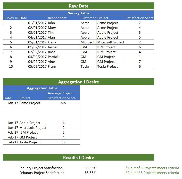
The lowest granular level of information is Date & Respondent.
As you can have multiple Respondents & Dates per each Project, I first need to calculate the Average Score Per Each Project Per Each Month.
For instance "Acme Project" average = (7+4)/2 = 5.5 =Meets Satisfaction Score in January.
I then need to formulate:
CountIF( (Average of Project)>=5))
Count of All Projects
Is there an easy way to do this.
I have tried SumX and Summarize functions but to no avail.
I also attempted to create a Projects and Date Table and do a lookup.
Would really appreciate any help, as the month end is approaching and will need for next Monday.
Thanks,
Brian
Solved! Go to Solution.


- Mark as New
- Bookmark
- Subscribe
- Mute
- Subscribe to RSS Feed
- Permalink
- Report Inappropriate Content
Hi @Brianoreilly,
You can create new calculated column below:
Date(M-Y) = FORMAT('Table1'[Date],"MMM") & "-" & YEAR('Table1'[Date])
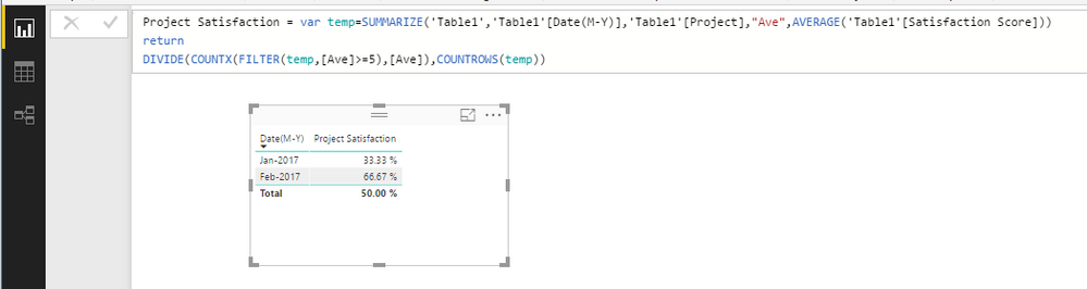
Then create a measure to return project satisfaction:
Project Satisfaction = var temp=SUMMARIZE('Table1','Table1'[Date(M-Y)],'Table1'[Project],"Ave",AVERAGE('Table1'[Satisfaction Score]))
return
DIVIDE(COUNTX(FILTER(temp,[Ave]>=5),[Ave]),COUNTROWS(temp))
Best Regards,
Qiuyun Yu
If this post helps, then please consider Accept it as the solution to help the other members find it more quickly.

- Mark as New
- Bookmark
- Subscribe
- Mute
- Subscribe to RSS Feed
- Permalink
- Report Inappropriate Content
Hi,
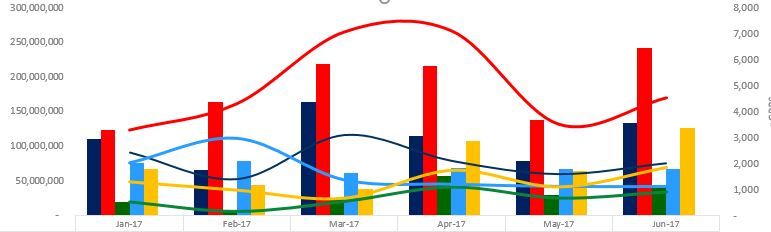
I have an instance where i have to use Multiple Lines in secondary axis.
I am expecting to draw a chart like below in power bi, but i could find option. In the line and clustered column chart, i am able to get only one line in secondary axis.
- Mark as New
- Bookmark
- Subscribe
- Mute
- Subscribe to RSS Feed
- Permalink
- Report Inappropriate Content
Hi @Brianoreilly,
You can create new calculated column below:
Date(M-Y) = FORMAT('Table1'[Date],"MMM") & "-" & YEAR('Table1'[Date])
Then create a measure to return project satisfaction:
Project Satisfaction = var temp=SUMMARIZE('Table1','Table1'[Date(M-Y)],'Table1'[Project],"Ave",AVERAGE('Table1'[Satisfaction Score]))
return
DIVIDE(COUNTX(FILTER(temp,[Ave]>=5),[Ave]),COUNTROWS(temp))
Best Regards,
Qiuyun Yu
If this post helps, then please consider Accept it as the solution to help the other members find it more quickly.
- Mark as New
- Bookmark
- Subscribe
- Mute
- Subscribe to RSS Feed
- Permalink
- Report Inappropriate Content
Hi Qiuyun Yu ,
Thank you so much for the solution.
There was no way in hell, I would of figured that out by myself.
Appreciate your diligent work.
Kind Regards,
Brian.


- Mark as New
- Bookmark
- Subscribe
- Mute
- Subscribe to RSS Feed
- Permalink
- Report Inappropriate Content
Hey,
please provide the data in an easy to reproduce format by preparing a pbix file upload the to onedrive or dropbox, and share the link here.
Regards
Tom
Did I answer your question? Mark my post as a solution, this will help others!
Proud to be a Super User!
I accept Kudos 😉
Hamburg, Germany
- Mark as New
- Bookmark
- Subscribe
- Mute
- Subscribe to RSS Feed
- Permalink
- Report Inappropriate Content
Hi Tom,
Thank you so much for the assistance.
I really appreciate it.
The solution provided by the moderator actually worked and meets my needs.
Thanks again,
Regards,
Brian.
- Mark as New
- Bookmark
- Subscribe
- Mute
- Subscribe to RSS Feed
- Permalink
- Report Inappropriate Content
Hi All,
I have a scenario where I need to calculate the "% of Projects that meet our Customer Satisfaction Score" >= to 5 and show the result in a Card Visual. This needs to be done on a monthly basis.
The lowest granular level of information is Date & Respondent.
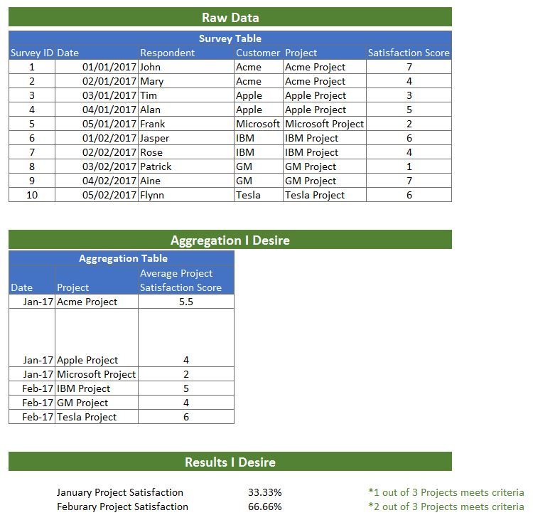
As you can have multiple Respondents & Dates per each Project, I first need to calculate the Average Score Per Each Project Per Each Month.
For instance "Acme Project" average = (7+4)/2 = 5.5 =Meets Satisfaction Score in January.
The lowest granular level of information is Date & Respondent.
As you can have multiple Respondents & Dates per each Project, I first need to calculate the Average Score Per Each Project Per Each Month.
For instance "Acme Project" average = (7+4)/2 = 5.5 =Meets Satisfaction Score in January.
I then need to formulate:
CountIF( (Average of Project)>=5))
Count of All Projects
Is there an easy way to do this.
I have tried SumX and Summarize functions but to no avail.
I also attempted to create a Projects and Date Table and do a lookup.
Would really appreciate any help, as the month end is approaching and will need for next Monday.
Thanks,
Brian
- Mark as New
- Bookmark
- Subscribe
- Mute
- Subscribe to RSS Feed
- Permalink
- Report Inappropriate Content
Anybody with any idea....... please .....

Helpful resources

Power BI Monthly Update - September 2025
Check out the September 2025 Power BI update to learn about new features.

FabCon Atlanta 2026
Join us at FabCon Atlanta, March 16-20, for the ultimate Fabric, Power BI, AI and SQL community-led event. Save $200 with code FABCOMM.


