Join us at the 2025 Microsoft Fabric Community Conference
March 31 - April 2, 2025, in Las Vegas, Nevada. Use code MSCUST for a $150 discount! Early bird discount ends December 31.
Register Now- Power BI forums
- Get Help with Power BI
- Desktop
- Service
- Report Server
- Power Query
- Mobile Apps
- Developer
- DAX Commands and Tips
- Custom Visuals Development Discussion
- Health and Life Sciences
- Power BI Spanish forums
- Translated Spanish Desktop
- Training and Consulting
- Instructor Led Training
- Dashboard in a Day for Women, by Women
- Galleries
- Community Connections & How-To Videos
- COVID-19 Data Stories Gallery
- Themes Gallery
- Data Stories Gallery
- R Script Showcase
- Webinars and Video Gallery
- Quick Measures Gallery
- 2021 MSBizAppsSummit Gallery
- 2020 MSBizAppsSummit Gallery
- 2019 MSBizAppsSummit Gallery
- Events
- Ideas
- Custom Visuals Ideas
- Issues
- Issues
- Events
- Upcoming Events
Be one of the first to start using Fabric Databases. View on-demand sessions with database experts and the Microsoft product team to learn just how easy it is to get started. Watch now
- Power BI forums
- Forums
- Get Help with Power BI
- Desktop
- Re: Advise on best approach -
- Subscribe to RSS Feed
- Mark Topic as New
- Mark Topic as Read
- Float this Topic for Current User
- Bookmark
- Subscribe
- Printer Friendly Page
- Mark as New
- Bookmark
- Subscribe
- Mute
- Subscribe to RSS Feed
- Permalink
- Report Inappropriate Content
Advise on best approach -
I all, I am looking fo some guidance on best practice.
I am creating a student dashboard. I have a big data table that contains data from an annual student test covering multiple years. I can select a student via basic slicer and diplay current subjects and the series of annual scores.
However I need to show student performance in the context of the other students for that year either as a box or violin plot (ie. Year 5 student vs all Year 5 students in 2013, Year 6 student vs all year 6 students in 2014 etc). The slicer reduces the data set to just the student so the box/violin ends up with one data point.
I can easily create an alternate table using SQL but it seems so wrong to not do this in PBI. What would be the best practice approach? I just need a pointer and can run with it from there.
Thanks in advance.
Solved! Go to Solution.
- Mark as New
- Bookmark
- Subscribe
- Mute
- Subscribe to RSS Feed
- Permalink
- Report Inappropriate Content
Hey @lutho
As @amitchandak mentioned it would be best to have some sample data and a sample output to answer this question.
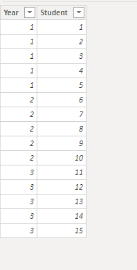
Without this, here is some sample data I have included to try and meet your solution
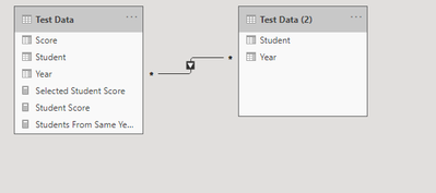
Also I've gone ahead and duplicate this table in the query editor and paried it down just to unique Student-Year combinations
The tables are connected by year and one filters the other in a one way many to many relationship
Now we can write a measure like this
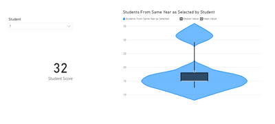
Students From Same Year as Selected =

var TheStudent = VALUES('Test Data (2)'[Student])

var TheYear = CALCULATE(MAX('Test Data'[Year]), 'Test Data'[Student] in TheStudent)

return

CALCULATE(MAX('Test Data'[Score]), 'Test Data'[Year] = TheYear)
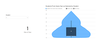
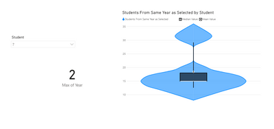
This will allow us to make a violin chart that will adjust based on the year of our selected student
If you wanted to also see the selected student's score you could add a card with this measure
Student Score =

var TheSelectedStudent = SELECTEDVALUE('Test Data (2)'[Student])

return

CALCULATE(MAX('Test Data'[Score]), 'Test Data'[Student] = TheSelectedStudent)
Let me know if this helps or if you were looking for different functionality.
- Mark as New
- Bookmark
- Subscribe
- Mute
- Subscribe to RSS Feed
- Permalink
- Report Inappropriate Content
@lutho ,Can you share sample data and sample output in table format? Or a sample pbix after removing sensitive data.
At the Microsoft Analytics Community Conference, global leaders and influential voices are stepping up to share their knowledge and help you master the latest in Microsoft Fabric, Copilot, and Purview. ✨
️ November 12th-14th, 2024
Online Event
Register Here
Helpful resources

Join us at the Microsoft Fabric Community Conference
March 31 - April 2, 2025, in Las Vegas, Nevada. Use code MSCUST for a $150 discount!

We want your feedback!
Your insights matter. That’s why we created a quick survey to learn about your experience finding answers to technical questions.

Microsoft Fabric Community Conference 2025
Arun Ulag shares exciting details about the Microsoft Fabric Conference 2025, which will be held in Las Vegas, NV.

| User | Count |
|---|---|
| 134 | |
| 91 | |
| 90 | |
| 64 | |
| 58 |
| User | Count |
|---|---|
| 201 | |
| 137 | |
| 107 | |
| 72 | |
| 68 |

