Fabric Data Days starts November 4th!
Advance your Data & AI career with 50 days of live learning, dataviz contests, hands-on challenges, study groups & certifications and more!
Get registered- Power BI forums
- Get Help with Power BI
- Desktop
- Service
- Report Server
- Power Query
- Mobile Apps
- Developer
- DAX Commands and Tips
- Custom Visuals Development Discussion
- Health and Life Sciences
- Power BI Spanish forums
- Translated Spanish Desktop
- Training and Consulting
- Instructor Led Training
- Dashboard in a Day for Women, by Women
- Galleries
- Data Stories Gallery
- Themes Gallery
- Contests Gallery
- Quick Measures Gallery
- Visual Calculations Gallery
- Notebook Gallery
- Translytical Task Flow Gallery
- TMDL Gallery
- R Script Showcase
- Webinars and Video Gallery
- Ideas
- Custom Visuals Ideas (read-only)
- Issues
- Issues
- Events
- Upcoming Events
Join us at FabCon Atlanta from March 16 - 20, 2026, for the ultimate Fabric, Power BI, AI and SQL community-led event. Save $200 with code FABCOMM. Register now.
- Power BI forums
- Forums
- Get Help with Power BI
- Desktop
- Advanced histogram parametring by cluster of data
- Subscribe to RSS Feed
- Mark Topic as New
- Mark Topic as Read
- Float this Topic for Current User
- Bookmark
- Subscribe
- Printer Friendly Page
- Mark as New
- Bookmark
- Subscribe
- Mute
- Subscribe to RSS Feed
- Permalink
- Report Inappropriate Content
Advanced histogram parametring by cluster of data
Hi people!
I have once again an issue, concerning histogram parametring.
Below are the samples:
- my data is as seen in the table : division by country/region/zone/dealer
- my histogram should show the ratio Sales/offers, but 4 times:
- sales(country)/offer(country)
- sales(region)/offer(region)
- etc.
--> Constraint: their are several slicers allowing the user to choose country/region/zone/dealer but I need to be able to show, for each level of filtering,
- the complete data for the country
- complete country + the region data according to the one selected
- complete country + the region data according to the one selected + the zone selected
- complete country + the region data according to the one selected + the zone selected + dealer selected.
Here are samples :
| Country | Region | Zone | Dealer | Product | Offers | Sales | %Country | %Region | %Dealer | %Zone |
| France | 1 | 1 | 1001 | Pdt 1 | 15 | 5 | 70% | 44% | 33% | 33% |
| France | 1 | 2 | 1002 | Pdt 2 | 45 | 21 | 70% | 44% | 47% | 47% |
| France | 1 | 3 | 1003 | Pdt 3 | 2 | 1 | 70% | 44% | 50% | 50% |
| France | 2 | 4 | 1004 | Pdt 1 | 6 | 3 | 70% | 78% | 50% | 50% |
| France | 2 | 5 | 1005 | Pdt 2 | 67 | 54 | 70% | 78% | 81% | 81% |
| France | 3 | 6 | 1006 | Pdt 3 | 54 | 35 | 70% | 80% | 65% | 65% |
| France | 3 | 7 | 1007 | Pdt 1 | 24 | 24 | 70% | 80% | 100% | 100% |
| France | 3 | 8 | 1008 | Pdt 2 | 22 | 21 | 70% | 80% | 95% | 95% |
| France | 4 | 9 | 1009 | Pdt 3 | 1 | 1 | 70% | 100% | 100% | 100% |
Screenshot:

To all, thanks!
Noob
Solved! Go to Solution.
- Mark as New
- Bookmark
- Subscribe
- Mute
- Subscribe to RSS Feed
- Permalink
- Report Inappropriate Content
Hi @Noob78,
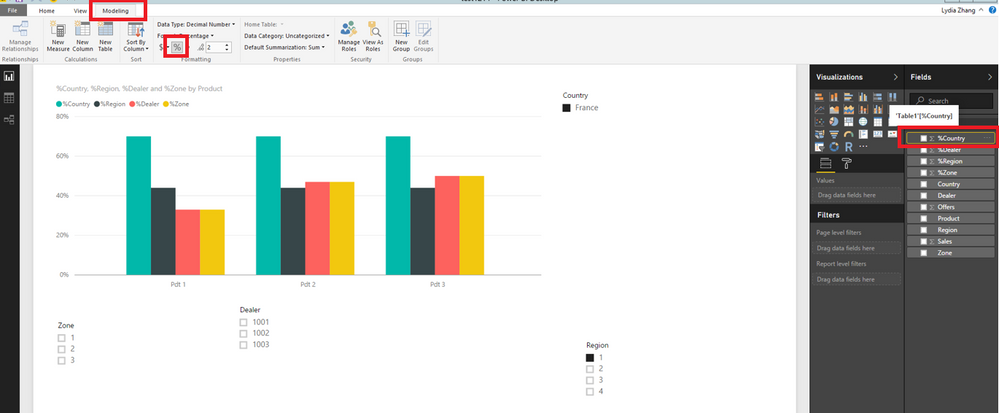
Click your field(for example:%Country) in Fields Panel, then under Modeling ribbon,click the percentage format, you will get your desired result.
Thanks,
Lydia Zhang
- Mark as New
- Bookmark
- Subscribe
- Mute
- Subscribe to RSS Feed
- Permalink
- Report Inappropriate Content
Hi @Noob78,
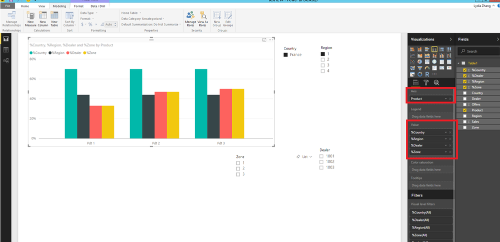
Based on your description and screenshots, it seems that you want to create a column chart using sample data in Power BI Desktop and want to filter it with different levels of slicers, right?
If that is the case, you can create a Clustered column chart using fields as shown in the following screenshot, then create 4 slicers using country/region/zone/dealer field. You will be able to filter the chart using slicers at different levels.
For more details, you can review this attached PBIX file.
Thanks,
Lydia Zhang
- Mark as New
- Bookmark
- Subscribe
- Mute
- Subscribe to RSS Feed
- Permalink
- Report Inappropriate Content
Thank you! This is quite it visually.
How have you determined the %? A measure? Directly in data?...
- Mark as New
- Bookmark
- Subscribe
- Mute
- Subscribe to RSS Feed
- Permalink
- Report Inappropriate Content
Hi @Noob78,
Click your field(for example:%Country) in Fields Panel, then under Modeling ribbon,click the percentage format, you will get your desired result.
Thanks,
Lydia Zhang
- Mark as New
- Bookmark
- Subscribe
- Mute
- Subscribe to RSS Feed
- Permalink
- Report Inappropriate Content
Thank you Lydia
- Mark as New
- Bookmark
- Subscribe
- Mute
- Subscribe to RSS Feed
- Permalink
- Report Inappropriate Content
up?
Helpful resources

FabCon Global Hackathon
Join the Fabric FabCon Global Hackathon—running virtually through Nov 3. Open to all skill levels. $10,000 in prizes!

Power BI Monthly Update - October 2025
Check out the October 2025 Power BI update to learn about new features.

| User | Count |
|---|---|
| 82 | |
| 42 | |
| 31 | |
| 27 | |
| 27 |


