Join us at the 2025 Microsoft Fabric Community Conference
Microsoft Fabric Community Conference 2025, March 31 - April 2, Las Vegas, Nevada. Use code FABINSIDER for a $400 discount.
Register now- Power BI forums
- Get Help with Power BI
- Desktop
- Service
- Report Server
- Power Query
- Mobile Apps
- Developer
- DAX Commands and Tips
- Custom Visuals Development Discussion
- Health and Life Sciences
- Power BI Spanish forums
- Translated Spanish Desktop
- Training and Consulting
- Instructor Led Training
- Dashboard in a Day for Women, by Women
- Galleries
- Webinars and Video Gallery
- Data Stories Gallery
- Themes Gallery
- Power BI DataViz World Championships Gallery
- Quick Measures Gallery
- R Script Showcase
- COVID-19 Data Stories Gallery
- Community Connections & How-To Videos
- 2021 MSBizAppsSummit Gallery
- 2020 MSBizAppsSummit Gallery
- 2019 MSBizAppsSummit Gallery
- Events
- Ideas
- Custom Visuals Ideas
- Issues
- Issues
- Events
- Upcoming Events
The Power BI DataViz World Championships are on! With four chances to enter, you could win a spot in the LIVE Grand Finale in Las Vegas. Show off your skills.
- Power BI forums
- Forums
- Get Help with Power BI
- Desktop
- Re: Adjusting colors to the data in the legend
- Subscribe to RSS Feed
- Mark Topic as New
- Mark Topic as Read
- Float this Topic for Current User
- Bookmark
- Subscribe
- Printer Friendly Page
- Mark as New
- Bookmark
- Subscribe
- Mute
- Subscribe to RSS Feed
- Permalink
- Report Inappropriate Content
Adjusting colors to the data in the legend
Hello!
For the last few hours I started digging into the topic of changing colors in Power BI. I was introduced to ,,advanced controls" in the visuals and much more staff, but nothing coming from that research could work with my project.
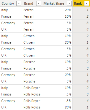
The task that I'm working on right now contains of creating the map which shows leader brands in individual countries. I created a table which was divided by country and by brand and I also ranked market share (by rankx) which than gave me a leader for every country. Then I changed the table to Filled map and it worked perfectly and map also acts great with changing filters.
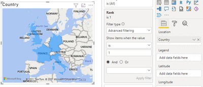
The only issue I have is the color of leader brands shown on the map. I need to be really strict and have the country coloured in an exact colour of the brand by HEX code or RGB of the official brand, and not have something like this:
So let's take car market for an example. In Italy the market leader is Ferrari and I want the country to be coloured red because it's an official color of brand Ferrari and not violet like it's shown on the map. Anticipating the questions I saw that Power BI let users to use advanced controls in Data colors formatting but in my case, in which I have to use a legend from a column in a table, the option of advanced controls just doesn't appear. I also know that I can change colors manually by just pasting the HEX code to different brands, but the case is that I want to standardize colors of individual brands for every visualization in this power bi sheet. F.ex. If I create a bar chart, the brands there will have exactly same colors as on the map.
Is there any way to do such a thing, by some measure or making a table with colors? Thank you in advance for your help 🙂
Solved! Go to Solution.
- Mark as New
- Bookmark
- Subscribe
- Mute
- Subscribe to RSS Feed
- Permalink
- Report Inappropriate Content
Hi @mzienowicz99 ,
According to your description, you can modify the formula like this:
Rank =
RANKX (
    FILTER (
        'Car',
        'Car'[Brand] = EARLIER ( Car[Brand] )
            && 'Car'[Month] = EARLIER ( Car[Month] )
    ),
    'Car'[Market Share],
    ,
    DESC,
    DENSE
)
In this way, the rank of market share will be depending on the month.
For bar and line chart, it also works fine.
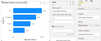
First, put country in axis, market share in values and rank in visual filter, then set rank is 1.
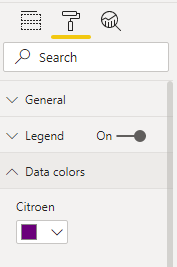
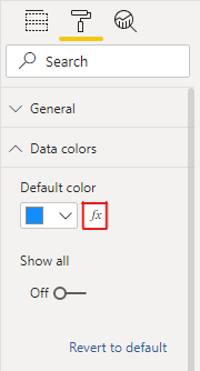
Also click fx in Data colors, and use the color measure.
Get the expected result, and the month should be putted in a slicer.
I attach my sample below for reference.
Best Regards,
Community Support Team _ kalyj
If this post helps, then please consider Accept it as the solution to help the other members find it more quickly.
- Mark as New
- Bookmark
- Subscribe
- Mute
- Subscribe to RSS Feed
- Permalink
- Report Inappropriate Content
Hi @mzienowicz99 ,
By my test, if there is a value in legend, the fx icon in Data colors will missing as you described.
Here’s my solution.
1.I create a sample by your description, Create a rank column by the market share as you mentioned, then brands with rank equal to 1 are the leading brands in this country.
Rank =
RANKX (
    FILTER ( 'Car', 'Car'[Brand] = EARLIER ( Car[Brand] ) ),
    'Car'[Market Share],
    ,
    DESC,
    DENSE
)
2.Put country in the location filed and put rank in the visual filter, then select rank is 1.
3.Create a measure to define to the color of different brands.
Color =
SWITCH(TRUE(),
MAX('Car'[Brand])="Citroen","Green",
MAX('Car'[Brand])="Ferrari","Red",
MAX('Car'[Brand])="Rolls Royce","Blue",
MAX('Car'[Brand])="Porsche","Orange"
)
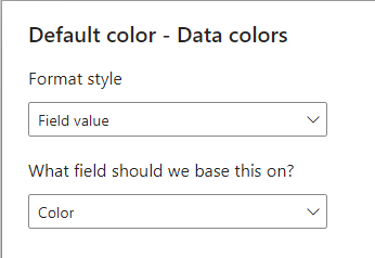
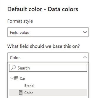
4.Select the fx icon under the Default color, then select the measure as the based on field.
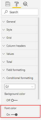
5.For the table of brand, select conditional formatting and select the measure as the based on field also.
6.Get the final result.
I attach my sample below for reference.
Best Regards,
Community Support Team _ kalyj
If this post helps, then please consider Accept it as the solution to help the other members find it more quickly.
- Mark as New
- Bookmark
- Subscribe
- Mute
- Subscribe to RSS Feed
- Permalink
- Report Inappropriate Content
Hello, thank you for your extended response. It looks like it can work but I have a question about recreating formula for the rank column if I also have month as a category (so I want to rank Market Share in month first, then in country by brand). And the next thing I'm concerned about is that method working for other visuals like bar chart and line chart?
- Mark as New
- Bookmark
- Subscribe
- Mute
- Subscribe to RSS Feed
- Permalink
- Report Inappropriate Content
Hi @mzienowicz99 ,
According to your description, you can modify the formula like this:
Rank =
RANKX (
    FILTER (
        'Car',
        'Car'[Brand] = EARLIER ( Car[Brand] )
            && 'Car'[Month] = EARLIER ( Car[Month] )
    ),
    'Car'[Market Share],
    ,
    DESC,
    DENSE
)
In this way, the rank of market share will be depending on the month.
For bar and line chart, it also works fine.
First, put country in axis, market share in values and rank in visual filter, then set rank is 1.
Also click fx in Data colors, and use the color measure.
Get the expected result, and the month should be putted in a slicer.
I attach my sample below for reference.
Best Regards,
Community Support Team _ kalyj
If this post helps, then please consider Accept it as the solution to help the other members find it more quickly.
- Mark as New
- Bookmark
- Subscribe
- Mute
- Subscribe to RSS Feed
- Permalink
- Report Inappropriate Content
@mzienowicz99 yes, by mapping I mean connecting main table to this new table with Brands and their colours. As mentioned in your snap, I assume that is the colour table and your main table must have brand names' column to which you map this with. You can then use the colour column from new table to format the brands from main table. The relationship between the table can be single or bi-directional as per your filtering needs.
Did I answer your question?
Please mark the solution as Accepted!
- Mark as New
- Bookmark
- Subscribe
- Mute
- Subscribe to RSS Feed
- Permalink
- Report Inappropriate Content
@mzienowicz99 you can try creating a table with Brands and their colours and map that with your fact table. Use the colour column from this newly created table to conditionally format the visuals.
Did I answer your question?
Please mark the solution as Accepted!
- Mark as New
- Bookmark
- Subscribe
- Mute
- Subscribe to RSS Feed
- Permalink
- Report Inappropriate Content
OK, thanks, sounds good but my only issue is with mapping the new table with the table that is a base to my map visual? how to do it so the colour codes only appear next to right brands? because thats what you mean by mapping? or map the color table to the main table with whole data. Sorry, for my lack of knowledge but I'm a begginer and I am reallly curious about most things 😞
- Mark as New
- Bookmark
- Subscribe
- Mute
- Subscribe to RSS Feed
- Permalink
- Report Inappropriate Content
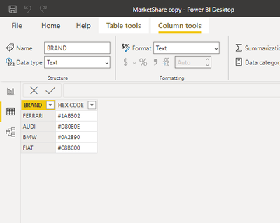
And also can i then format conditionally from a table looking like this, just from codes
Helpful resources

Join us at the Microsoft Fabric Community Conference
March 31 - April 2, 2025, in Las Vegas, Nevada. Use code MSCUST for a $150 discount!

Power BI Monthly Update - February 2025
Check out the February 2025 Power BI update to learn about new features.

Join our Community Sticker Challenge 2025
If you love stickers, then you will definitely want to check out our Community Sticker Challenge!

| User | Count |
|---|---|
| 84 | |
| 69 | |
| 68 | |
| 39 | |
| 37 |


