- Power BI forums
- Updates
- News & Announcements
- Get Help with Power BI
- Desktop
- Service
- Report Server
- Power Query
- Mobile Apps
- Developer
- DAX Commands and Tips
- Custom Visuals Development Discussion
- Health and Life Sciences
- Power BI Spanish forums
- Translated Spanish Desktop
- Power Platform Integration - Better Together!
- Power Platform Integrations (Read-only)
- Power Platform and Dynamics 365 Integrations (Read-only)
- Training and Consulting
- Instructor Led Training
- Dashboard in a Day for Women, by Women
- Galleries
- Community Connections & How-To Videos
- COVID-19 Data Stories Gallery
- Themes Gallery
- Data Stories Gallery
- R Script Showcase
- Webinars and Video Gallery
- Quick Measures Gallery
- 2021 MSBizAppsSummit Gallery
- 2020 MSBizAppsSummit Gallery
- 2019 MSBizAppsSummit Gallery
- Events
- Ideas
- Custom Visuals Ideas
- Issues
- Issues
- Events
- Upcoming Events
- Community Blog
- Power BI Community Blog
- Custom Visuals Community Blog
- Community Support
- Community Accounts & Registration
- Using the Community
- Community Feedback
Register now to learn Fabric in free live sessions led by the best Microsoft experts. From Apr 16 to May 9, in English and Spanish.
- Power BI forums
- Forums
- Get Help with Power BI
- Desktop
- Adding Linear Trend line to bar chart
- Subscribe to RSS Feed
- Mark Topic as New
- Mark Topic as Read
- Float this Topic for Current User
- Bookmark
- Subscribe
- Printer Friendly Page
- Mark as New
- Bookmark
- Subscribe
- Mute
- Subscribe to RSS Feed
- Permalink
- Report Inappropriate Content
Adding Linear Trend line to bar chart
Hello,
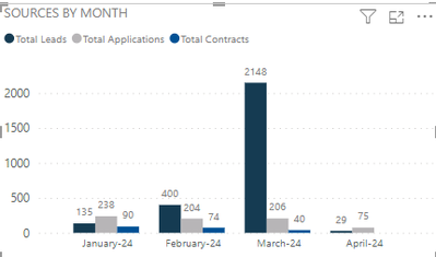
I have a bar graph with the Month/Year on the x-axis, and three measures on the y. The user is asking for a linear trend line of one of the measures. Not really sure what that means?
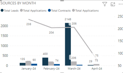
This is what the bar graph looks like now, with and without a line for the Total Applications.
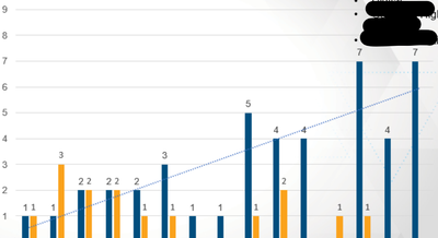
This is the users example of how she wants it to look:
I'm thinking it's just a nice straight line because those numbers only go up. In reality, Total Applicatoins go up and down. Would a linear line look at the first month of 238 and the last month of 75 and just have a straight line pointing in the down direction? How would I do that?
Solved! Go to Solution.
- Mark as New
- Bookmark
- Subscribe
- Mute
- Subscribe to RSS Feed
- Permalink
- Report Inappropriate Content
Am I correct in stating that the user's sample has nothing to do with the two graphs above it? It is only to indicate that she wants a straight line between the first and last points (238 and 75)?
Start out by just entering some hard numbers into a new DAX table: two rows (first month and last month) and their respective values 238 and 75. Join that to the common x Axis date dimension. See what happens when you plot it on top of your columns (Yes, that is a COLUMN CHART, not a BAR CHART. Bar charts go horizontal.)
Now try to recreate that table with a SUMMARIZE DAX statement, with fancy FILTER statements that filter for first and last month only.
Hope that helps.
Proud to be a Super User! |  |
- Mark as New
- Bookmark
- Subscribe
- Mute
- Subscribe to RSS Feed
- Permalink
- Report Inappropriate Content
Hi @aashton ,
May I ask whether the problem has been solved? If so, please mark it as the correct solution, and point out if the problem persists.
Best Regards,
Adamk Kong
- Mark as New
- Bookmark
- Subscribe
- Mute
- Subscribe to RSS Feed
- Permalink
- Report Inappropriate Content
Am I correct in stating that the user's sample has nothing to do with the two graphs above it? It is only to indicate that she wants a straight line between the first and last points (238 and 75)?
Start out by just entering some hard numbers into a new DAX table: two rows (first month and last month) and their respective values 238 and 75. Join that to the common x Axis date dimension. See what happens when you plot it on top of your columns (Yes, that is a COLUMN CHART, not a BAR CHART. Bar charts go horizontal.)
Now try to recreate that table with a SUMMARIZE DAX statement, with fancy FILTER statements that filter for first and last month only.
Hope that helps.
Proud to be a Super User! |  |
- Mark as New
- Bookmark
- Subscribe
- Mute
- Subscribe to RSS Feed
- Permalink
- Report Inappropriate Content
@ToddChitt Yes, you are correct, that second chart was just an example. Thank you for the explanation, I'll try to work that out.
Helpful resources

Microsoft Fabric Learn Together
Covering the world! 9:00-10:30 AM Sydney, 4:00-5:30 PM CET (Paris/Berlin), 7:00-8:30 PM Mexico City

Power BI Monthly Update - April 2024
Check out the April 2024 Power BI update to learn about new features.

| User | Count |
|---|---|
| 97 | |
| 95 | |
| 80 | |
| 77 | |
| 66 |
| User | Count |
|---|---|
| 130 | |
| 106 | |
| 105 | |
| 86 | |
| 72 |


