Fabric Data Days starts November 4th!
Advance your Data & AI career with 50 days of live learning, dataviz contests, hands-on challenges, study groups & certifications and more!
Get registered- Power BI forums
- Get Help with Power BI
- Desktop
- Service
- Report Server
- Power Query
- Mobile Apps
- Developer
- DAX Commands and Tips
- Custom Visuals Development Discussion
- Health and Life Sciences
- Power BI Spanish forums
- Translated Spanish Desktop
- Training and Consulting
- Instructor Led Training
- Dashboard in a Day for Women, by Women
- Galleries
- Data Stories Gallery
- Themes Gallery
- Contests Gallery
- Quick Measures Gallery
- Visual Calculations Gallery
- Notebook Gallery
- Translytical Task Flow Gallery
- TMDL Gallery
- R Script Showcase
- Webinars and Video Gallery
- Ideas
- Custom Visuals Ideas (read-only)
- Issues
- Issues
- Events
- Upcoming Events
Get Fabric Certified for FREE during Fabric Data Days. Don't miss your chance! Learn more
- Power BI forums
- Forums
- Get Help with Power BI
- Desktop
- Actual vs. Target Trellis style chart across multi...
- Subscribe to RSS Feed
- Mark Topic as New
- Mark Topic as Read
- Float this Topic for Current User
- Bookmark
- Subscribe
- Printer Friendly Page
- Mark as New
- Bookmark
- Subscribe
- Mute
- Subscribe to RSS Feed
- Permalink
- Report Inappropriate Content
Actual vs. Target Trellis style chart across multiple KPIs?
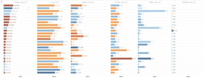
I am working on a dashboard where I need to be able to show a detailed actual vs. target visually across multiple KPIs by a dimension. I know I can add a "Bar" in conditional formatting for matrix chart, but I need to be able to show whether the value is above/below the target and how far from the target for each KPI in a single column, similar to this example I found:
Is this possible in Power BI? I haven't found a custom visualization that fits the bill, nor any good examples of how to do this in Power BI, and would be grateful for any advice on how to accomplish something similar.
- Mark as New
- Bookmark
- Subscribe
- Mute
- Subscribe to RSS Feed
- Permalink
- Report Inappropriate Content
@Anonymous , explore bullet chart: https://appsource.microsoft.com/en-us/product/power-bi-visuals/wa104380755?tab=overview
Also refer my video on conditional formatting
- Mark as New
- Bookmark
- Subscribe
- Mute
- Subscribe to RSS Feed
- Permalink
- Report Inappropriate Content
Hi Amit thanks for your quick reply -
The bullet charts only allow for one measure at a time, so this isn't practical for what I am trying to achieve. (see the screen shot I posted above) This is easily achieved in Tableau, so I am really hoping for a similar Power BI solution. There are only 3 bullet chart options available when I click to add more visuals, and none of them allow for multiple measure within the same visual.
For the conditional formatting, I don't think there is a way to make the bar color to show "Green" for above target and "Red" for below for example - you have to put in a discrete value, it cannot be based on another field. This is only allowed for background color.
Helpful resources

Fabric Data Days
Advance your Data & AI career with 50 days of live learning, contests, hands-on challenges, study groups & certifications and more!

Power BI Monthly Update - October 2025
Check out the October 2025 Power BI update to learn about new features.


