Jumpstart your career with the Fabric Career Hub
Find everything you need to get certified on Fabric—skills challenges, live sessions, exam prep, role guidance, and a 50 percent discount on exams.
Get started- Power BI forums
- Updates
- News & Announcements
- Get Help with Power BI
- Desktop
- Service
- Report Server
- Power Query
- Mobile Apps
- Developer
- DAX Commands and Tips
- Custom Visuals Development Discussion
- Health and Life Sciences
- Power BI Spanish forums
- Translated Spanish Desktop
- Power Platform Integration - Better Together!
- Power Platform Integrations (Read-only)
- Power Platform and Dynamics 365 Integrations (Read-only)
- Training and Consulting
- Instructor Led Training
- Dashboard in a Day for Women, by Women
- Galleries
- Community Connections & How-To Videos
- COVID-19 Data Stories Gallery
- Themes Gallery
- Data Stories Gallery
- R Script Showcase
- Webinars and Video Gallery
- Quick Measures Gallery
- 2021 MSBizAppsSummit Gallery
- 2020 MSBizAppsSummit Gallery
- 2019 MSBizAppsSummit Gallery
- Events
- Ideas
- Custom Visuals Ideas
- Issues
- Issues
- Events
- Upcoming Events
- Community Blog
- Power BI Community Blog
- Custom Visuals Community Blog
- Community Support
- Community Accounts & Registration
- Using the Community
- Community Feedback
Earn a 50% discount on the DP-600 certification exam by completing the Fabric 30 Days to Learn It challenge.
- Power BI forums
- Forums
- Get Help with Power BI
- Desktop
- Re: Active User Curve - help needed
- Subscribe to RSS Feed
- Mark Topic as New
- Mark Topic as Read
- Float this Topic for Current User
- Bookmark
- Subscribe
- Printer Friendly Page
- Mark as New
- Bookmark
- Subscribe
- Mute
- Subscribe to RSS Feed
- Permalink
- Report Inappropriate Content
Active User Curve - help needed
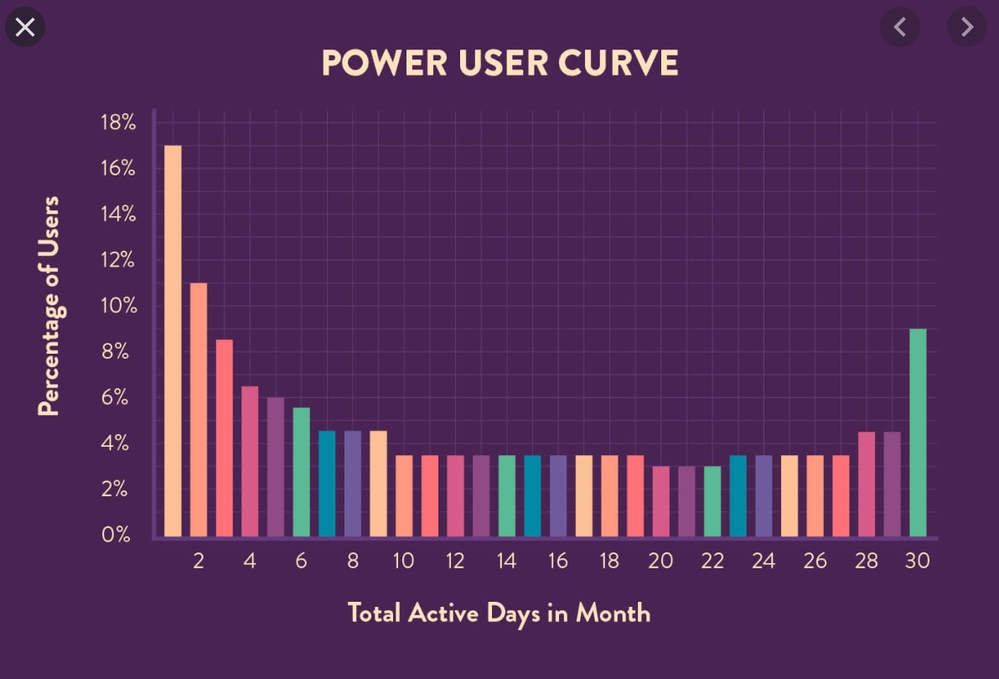
I am trying to create a graph to show what % of my active user base completes 1, 2, 3, 4, etc. number of tasks in a given month. (see image to understand output desired and axis )
I have the following tables:
- CALENDAR TABLE
- ACTIVTY TABLE:
| Activity Reference | ActivityPrevStatus | ActivityNewStatus | UserID | Date |
| 12 | Assigned | Assigned | 1 | 12/19/19 |
| 12 | Completed | Completed | 1 | 12/22/19 |
| 13 | Assigned | Assigned | 3 | 12/19/19 |
| 13 | Completed | Completed | 3 | 12/22/19 |
| 14 | Assigned | Assigned | 1 | 12/19/19 |
| 14 | Completed | Completed | 1 | 12/22/19 |
USERS TABLE
| USERID | USERSTATUS | Date Activated | Date Deactived |
| 1 | Active | 11/1/19 |
|
| 2 | Deactivated | 11/1/19 | 12/1/19 |
| 3 | Active | 11/1/19 | |
| 4 | Active | 12/1/19 |
How can I create measures with this information to make the graph I want?
@amitchandak you've been super helpful before, any thoughts?
- Mark as New
- Bookmark
- Subscribe
- Mute
- Subscribe to RSS Feed
- Permalink
- Report Inappropriate Content
Hi @Anonymous
Which should be used to color the columns of the picture?
Could you clear me what is the value and the rule to calculate it?
Best Regards
Maggie
- Mark as New
- Bookmark
- Subscribe
- Mute
- Subscribe to RSS Feed
- Permalink
- Report Inappropriate Content
Bump on this post. This is almost identical to what I'm trying to do. Any idea on steps I need to take?
I have two tables. One is Unique Users and date they activated on my website. The second is User ID, ActivityID, date of ActitivityID.
What I need to do is summarize the users that have 1 activity, and then group them and show them as a whole (18 users for "1"), and then proceed for each day value. Right?


