Join us at the 2025 Microsoft Fabric Community Conference
March 31 - April 2, 2025, in Las Vegas, Nevada. Use code MSCUST for a $150 discount! Early bird discount ends December 31.
Register Now- Power BI forums
- Get Help with Power BI
- Desktop
- Service
- Report Server
- Power Query
- Mobile Apps
- Developer
- DAX Commands and Tips
- Custom Visuals Development Discussion
- Health and Life Sciences
- Power BI Spanish forums
- Translated Spanish Desktop
- Training and Consulting
- Instructor Led Training
- Dashboard in a Day for Women, by Women
- Galleries
- Community Connections & How-To Videos
- COVID-19 Data Stories Gallery
- Themes Gallery
- Data Stories Gallery
- R Script Showcase
- Webinars and Video Gallery
- Quick Measures Gallery
- 2021 MSBizAppsSummit Gallery
- 2020 MSBizAppsSummit Gallery
- 2019 MSBizAppsSummit Gallery
- Events
- Ideas
- Custom Visuals Ideas
- Issues
- Issues
- Events
- Upcoming Events
Be one of the first to start using Fabric Databases. View on-demand sessions with database experts and the Microsoft product team to learn just how easy it is to get started. Watch now
- Power BI forums
- Forums
- Get Help with Power BI
- Desktop
- Re: 100% stacked bar chart - Y axis - max area wid...
- Subscribe to RSS Feed
- Mark Topic as New
- Mark Topic as Read
- Float this Topic for Current User
- Bookmark
- Subscribe
- Printer Friendly Page
- Mark as New
- Bookmark
- Subscribe
- Mute
- Subscribe to RSS Feed
- Permalink
- Report Inappropriate Content
100% stacked bar chart - Y axis - max area width - can I fix the width
Hi,
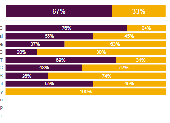
I am using a 100% Stacked bar chart, together with separate "total%" of it:
I have played around with the Y-axis: max area width, but as we can only play around with the MAX width, and cannot FIX it, I am facing problems when I am breaking down on different dimension, e.g.:
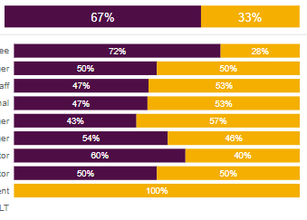
The detailed chart starts before the Total when Y axis label is shorter:
The detailed chart starts after the Total when Y axis label is longer:
This problem is based on the assumption of: We can only play around with the MAX width of Y-axis label, and cannot FIX it.
Is there any way to FIX this width - so I know exactly where the viz starts, and align the Total chart ?
Thanks.
Solved! Go to Solution.
- Mark as New
- Bookmark
- Subscribe
- Mute
- Subscribe to RSS Feed
- Permalink
- Report Inappropriate Content
Hi @Saniat
Create a disconnected table with all the categories and a row with the total:
Then add the following metric:
Total values =
SWITCH (
    TRUE (),
    SELECTEDVALUE ( 'Table (2)'[Cat] ) = "Total", SUM ( 'Table'[Value] ),
    CALCULATE (
        SUM ( 'Table'[Value] ),
        FILTER ( 'Table', 'Table'[Cat] IN DISTINCT ( 'Table (2)'[Cat] ) )
    )
)
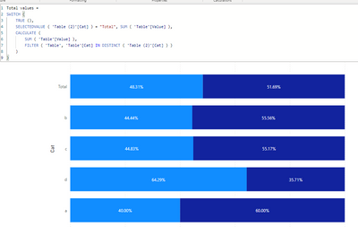
Now use this metric and the new table on the visual.
If you want you can add a sort id on the table so you have the values of the category in the correct order.
Regards
Miguel Félix
Did I answer your question? Mark my post as a solution!
Proud to be a Super User!
Check out my blog: Power BI em Português- Mark as New
- Bookmark
- Subscribe
- Mute
- Subscribe to RSS Feed
- Permalink
- Report Inappropriate Content
Hi @Saniat
Create a disconnected table with all the categories and a row with the total:
Then add the following metric:
Total values =
SWITCH (
    TRUE (),
    SELECTEDVALUE ( 'Table (2)'[Cat] ) = "Total", SUM ( 'Table'[Value] ),
    CALCULATE (
        SUM ( 'Table'[Value] ),
        FILTER ( 'Table', 'Table'[Cat] IN DISTINCT ( 'Table (2)'[Cat] ) )
    )
)
Now use this metric and the new table on the visual.
If you want you can add a sort id on the table so you have the values of the category in the correct order.
Regards
Miguel Félix
Did I answer your question? Mark my post as a solution!
Proud to be a Super User!
Check out my blog: Power BI em PortuguêsHelpful resources

Join us at the Microsoft Fabric Community Conference
March 31 - April 2, 2025, in Las Vegas, Nevada. Use code MSCUST for a $150 discount!

We want your feedback!
Your insights matter. That’s why we created a quick survey to learn about your experience finding answers to technical questions.

Microsoft Fabric Community Conference 2025
Arun Ulag shares exciting details about the Microsoft Fabric Conference 2025, which will be held in Las Vegas, NV.

| User | Count |
|---|---|
| 129 | |
| 90 | |
| 75 | |
| 58 | |
| 53 |
| User | Count |
|---|---|
| 200 | |
| 104 | |
| 101 | |
| 67 | |
| 55 |


