Join us at the 2025 Microsoft Fabric Community Conference
March 31 - April 2, 2025, in Las Vegas, Nevada. Use code MSCUST for a $150 discount! Early bird discount ends December 31.
Register Now- Power BI forums
- Get Help with Power BI
- Desktop
- Service
- Report Server
- Power Query
- Mobile Apps
- Developer
- DAX Commands and Tips
- Custom Visuals Development Discussion
- Health and Life Sciences
- Power BI Spanish forums
- Translated Spanish Desktop
- Training and Consulting
- Instructor Led Training
- Dashboard in a Day for Women, by Women
- Galleries
- Community Connections & How-To Videos
- COVID-19 Data Stories Gallery
- Themes Gallery
- Data Stories Gallery
- R Script Showcase
- Webinars and Video Gallery
- Quick Measures Gallery
- 2021 MSBizAppsSummit Gallery
- 2020 MSBizAppsSummit Gallery
- 2019 MSBizAppsSummit Gallery
- Events
- Ideas
- Custom Visuals Ideas
- Issues
- Issues
- Events
- Upcoming Events
Be one of the first to start using Fabric Databases. View on-demand sessions with database experts and the Microsoft product team to learn just how easy it is to get started. Watch now
- Power BI forums
- Forums
- Get Help with Power BI
- Desktop
- 100% STACKED COLUMN CHART WITH NORMAL VALUES, NOT ...
- Subscribe to RSS Feed
- Mark Topic as New
- Mark Topic as Read
- Float this Topic for Current User
- Bookmark
- Subscribe
- Printer Friendly Page
- Mark as New
- Bookmark
- Subscribe
- Mute
- Subscribe to RSS Feed
- Permalink
- Report Inappropriate Content
100% STACKED COLUMN CHART WITH NORMAL VALUES, NOT PERCENTAGE
Hello!
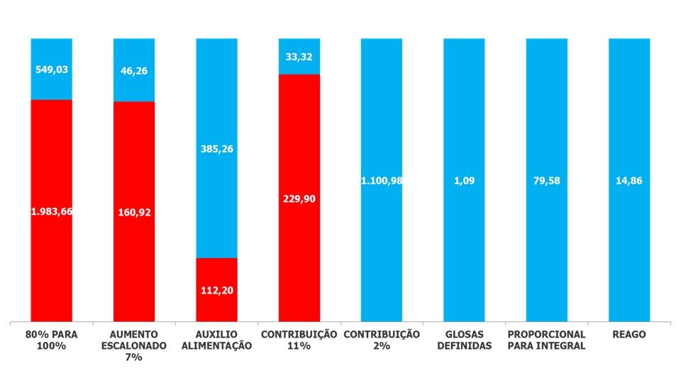
I wan't to do a simple task of having a 100% Stacked Column Chart showing values of my dataset normaly instead of %.
Is that possible? I can't find the solution.
Here's an example of what I wan't using Excel:
This chart shows Victory total in blue and Defeat total in red by each law suitcases request.
- Mark as New
- Bookmark
- Subscribe
- Mute
- Subscribe to RSS Feed
- Permalink
- Report Inappropriate Content
I think I found the solution to this:
Under the "Format Visual" button, turn on data labels. Under data labels, go to values, and add a custom label (turn it on). For the field select your measure. This worked for me.
So, for my own use case I came up with the following measure:
Value and Percent =
CONCATENATE(COUNT(Table1[ID])," ("&FORMAT('New Measures'[% of Total],"0.0%")&")")
Proud to be a Super User! |  |
- Mark as New
- Bookmark
- Subscribe
- Mute
- Subscribe to RSS Feed
- Permalink
- Report Inappropriate Content
I am struggling with exactly the same issue. Also, exactly same reason I cannot use normal Stacked Chart, don't want to compare 2 columns.
- Mark as New
- Bookmark
- Subscribe
- Mute
- Subscribe to RSS Feed
- Permalink
- Report Inappropriate Content
Hey,
I have to admit that I do not understand what you mean by
"... 100% Stacked Column Chart showing values of my dataset normaly instead of % ..."
Why can't you just use a "normal" stacked column chart?
Regards
Tom
Did I answer your question? Mark my post as a solution, this will help others!
Proud to be a Super User!
I accept Kudos 😉
Hamburg, Germany
- Mark as New
- Bookmark
- Subscribe
- Mute
- Subscribe to RSS Feed
- Permalink
- Report Inappropriate Content
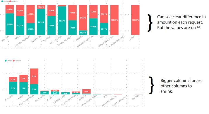
Because the normal stacked column doenst show the difference in each column, it compares each columns.
My objective is not to compare each column, but to compare the total victory and defeat on each request and see which one I have a major victory or defeat but, instead of %, showing the exact value.
I can show the problem I'm having on the picture below:
Thank you for answering!
I'm open for ideas.
- Mark as New
- Bookmark
- Subscribe
- Mute
- Subscribe to RSS Feed
- Permalink
- Report Inappropriate Content
So, understand!
Just tried the Mekko visual as @andrecalais already suggested, but wasn't able to get the "absolute" value, besides the tooltip. but the tooltip also shows the absolute value for the normal "%stacked column chart"
Could be some line of R code using the ggplot2 package, but then you couldn't use the visual for cross filtering other visuals.
Regards
Tom
Did I answer your question? Mark my post as a solution, this will help others!
Proud to be a Super User!
I accept Kudos 😉
Hamburg, Germany
- Mark as New
- Bookmark
- Subscribe
- Mute
- Subscribe to RSS Feed
- Permalink
- Report Inappropriate Content
But Tom, would other visuals (like the Slicer for example) change the R coded visual? But not the other way around.
I will also post as a idea for Microsoft to enable other options for values visualization on 100% Stacked Column Chart.
- Mark as New
- Bookmark
- Subscribe
- Mute
- Subscribe to RSS Feed
- Permalink
- Report Inappropriate Content
Hey @andrecalais, yes all other viusals (also slicer) would have impact on the R script visual, as the filter down the data that will be passed to the R script visual.
If you provide some sample data (upload a pbix to onedrive or dropbox and share the link I will give it a "quick" shot 🙂
Regards
Tom
Did I answer your question? Mark my post as a solution, this will help others!
Proud to be a Super User!
I accept Kudos 😉
Hamburg, Germany
- Mark as New
- Bookmark
- Subscribe
- Mute
- Subscribe to RSS Feed
- Permalink
- Report Inappropriate Content
Thanks, Tom!
Unfortunaly I can't provide the data I'm using, I'll try to take sometime and make one with different names and stuff so I can share it.
I'll also try to workaround with R.
I'll leave the post open for people to bring new solutions.
Please, vote the idea for more data label options on 100% Stacked Column Chart
- Mark as New
- Bookmark
- Subscribe
- Mute
- Subscribe to RSS Feed
- Permalink
- Report Inappropriate Content
Can you verify if "Mekko Chart" from market place satisfy your requirement.
- Mark as New
- Bookmark
- Subscribe
- Mute
- Subscribe to RSS Feed
- Permalink
- Report Inappropriate Content
Thanks for the tip but it didn't worked. Victory and Defeat won't stack.
But the visual is good!
Helpful resources

Join us at the Microsoft Fabric Community Conference
March 31 - April 2, 2025, in Las Vegas, Nevada. Use code MSCUST for a $150 discount!

We want your feedback!
Your insights matter. That’s why we created a quick survey to learn about your experience finding answers to technical questions.

Microsoft Fabric Community Conference 2025
Arun Ulag shares exciting details about the Microsoft Fabric Conference 2025, which will be held in Las Vegas, NV.

| User | Count |
|---|---|
| 123 | |
| 86 | |
| 73 | |
| 57 | |
| 52 |
| User | Count |
|---|---|
| 197 | |
| 133 | |
| 107 | |
| 69 | |
| 65 |


