New Offer! Become a Certified Fabric Data Engineer
Check your eligibility for this 50% exam voucher offer and join us for free live learning sessions to get prepared for Exam DP-700.
Get Started- Power BI forums
- Get Help with Power BI
- Desktop
- Service
- Report Server
- Power Query
- Mobile Apps
- Developer
- DAX Commands and Tips
- Custom Visuals Development Discussion
- Health and Life Sciences
- Power BI Spanish forums
- Translated Spanish Desktop
- Training and Consulting
- Instructor Led Training
- Dashboard in a Day for Women, by Women
- Galleries
- Community Connections & How-To Videos
- COVID-19 Data Stories Gallery
- Themes Gallery
- Data Stories Gallery
- R Script Showcase
- Webinars and Video Gallery
- Quick Measures Gallery
- 2021 MSBizAppsSummit Gallery
- 2020 MSBizAppsSummit Gallery
- 2019 MSBizAppsSummit Gallery
- Events
- Ideas
- Custom Visuals Ideas
- Issues
- Issues
- Events
- Upcoming Events
Don't miss out! 2025 Microsoft Fabric Community Conference, March 31 - April 2, Las Vegas, Nevada. Use code MSCUST for a $150 discount. Prices go up February 11th. Register now.
- Power BI forums
- Galleries
- Data Stories Gallery
- Re: Women in the Olympic Games
- Mark as New
- Bookmark
- Subscribe
- Mute
- Subscribe to RSS Feed
- Permalink
- Report Inappropriate Content
Women in the Olympic Games
As an example for this work, a dataset was selected that includes information about the participation of Women in the Olympic Games. You are invited to consider four screens, two of which show percentages for different categories. The first screen shows statistics on changes in the number of women participating in the Summer and Winter Olympic Games. The second one provides information on how the number of summer disciplines in which women participated has changed.
This dashboard is based on real data and created as part of a training program.
Made by a student of St. Petersburg State Technological University, Faculty of Economics and Management, direction "Business Informatics".
During the analysis, we came to the following results:
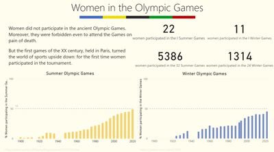
At the first Olympic Games, the percentage of female participants was only 2%, and at the 2020 Olympic Games in Tokyo, this percentage was 48.8%.
The same positive dynamics is observed at the Winter Olympics: 4.3% and 45.4% at the Beijing Games.
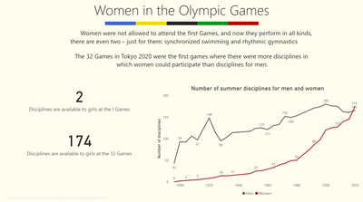
Not only the number of participants of the Olympic Games is growing, but also the number of disciplines in which they can participate. Now at the Summer Games, girls participate in 174 sports, instead of 2.
Women were not allowed to attend the first Games, and now they perform in all kinds, there are even two – only for them: synchronized swimming and rhythmic gymnastics
In Atlanta in 1996, 34% of the participants were women, and at the Tokyo Games the representation grew to 48.8% - this is a record. It is planned that already in Paris-2024 there will be a perfect balance.
eyJrIjoiZTM3ZmFmMjQtMGU4NC00MGFkLTlkNjAtYzBiYmJjNDhlMDM3IiwidCI6IjZiZTgxZjIwLWFlY2MtNGQyZC1hMTM0LWJmZWJlOTAxODE4NCIsImMiOjl9
____________
⭐️ Fabric Group Channel
⭐️ Microsoft Fabric Community
Please join the Power BI UX/UI User Group if you need help with dashboard design and usability
Join to Data Governance User Group
Join to DENEB and Power BI Enthusiasts User Group
Join to Data Fabric Best Practices User Group
Subscribe to my medium blog
- Mark as New
- Bookmark
- Subscribe
- Mute
- Subscribe to RSS Feed
- Permalink
- Report Inappropriate Content
Simple and tasteful. Excellent design, nothing superfluous, and the information that the dashboard carries is also clear.
- Mark as New
- Bookmark
- Subscribe
- Mute
- Subscribe to RSS Feed
- Permalink
- Report Inappropriate Content
amazing design and quite an interesting topic for data analysis, very well done
- Mark as New
- Bookmark
- Subscribe
- Mute
- Subscribe to RSS Feed
- Permalink
- Report Inappropriate Content
This topic is very interesting!. I wish there was more material on it.
- Mark as New
- Bookmark
- Subscribe
- Mute
- Subscribe to RSS Feed
- Permalink
- Report Inappropriate Content
In my opinion, a little more information needs to be added to make the dashboard perfect.
- Mark as New
- Bookmark
- Subscribe
- Mute
- Subscribe to RSS Feed
- Permalink
- Report Inappropriate Content
In my opinion, this dashboard is very professional!
- Mark as New
- Bookmark
- Subscribe
- Mute
- Subscribe to RSS Feed
- Permalink
- Report Inappropriate Content
Interesting information, beautiful design! It would be better to add a separation between the graphs so that they do not merge with each other and it is easier to read
- Mark as New
- Bookmark
- Subscribe
- Mute
- Subscribe to RSS Feed
- Permalink
- Report Inappropriate Content
I would like to see a little more graphs, but in general the work is very interesting and pleasing to the eye.
- Mark as New
- Bookmark
- Subscribe
- Mute
- Subscribe to RSS Feed
- Permalink
- Report Inappropriate Content
Very interesting information, good job!
- Mark as New
- Bookmark
- Subscribe
- Mute
- Subscribe to RSS Feed
- Permalink
- Report Inappropriate Content
When everything has a consistent structure, it is easier for users to work with the interface — they find everything where they expect. Thanks!
- Mark as New
- Bookmark
- Subscribe
- Mute
- Subscribe to RSS Feed
- Permalink
- Report Inappropriate Content
A very interesting dashboard. I would be interested to know which sport is most popular among women
- Mark as New
- Bookmark
- Subscribe
- Mute
- Subscribe to RSS Feed
- Permalink
- Report Inappropriate Content
Understandable visualization and interesting topic
- Mark as New
- Bookmark
- Subscribe
- Mute
- Subscribe to RSS Feed
- Permalink
- Report Inappropriate Content
Very interesting topic!


