Re: The analysis of data on chocolate bars
07-05-2022 11:22 AM
- Mark as New
- Bookmark
- Subscribe
- Mute
- Subscribe to RSS Feed
- Permalink
- Report Inappropriate Content
The analysis of data on chocolate bars
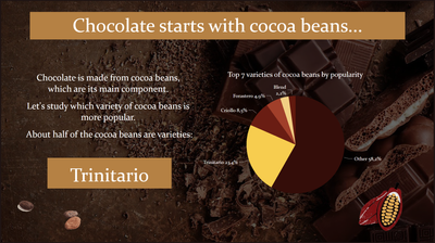
You are given 5 screens on the questions of cocoa beans in chocolate bars, and you can answer the questions: which cocoa beans are used in chocolate, which is the most popular variety of cocoa beans in the world, which countries are the origin of cocoa beans, what percentage of cocoa content in chocolate bars.
This dashboard is based on real data and made as part of the curriculum.
Made by a student at St. Petersburg State Technological University, Faculty of Economics and Management, direction "Business Informatics" Alexander Yolohov.
During the analysis, we came to different results on the design:
- Chocolate is created from cocoa beans, which is its main component. Consider seven varieties of cocoa beans
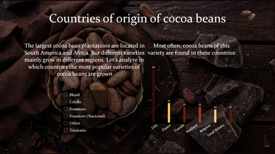
- The largest cocoa bean plantations are in South America and Africa. But different varieties grow in different regions. Consider a different variety of beans in different countries.
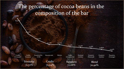
- Information on the percentage of cocoa beans in bars is also provided.
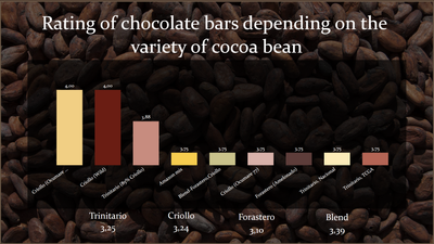
- Rating of chocolate bars depending on different varieties of cocoa beans.
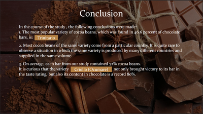
During the study, the following conclusions were made:
The most popular variety of cocoa beans, which was found in 46.6 percent of chocolate bars, is: Trinitario
Most cocoa beans of the same variety come from a particular country.
It is quite rare to observe a situation in which the same variety is produced by many different countries and supplied in the same volume.
On average, each bar from our study contained 72% cocoa beans.
Curiously, the Criollo (Ocumare) variety not only brought victory to its bar in the taste rating, but also its content in chocolate is a record 80%.
____________
⭐️ Fabric Group Channel
⭐️ Microsoft Fabric Community
Please join the Power BI UX/UI User Group if you need help with dashboard design and usability
Join to Data Governance User Group
Join to DENEB and Power BI Enthusiasts User Group
Join to Data Fabric Best Practices User Group
Subscribe to my medium blog
- Mark as New
- Bookmark
- Subscribe
- Mute
- Subscribe to RSS Feed
- Permalink
- Report Inappropriate Content
This is super interesting! I didn’t realize Trinitario beans are in nearly half of chocolate bars, and the Criollo variety with 80% cocoa sounds amazing. Cool insights on how different regions influence flavor! Thanks for sharing!
- Mark as New
- Bookmark
- Subscribe
- Mute
- Subscribe to RSS Feed
- Permalink
- Report Inappropriate Content
@authorjames248 Thanks!
____________
⭐️ Fabric Group Channel
⭐️ Microsoft Fabric Community
Please join the Power BI UX/UI User Group if you need help with dashboard design and usability
Join to Data Governance User Group
Join to DENEB and Power BI Enthusiasts User Group
Join to Data Fabric Best Practices User Group
Subscribe to my medium blog
- Mark as New
- Bookmark
- Subscribe
- Mute
- Subscribe to RSS Feed
- Permalink
- Report Inappropriate Content
Hello there Alex, great job with your visuals and storytelling. I have learned a lot from your project.
You however mixed up some of the information from the data. The country column you used for the "countries of origin of cocoa beans" is rather the list of countries who use the beans to make chocolate bars i.e. countries in chocolate bar production. The correct country column (i.e. predominantly South American and African Countries who produce the beans) is supposed to have countries like Venezuela, Ghana, Peru, Ecuador, Togo, etc which you named "The country of origin of the bean" in your table.
Kudos to you!
- Mark as New
- Bookmark
- Subscribe
- Mute
- Subscribe to RSS Feed
- Permalink
- Report Inappropriate Content
@Anonymous Thanks for the comments! I think it will be possible to make changes in the next version for this dashboard.
____________
⭐️ Fabric Group Channel
⭐️ Microsoft Fabric Community
Please join the Power BI UX/UI User Group if you need help with dashboard design and usability
Join to Data Governance User Group
Join to DENEB and Power BI Enthusiasts User Group
Join to Data Fabric Best Practices User Group
Subscribe to my medium blog
- Mark as New
- Bookmark
- Subscribe
- Mute
- Subscribe to RSS Feed
- Permalink
- Report Inappropriate Content
The page backgrounds and colors are great and look very appetizing.
- Mark as New
- Bookmark
- Subscribe
- Mute
- Subscribe to RSS Feed
- Permalink
- Report Inappropriate Content
Perfectly matched background for each picture! In addition, the colors of the graphs that match the background are well chosen
- Mark as New
- Bookmark
- Subscribe
- Mute
- Subscribe to RSS Feed
- Permalink
- Report Inappropriate Content
I learned a little more about my favorite chocolate, very interesting information and beautiful design. Alexander, you have a talent
- Mark as New
- Bookmark
- Subscribe
- Mute
- Subscribe to RSS Feed
- Permalink
- Report Inappropriate Content
The information was well presented and the color scheme is well chosen
- Mark as New
- Bookmark
- Subscribe
- Mute
- Subscribe to RSS Feed
- Permalink
- Report Inappropriate Content
A very interesting dashboard, not to mention the fact that I love chocolate
- Mark as New
- Bookmark
- Subscribe
- Mute
- Subscribe to RSS Feed
- Permalink
- Report Inappropriate Content
Interesting choice of theme! but sometimes the data is difficult to read because of the dark colors
- Mark as New
- Bookmark
- Subscribe
- Mute
- Subscribe to RSS Feed
- Permalink
- Report Inappropriate Content
A very appetizing dashboard.
- Mark as New
- Bookmark
- Subscribe
- Mute
- Subscribe to RSS Feed
- Permalink
- Report Inappropriate Content
Great job, but in some places the information is hard to see due to the dark colors of the dashboard.
- Mark as New
- Bookmark
- Subscribe
- Mute
- Subscribe to RSS Feed
- Permalink
- Report Inappropriate Content
I really liked the design, a lot of informative information
- Mark as New
- Bookmark
- Subscribe
- Mute
- Subscribe to RSS Feed
- Permalink
- Report Inappropriate Content
A good choice of chart types. Great design!
- Mark as New
- Bookmark
- Subscribe
- Mute
- Subscribe to RSS Feed
- Permalink
- Report Inappropriate Content
Love the variety of pictures on the background!
- Mark as New
- Bookmark
- Subscribe
- Mute
- Subscribe to RSS Feed
- Permalink
- Report Inappropriate Content
Beautiful color palette!
- Mark as New
- Bookmark
- Subscribe
- Mute
- Subscribe to RSS Feed
- Permalink
- Report Inappropriate Content
Why didn't you use a tree matrix when visualizing countries?
- Mark as New
- Bookmark
- Subscribe
- Mute
- Subscribe to RSS Feed
- Permalink
- Report Inappropriate Content
Will think about it😉
____________
⭐️ Fabric Group Channel
⭐️ Microsoft Fabric Community
Please join the Power BI UX/UI User Group if you need help with dashboard design and usability
Join to Data Governance User Group
Join to DENEB and Power BI Enthusiasts User Group
Join to Data Fabric Best Practices User Group
Subscribe to my medium blog
- Mark as New
- Bookmark
- Subscribe
- Mute
- Subscribe to RSS Feed
- Permalink
- Report Inappropriate Content
Good design!


