- Power BI forums
- Updates
- News & Announcements
- Get Help with Power BI
- Desktop
- Service
- Report Server
- Power Query
- Mobile Apps
- Developer
- DAX Commands and Tips
- Custom Visuals Development Discussion
- Health and Life Sciences
- Power BI Spanish forums
- Translated Spanish Desktop
- Power Platform Integration - Better Together!
- Power Platform Integrations (Read-only)
- Power Platform and Dynamics 365 Integrations (Read-only)
- Training and Consulting
- Instructor Led Training
- Dashboard in a Day for Women, by Women
- Galleries
- Community Connections & How-To Videos
- COVID-19 Data Stories Gallery
- Themes Gallery
- Data Stories Gallery
- R Script Showcase
- Webinars and Video Gallery
- Quick Measures Gallery
- 2021 MSBizAppsSummit Gallery
- 2020 MSBizAppsSummit Gallery
- 2019 MSBizAppsSummit Gallery
- Events
- Ideas
- Custom Visuals Ideas
- Issues
- Issues
- Events
- Upcoming Events
- Community Blog
- Power BI Community Blog
- Custom Visuals Community Blog
- Community Support
- Community Accounts & Registration
- Using the Community
- Community Feedback
Register now to learn Fabric in free live sessions led by the best Microsoft experts. From Apr 16 to May 9, in English and Spanish.
- Power BI forums
- Galleries
- Data Stories Gallery
- Sales modelling
- Mark as New
- Bookmark
- Subscribe
- Mute
- Subscribe to RSS Feed
- Permalink
- Report Inappropriate Content
Sales modelling
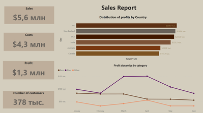
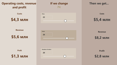
A dataset was chosen as a case study for this work, which includes information about the sales of KEE'S CHOCOLATES. The final work includes two dashboards: a sales report in the company, which is needed to visualize the main indicators of this process, and a "What if?" model, which is necessary in order to track the impact of various dynamics on the main indicators.
A thematic data set was found and processed. After connecting it to power bi, two dashboards were built.
The first dashboard is a simple collection of graphs forming a sales report for 2020. The composition of the screen includes:
- Pie chart with the distribution of profits by country
- 4 Cards showing profit, costs, revenue and number of customers
- A graph showing the dynamics of revenue by category
The second dashboard was created using the "What if?" function and it consists of:
- Actual cost, revenue and profit cards
- Cards of projected costs, revenue and profit
- Cost, revenue and profit cross-sections that reflect the planned change in indicators as a percentage
The created dashboard is designed for financial forecasting. It is able to help in building a plan, assessing the profitability of changes in indicators with an increase in cost prices.
eyJrIjoiOWMxNzBkYzYtM2YyYS00YTJmLTlhYzAtYjJiOTJjY2I4MWY2IiwidCI6IjZiZTgxZjIwLWFlY2MtNGQyZC1hMTM0LWJmZWJlOTAxODE4NCIsImMiOjl9
____________
Please join the Power BI UX/UI User Group if you need help with dashboard design and usability
Join to Data Governance User Group
Join to DENEB and Power BI Enthusiasts User Group
Join to Data Fabric Best Practices User Group
Subscribe to my medium blog
- Mark as New
- Bookmark
- Subscribe
- Mute
- Subscribe to RSS Feed
- Permalink
- Report Inappropriate Content
I love these color combinations, so this dashboard was very attractive. The filters are unusual and surprisingly comfortable. Thank you for your work
- Mark as New
- Bookmark
- Subscribe
- Mute
- Subscribe to RSS Feed
- Permalink
- Report Inappropriate Content
The filters on the second page look interesting, good job!
- Mark as New
- Bookmark
- Subscribe
- Mute
- Subscribe to RSS Feed
- Permalink
- Report Inappropriate Content
A little dull palette of colors, but fits the theme. Interesting choice of visualization of the second slide
- Mark as New
- Bookmark
- Subscribe
- Mute
- Subscribe to RSS Feed
- Permalink
- Report Inappropriate Content
An excellent idea of sales modeling, as well as a well-chosen color palette!


