I hope everyone is keeping safe and well during these turbulent times. Almost three weeks into lockdown in the UK, I have finally got around to finishing a Coronavirus dashboard for England in relation to Coronavirus cases reported. If time permits, I will extend this dashboard to the rest of UK.
The reason behind this dashboard was to demonstrate the visibility of the "Corona growth curve" at a regional/local authority level: a reminder of how important it is to stay at home to flatten the curve. We have all seen this curve (too) many times at national level, but I was very curious to see what was going on regionally.
The data source is Public Health England and I have pulled in some some census information (population/household data) to create some metrics such as "cases per 10,000 people". The census was, unfortunately, almost 9 years ago, so this stat should be taken more as a guideline than actual fact. Also, the main source of the data is Public Health England, which itself has some caveats as not all cases are reported or tested. There is also no access to information related to mortality or recovery rates at a regional/local authority level, with this information being reported at national level only.
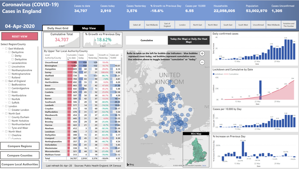
Below are a few snippets from the report:
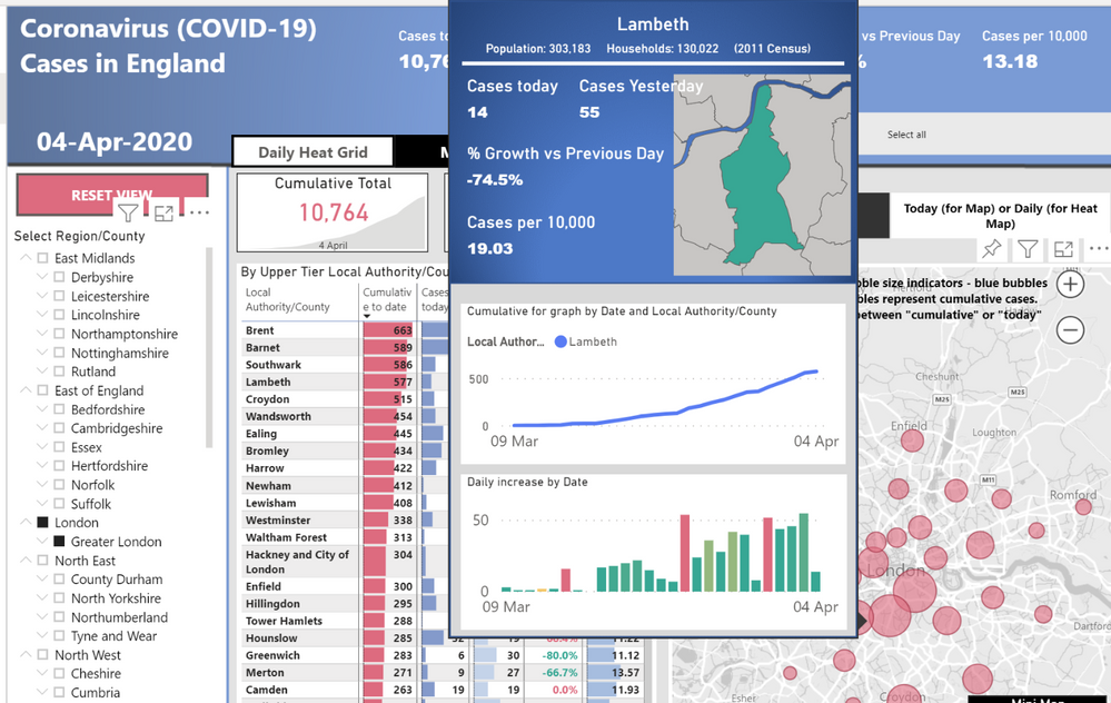
Main Page (with selection slicers along the left). Toggle between "Daily Heat Grid" or "Map" and hover over map for additional data points (Lambeth shown below)
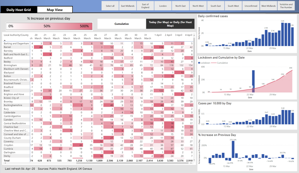
The "Daily Heat Grid" (below) can be viewed at a daily or cumulative level. The dark red denotes an increase of more than 500% from the previous day:
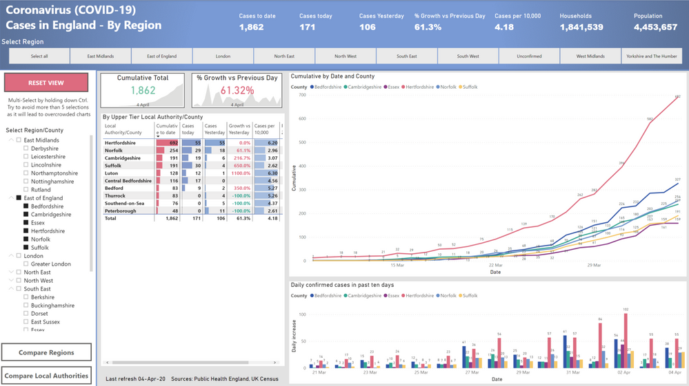
Comparison by region (with County and Local authority also included):
The report is fully interactive, allowing you to view the "curve" and compare it to any region/local authority of your choice. Unfortunately, Public Health England use a combination of Local Authority and County level information so some areas are not as transparent as others. Also puzzling, is the fact that Hackney is combined with the local authority "City of London".
One conclusion I can draw which is clear from the data, is that some regions should have been in lockdown earlier (Birmingham/Hampshire being prime examples).
Data Sources:
https://fingertips.phe.org.uk/documents/Historic%20COVID-19%20Dashboard%20Data.xlsx
https://www.ons.gov.uk/census/2011census


