Get Fabric or SQL Certified for Free.
Get certified for free when you join Fabric Data Days 2026 and dive into Fabric, Power BI, SQL, AI, and other essential data skills.
Join now- Power BI forums
- Get Help with Power BI
- Desktop
- Service
- Report Server
- Power Query
- Mobile Apps
- Developer
- DAX Commands and Tips
- Custom Visuals Development Discussion
- Health and Life Sciences
- Power BI Spanish forums
- Translated Spanish Desktop
- Training and Consulting
- Instructor Led Training
- Dashboard in a Day for Women, by Women
- Galleries
- Data Stories Gallery
- Themes Gallery
- Contests Gallery
- QuickViz Gallery
- Quick Measures Gallery
- Visual Calculations Gallery
- Notebook Gallery
- Translytical Task Flow Gallery
- TMDL Gallery
- R Script Showcase
- Webinars and Video Gallery
- Ideas
- Custom Visuals Ideas (read-only)
- Issues
- Issues
- Events
- Upcoming Events
Data Days is here! Join us now for 60+ days of learning, challenges, and connection. Learn more
- Power BI forums
- Galleries
- Data Stories Gallery
- Parallel Coordinates Example
Your file has been submitted successfully. We’re processing it now - please check back in a few minutes to view your report.
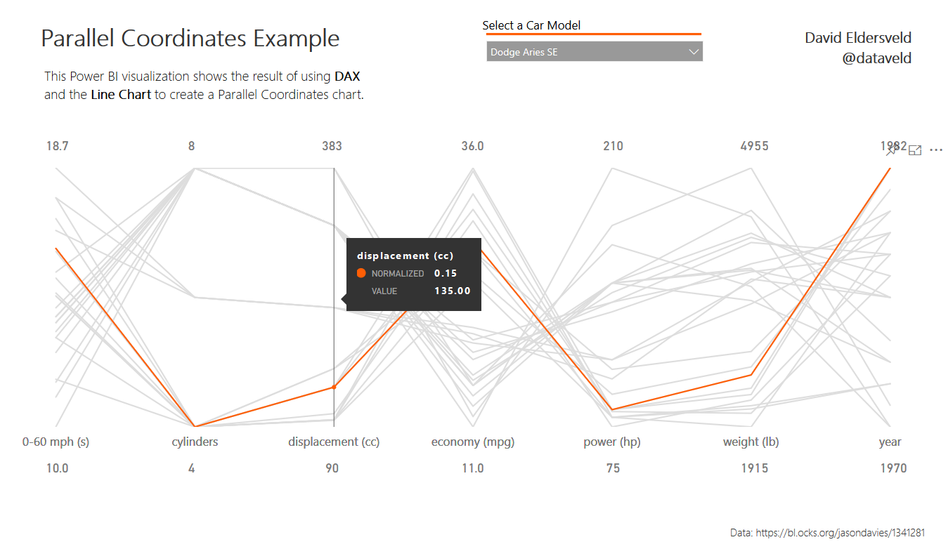
Parallel Coordinates Example
07-30-2017 06:42 AM - last edited 10-01-2019 12:45 PM


- Mark as New
- Bookmark
- Subscribe
- Mute
- Subscribe to RSS Feed
- Permalink
- Report Inappropriate Content
Parallel Coordinates Example
This Parallel Coordinates plot uses DAX to normalize the scale for each category. The visual itself uses two overlaid Line Charts to achieve the grey background and orange highlight when selecting an automobile model. The DAX used for normalizing the data is available here: https://dataveld.com/2017/07/29/using-dax-to-normalize-data-in-power-bi/
eyJrIjoiNGM5NTJjMmQtZjZlOS00YjZjLWIwOGItZTlkNTJiMDM2YzNlIiwidCI6ImFjYzhhYWE1LWYxOTEtNDgyZi05MjFiLWNmNmMzM2E1ODgzMiIsImMiOjF9