Join us at the 2025 Microsoft Fabric Community Conference
Microsoft Fabric Community Conference 2025, March 31 - April 2, Las Vegas, Nevada. Use code FABINSIDER for a $400 discount.
Register now- Power BI forums
- Get Help with Power BI
- Desktop
- Service
- Report Server
- Power Query
- Mobile Apps
- Developer
- DAX Commands and Tips
- Custom Visuals Development Discussion
- Health and Life Sciences
- Power BI Spanish forums
- Translated Spanish Desktop
- Training and Consulting
- Instructor Led Training
- Dashboard in a Day for Women, by Women
- Galleries
- Webinars and Video Gallery
- Data Stories Gallery
- Themes Gallery
- Power BI DataViz World Championships Gallery
- Quick Measures Gallery
- R Script Showcase
- COVID-19 Data Stories Gallery
- Community Connections & How-To Videos
- 2021 MSBizAppsSummit Gallery
- 2020 MSBizAppsSummit Gallery
- 2019 MSBizAppsSummit Gallery
- Events
- Ideas
- Custom Visuals Ideas (read-only)
- Issues
- Issues
- Events
- Upcoming Events
The Power BI DataViz World Championships are on! With four chances to enter, you could win a spot in the LIVE Grand Finale in Las Vegas. Show off your skills.
- Power BI forums
- Galleries
- Data Stories Gallery
- OV UNV Data Challenge - Andrew Yap
OV UNV Data Challenge - Andrew Yap
06-14-2020 04:30 AM - last edited 06-17-2020 23:01 PM


- Mark as New
- Bookmark
- Subscribe
- Mute
- Subscribe to RSS Feed
- Permalink
- Report Inappropriate Content
OV UNV Data Challenge - Andrew Yap
Hey there!
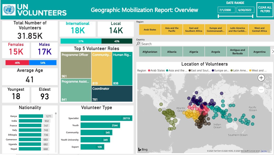
Every year, roughly 3000 selfless United Nations Volunteers offer their time and expertise to make the world a better place.
On behalf of United Nations, this simple interactive dashboard was created to serve as an easily accessible platform to provide key insights regarding the geographic mobilization and demographics of the volunteers. Built with intuitive filters, users can look into specific groups of volunteers to better understand the operations the volunteers are involved in during their work with UN.
Content of each page is as follows:
Page 1: Overview: Snapshot of all essential numbers and information that are commonly asked for
Page 2: Demographic Deep Dive: Trends and key information of key demographic groups
Page 3: Organization Deep Dive: Specific look into UN subsidiaries to track areas of operations
Please give it a kudos if you found it interesting and have a great day ahead! 😊
Also, I would love to have some feedback on the user experience of this dashboard, feel free to comment so we can all learn to improve as a community!
eyJrIjoiNzkzMTM5NTQtZGJkOC00NDZmLWI4YTYtZjFjMzA1YmMxNTNkIiwidCI6IjA2ODQ3YTc5LTUwYjUtNDM2MC1iYjhlLTYzNTc1M2Y4MzEyOSIsImMiOjEwfQ%3D%3D
- Mark as New
- Bookmark
- Subscribe
- Mute
- Subscribe to RSS Feed
- Permalink
- Report Inappropriate Content
great work and thanks for sharing the file !
- Mark as New
- Bookmark
- Subscribe
- Mute
- Subscribe to RSS Feed
- Permalink
- Report Inappropriate Content
Great work! All three tabs are showing very meaningful and impactful insights. The areas of operation feature in the 3rd page where you can filter the heatmap based on organizations is great!
- Mark as New
- Bookmark
- Subscribe
- Mute
- Subscribe to RSS Feed
- Permalink
- Report Inappropriate Content
Very interesting! Good way to segregate information for ease of access in obtaining data. Love the colour you choose haha.