- Power BI forums
- Updates
- News & Announcements
- Get Help with Power BI
- Desktop
- Service
- Report Server
- Power Query
- Mobile Apps
- Developer
- DAX Commands and Tips
- Custom Visuals Development Discussion
- Health and Life Sciences
- Power BI Spanish forums
- Translated Spanish Desktop
- Power Platform Integration - Better Together!
- Power Platform Integrations (Read-only)
- Power Platform and Dynamics 365 Integrations (Read-only)
- Training and Consulting
- Instructor Led Training
- Dashboard in a Day for Women, by Women
- Galleries
- Community Connections & How-To Videos
- COVID-19 Data Stories Gallery
- Themes Gallery
- Data Stories Gallery
- R Script Showcase
- Webinars and Video Gallery
- Quick Measures Gallery
- 2021 MSBizAppsSummit Gallery
- 2020 MSBizAppsSummit Gallery
- 2019 MSBizAppsSummit Gallery
- Events
- Ideas
- Custom Visuals Ideas
- Issues
- Issues
- Events
- Upcoming Events
- Community Blog
- Power BI Community Blog
- Custom Visuals Community Blog
- Community Support
- Community Accounts & Registration
- Using the Community
- Community Feedback
Earn a 50% discount on the DP-600 certification exam by completing the Fabric 30 Days to Learn It challenge.
- Power BI forums
- Galleries
- Data Stories Gallery
- Nate Barber's USA, State and County Level COVID-19...
Nate Barber's USA, State and County Level COVID-19 Projections
04-06-2020 15:46 PM - last edited 04-28-2020 10:02 AM


- Mark as New
- Bookmark
- Subscribe
- Mute
- Subscribe to RSS Feed
- Permalink
- Report Inappropriate Content
Nate Barber's USA, State and County Level COVID-19 Projections
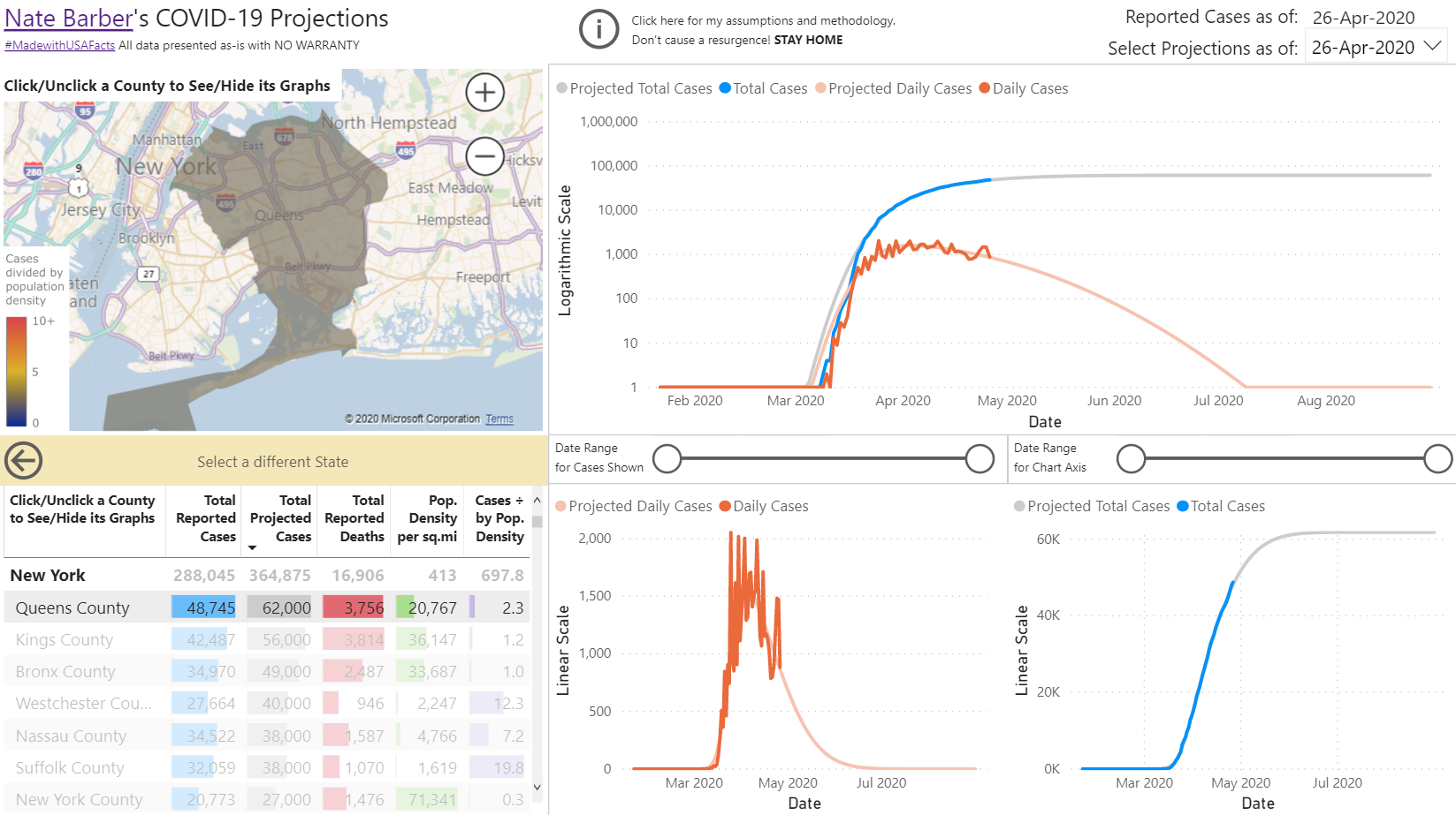
I have worked with statistics and projections my entire career, so I created a dashboard using @USAFacts data to try to help the average Joe understand how COVID-19 is progressing. Please let me know what you think of it and if it’s worth sharing. #MadewithUSAFacts
http://covid-19.opgrade.com/projections
The goal is to help as many people as possible make informed, rational decisions.
eyJrIjoiMjQ0MjZhNTktOTEyMi00ZDQwLTlhZjUtNGEwOTk3YzE5MDEzIiwidCI6ImI4NDlhOWMwLWUyNzQtNDNiOS1iZGFhLThiMWRjZDIzYzE3OSIsImMiOjN9
- Mark as New
- Bookmark
- Subscribe
- Mute
- Subscribe to RSS Feed
- Permalink
- Report Inappropriate Content
Great job my friend. i like the how you put it very simply.
i was wondering if you could please share the pbix file .
- Mark as New
- Bookmark
- Subscribe
- Mute
- Subscribe to RSS Feed
- Permalink
- Report Inappropriate Content
The report continues to evolve, and I have several additions I intend to make over the next several weeks. Until the report design stabilizes, I do not intend to share the pbix file. After that, I will make it public.
If you have ideas to improve this report, please share them!