New Offer! Become a Certified Fabric Data Engineer
Check your eligibility for this 50% exam voucher offer and join us for free live learning sessions to get prepared for Exam DP-700.
Get Started- Power BI forums
- Get Help with Power BI
- Desktop
- Service
- Report Server
- Power Query
- Mobile Apps
- Developer
- DAX Commands and Tips
- Custom Visuals Development Discussion
- Health and Life Sciences
- Power BI Spanish forums
- Translated Spanish Desktop
- Training and Consulting
- Instructor Led Training
- Dashboard in a Day for Women, by Women
- Galleries
- Community Connections & How-To Videos
- COVID-19 Data Stories Gallery
- Themes Gallery
- Data Stories Gallery
- R Script Showcase
- Webinars and Video Gallery
- Quick Measures Gallery
- 2021 MSBizAppsSummit Gallery
- 2020 MSBizAppsSummit Gallery
- 2019 MSBizAppsSummit Gallery
- Events
- Ideas
- Custom Visuals Ideas
- Issues
- Issues
- Events
- Upcoming Events
Don't miss out! 2025 Microsoft Fabric Community Conference, March 31 - April 2, Las Vegas, Nevada. Use code MSCUST for a $150 discount. Prices go up February 11th. Register now.
- Power BI forums
- Galleries
- Data Stories Gallery
- Re: Facebook Power BI Report
- Mark as New
- Bookmark
- Subscribe
- Mute
- Subscribe to RSS Feed
- Permalink
- Report Inappropriate Content
Facebook Power BI Report
Facebook is one of the most important channels on social media for to many companies. But handle all the Data that Facebook give you by its API is very hard and sometimes confusing, but in this interactive report I will show you another way to see Facebook Insights using a clear and simple but strong design to help you see if your marketing efforts are going well. This is just one of another 7 reports I designed for Facebook, Twitter, Pinterest, Youtube and Instagram on Power BI. But Colors, Shapes and Charts is just one part of this report, behind you will see Power query data modeling, DAX formulas, relationships etc. I hope you enjoy it.
Learn more about this report from the author by watching this video: https://www.youtube.com/watch?v=C2z-hj3J_Bs
eyJrIjoiYzlkYTE1YTAtY2RlMS00YWQ0LThlZDMtZTdiZmVlYmViNDY0IiwidCI6IjU3NGMzZTU2LTQ5MjQtNDAwNC1hZDFhLWQ4NDI3ZTdkYjI0MSIsImMiOjZ9
- Mark as New
- Bookmark
- Subscribe
- Mute
- Subscribe to RSS Feed
- Permalink
- Report Inappropriate Content
Hi, cannot see your power BI
- Mark as New
- Bookmark
- Subscribe
- Mute
- Subscribe to RSS Feed
- Permalink
- Report Inappropriate Content
would be possible to make the PBIX file available ?
- Mark as New
- Bookmark
- Subscribe
- Mute
- Subscribe to RSS Feed
- Permalink
- Report Inappropriate Content
Hello Mykhael,
Great report. How were you able to calculate M/M and Y/Y percentage changes and make these dynamic based on the date range selected? Your help is greatly appreciated.
Thanks,
Ben
- Mark as New
- Bookmark
- Subscribe
- Mute
- Subscribe to RSS Feed
- Permalink
- Report Inappropriate Content
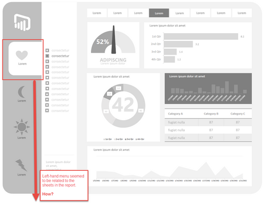
Hi Mykhael, I was fortunate to attend your demonstration on the webinar 'How to Design Visually Stunning Reports in Power BI' on Tuesday. I must say I am impressed with your work! I noticed that you seemed to be using links within a report using objects in the left-hand menu -
if so; could you describe how you would relate the menu to the report-sheets?
Thanks and kudos to you! ![]()
- Mark as New
- Bookmark
- Subscribe
- Mute
- Subscribe to RSS Feed
- Permalink
- Report Inappropriate Content
Hello @Anonymous,
Right now there is not a way to use an object to link the report to another page... the left-hand menu you are talking about it's just a reference, to let you know the title of the data information, it's just a way to make the reports looks beutiful, BUT, nothing is impossible and we can emulate the effect and create a REAL left-hand menu that change the pages and relate them. But I am working on that. If I find out a very friendly way to make it real, I will let you know ASAP.
Until that happen check the report you saw in the webinar, as you can see is not a Slicer or anything that change the data or pages, is just a "reference" area.
- Mark as New
- Bookmark
- Subscribe
- Mute
- Subscribe to RSS Feed
- Permalink
- Report Inappropriate Content
@Mykhael I notice in your reports you use a https://app.powerbi.com/view?r= type URL.
How do you get the r= querystring value?
- Mark as New
- Bookmark
- Subscribe
- Mute
- Subscribe to RSS Feed
- Permalink
- Report Inappropriate Content
Hello @Anonymous,
I cant see your Link, what are you talking about? can you send me a screenshot?
Best
- Mark as New
- Bookmark
- Subscribe
- Mute
- Subscribe to RSS Feed
- Permalink
- Report Inappropriate Content
Hi Mykhael,
Great job! I have one question.
Is there any way to grap data like gender or age from Facebook poll inside groups or events like on Sheet 4 of your report.
Thank you in advance.
Best
- Mark as New
- Bookmark
- Subscribe
- Mute
- Subscribe to RSS Feed
- Permalink
- Report Inappropriate Content
Great stuff
2 questions:
1. How did you create the StoryTellers by city bar chart wih labels to the right of the bars? I tried using the legend, but my legend line items do not line up as well as yours to the bars in chart.
2. My tooltip on bar chart seems to only show 2 values. The [Vakue] field and only one of my items in the Axis list (the first item) Your tooltip shows items.
thoughts? Thanks again as always for your contributions and quick repsonses. Best
- Mark as New
- Bookmark
- Subscribe
- Mute
- Subscribe to RSS Feed
- Permalink
- Report Inappropriate Content
Hello @tanckc,
aswering your questions:
1. Select your Horizontal Bar Chart, then go to "Edit" (the yellow pencil located into the right panel), expand Y-Axis, and change the "Position" from left to right.
2. Can you show me a screenshot to understand quite better what you are talking about?
Sorry to replied you until now. Best
- Mark as New
- Bookmark
- Subscribe
- Mute
- Subscribe to RSS Feed
- Permalink
- Report Inappropriate Content
great stuff
how do you get everything to line up/align so well....?
for example your page insights table page (in facebook demo)
Best
- Mark as New
- Bookmark
- Subscribe
- Mute
- Subscribe to RSS Feed
- Permalink
- Report Inappropriate Content
Hello @tanckc,
I designed this report in November 2015, in that moment I used an horizontal line as reference, but now you can align easyly from the visual tools "Format". 🙂
Greetings
- Mark as New
- Bookmark
- Subscribe
- Mute
- Subscribe to RSS Feed
- Permalink
- Report Inappropriate Content
Hey Mykhael
great work - how do you get he rounded edges on your charts and cards?
Best - tanckc@hotmail.com
- Mark as New
- Bookmark
- Subscribe
- Mute
- Subscribe to RSS Feed
- Permalink
- Report Inappropriate Content
The trick is very simple, those rounded squares are just that.... 1. Select shapes from the top panel. 2. Choose the square shape. 3. Select edit from the right panel (the icon is a little yellow pencil) 4. Go to General. 5. Change the rounded number. And that's it. You can change the line and shape color as well. Then you can overlay a chart or card to create the effect... If this answer helped you please give me a like and mark this answer as solution to help others. If you are interested in more tricks like this I invite you to check my posts here into the showcases, or you can email me and I can invite you in one of the conferences I speak about designing Power Bi reports. mmyers@redwaves.onmicrosoft.com
Best
- Mark as New
- Bookmark
- Subscribe
- Mute
- Subscribe to RSS Feed
- Permalink
- Report Inappropriate Content
I tried this. But I am not able to see any option for rounded number. I can only see X Position, Y Position, Width, Height.
- Mark as New
- Bookmark
- Subscribe
- Mute
- Subscribe to RSS Feed
- Permalink
- Report Inappropriate Content
Hi @vanessa,
It is very easy, let me explain you.
1. Select the shape
2. Go to the Format Shape Panel (it's in your right)
3. Select "Line"
4. change the "Round Edges" Percentage
That's it...
I hope this helped you, anything else let me know OK?
- Mark as New
- Bookmark
- Subscribe
- Mute
- Subscribe to RSS Feed
- Permalink
- Report Inappropriate Content
Hey Mykhael,
Congrats on a really beautiful report. I love the 1 to 20 navigation pane that you set up at the bottom of the report/dashboard and was wondering how you accomplished that. It's a really effective way to tell a story with data and I'd love to be able to use it too.
Thanks,
Sean
- Mark as New
- Bookmark
- Subscribe
- Mute
- Subscribe to RSS Feed
- Permalink
- Report Inappropriate Content
Congratulations for your dashboard @Mykhael
It´s amazing. Clear and very intuitive.
I would like to know how you calculate the forecast on page 19 and how you make the graph.
Thanks!
- Mark as New
- Bookmark
- Subscribe
- Mute
- Subscribe to RSS Feed
- Permalink
- Report Inappropriate Content
Hi Mykhael, congrats on that spectacular FB report!
Iam assuming that you are not using the FB connector on the power bi sources, right? Are you using fb page stats and loading it to a Database? Is it possible using power bi connector to build a report similar to yours?
Thanks!
- Mark as New
- Bookmark
- Subscribe
- Mute
- Subscribe to RSS Feed
- Permalink
- Report Inappropriate Content
Hello @chonox,
My apologize, I remember I told you the FB connector is not good enough to creat a good report around Facebook Insights. I was totally wrong, you can create a better report than this one using the FB connector, How do I know that?, because I am working right now using it, and I can tell you... It's AMAZING!!!, So I change my answer...
The answer is YES you can, and BETTER than this.
Best
Miguel


