Join us at the 2025 Microsoft Fabric Community Conference
March 31 - April 2, 2025, in Las Vegas, Nevada. Use code MSCUST for a $150 discount! Early bird discount ends December 31.
Register Now- Power BI forums
- Get Help with Power BI
- Desktop
- Service
- Report Server
- Power Query
- Mobile Apps
- Developer
- DAX Commands and Tips
- Custom Visuals Development Discussion
- Health and Life Sciences
- Power BI Spanish forums
- Translated Spanish Desktop
- Training and Consulting
- Instructor Led Training
- Dashboard in a Day for Women, by Women
- Galleries
- Community Connections & How-To Videos
- COVID-19 Data Stories Gallery
- Themes Gallery
- Data Stories Gallery
- R Script Showcase
- Webinars and Video Gallery
- Quick Measures Gallery
- 2021 MSBizAppsSummit Gallery
- 2020 MSBizAppsSummit Gallery
- 2019 MSBizAppsSummit Gallery
- Events
- Ideas
- Custom Visuals Ideas
- Issues
- Issues
- Events
- Upcoming Events
Be one of the first to start using Fabric Databases. View on-demand sessions with database experts and the Microsoft product team to learn just how easy it is to get started. Watch now
- Power BI forums
- Galleries
- Data Stories Gallery
- Countries ratings
- Mark as New
- Bookmark
- Subscribe
- Mute
- Subscribe to RSS Feed
- Permalink
- Report Inappropriate Content
Countries ratings
In the course of the work, an analysis was made of the cost-of-living data for 2020, 2021 and 2022. Made by a student of the St. Petersburg State Technological University, Faculty of Economics and Management, direction "Business Informatics" Azarenko Lyubov.
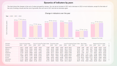
1. On the Dynamics page, the chart shows the changes in the sum of values grouped by measures. You can see an increase in 2021 and a decrease in 2022 in most indicators, except for the index of the cost of renting a house and the cost of groceries: the cost rose in 2021 and did not decrease again.
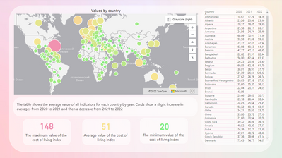
2. On the Map page. the table shows the average value of all indicators for each country by year. Cards show a slight increase in averages from 2020 to 2021 and then a decrease from 2021 to 2022
3. The page 2020-2021 matrix shows a matrix of data changes by country from 2020 to 2021, divided by indicators
eyJrIjoiMjFiZTg0NDEtYTE3YS00MGYyLTgzZjgtZmRjYjIwYTM4OWZkIiwidCI6IjZiZTgxZjIwLWFlY2MtNGQyZC1hMTM0LWJmZWJlOTAxODE4NCIsImMiOjl9
____________
⭐️ Fabric Group Channel
⭐️ Microsoft Fabric Community
Please join the Power BI UX/UI User Group if you need help with dashboard design and usability
Join to Data Governance User Group
Join to DENEB and Power BI Enthusiasts User Group
Join to Data Fabric Best Practices User Group
Subscribe to my medium blog
- Mark as New
- Bookmark
- Subscribe
- Mute
- Subscribe to RSS Feed
- Permalink
- Report Inappropriate Content
Great and informative visualization, but can`t help noticing lack of title list
- Mark as New
- Bookmark
- Subscribe
- Mute
- Subscribe to RSS Feed
- Permalink
- Report Inappropriate Content
Good design. The dashboard has a convenient and informative functionality.
- Mark as New
- Bookmark
- Subscribe
- Mute
- Subscribe to RSS Feed
- Permalink
- Report Inappropriate Content
It seems to me that this visualization is very useful for every citizen. Comparison shows how well we live.
- Mark as New
- Bookmark
- Subscribe
- Mute
- Subscribe to RSS Feed
- Permalink
- Report Inappropriate Content
I want to mention the amazing design of this dashboard. At the same time, it is quite informative and well-readable.


