Join us at the 2025 Microsoft Fabric Community Conference
Microsoft Fabric Community Conference 2025, March 31 - April 2, Las Vegas, Nevada. Use code FABINSIDER for a $400 discount.
Register now- Power BI forums
- Get Help with Power BI
- Desktop
- Service
- Report Server
- Power Query
- Mobile Apps
- Developer
- DAX Commands and Tips
- Custom Visuals Development Discussion
- Health and Life Sciences
- Power BI Spanish forums
- Translated Spanish Desktop
- Training and Consulting
- Instructor Led Training
- Dashboard in a Day for Women, by Women
- Galleries
- Webinars and Video Gallery
- Data Stories Gallery
- Themes Gallery
- Power BI DataViz World Championships Gallery
- Quick Measures Gallery
- R Script Showcase
- COVID-19 Data Stories Gallery
- Community Connections & How-To Videos
- 2021 MSBizAppsSummit Gallery
- 2020 MSBizAppsSummit Gallery
- 2019 MSBizAppsSummit Gallery
- Events
- Ideas
- Custom Visuals Ideas (read-only)
- Issues
- Issues
- Events
- Upcoming Events
The Power BI DataViz World Championships are on! With four chances to enter, you could win a spot in the LIVE Grand Finale in Las Vegas. Show off your skills.
- Power BI forums
- Galleries
- Data Stories Gallery
- Re: Choose your Power BI chart


- Mark as New
- Bookmark
- Subscribe
- Mute
- Subscribe to RSS Feed
- Permalink
- Report Inappropriate Content
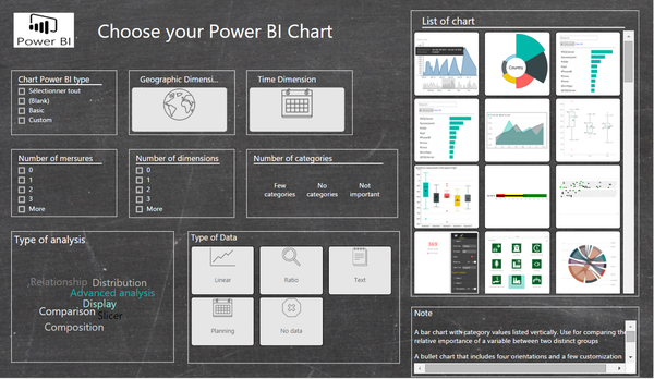
Choose your Power BI chart
Hello community
I would like to share with you a Power BI report, which can help you to choose the most suitable chart for your data. You must enter the properties of your data in the filter on the left, to obtain a list of graphics that put forward your data. You can also click on a chart to see easily its characteristics.
Note that this file must be updated, indeed the list of Power BI chart is not exhaustive.
Enjoy
eyJrIjoiODJjYmFkNmMtYzM4NS00NzkwLWE1OTktYTIyY2M2OTgyNTIyIiwidCI6ImYyYmNmYzBjLWI5YTctNDU1ZS05OTJjLTZlYTE4ZWYyYzcyZCIsImMiOjh9
- Mark as New
- Bookmark
- Subscribe
- Mute
- Subscribe to RSS Feed
- Permalink
- Report Inappropriate Content
This indeed is amazing. Can you share the PBIX file. Email ID: prathamesh.sable@gmail.com
Regards,
Prathamesh
- Mark as New
- Bookmark
- Subscribe
- Mute
- Subscribe to RSS Feed
- Permalink
- Report Inappropriate Content
Dear @cfunk I'ts great work !!
Could you please share the pbix file for this report,I really appreciate your effort.
Kindly do share at "inaki@myuax.com"
Thank You
- Mark as New
- Bookmark
- Subscribe
- Mute
- Subscribe to RSS Feed
- Permalink
- Report Inappropriate Content
Hi,
Very nice idea, to have knowledge on visuals in power bi. Could you Please share the .pbix file. So,that it will be helpful for learning about the visuals when to use which graph?
- Mark as New
- Bookmark
- Subscribe
- Mute
- Subscribe to RSS Feed
- Permalink
- Report Inappropriate Content
Nice work. Could you please share your resource file?
- Mark as New
- Bookmark
- Subscribe
- Mute
- Subscribe to RSS Feed
- Permalink
- Report Inappropriate Content
Hi,
Excellent ! i recognize "the visual reference for power BI"
Could you share with me ? fanny.shinka@gmail.com
Visuals evolve so much I can not understand how you have associated a visual with a type of use
Thank you !
- Mark as New
- Bookmark
- Subscribe
- Mute
- Subscribe to RSS Feed
- Permalink
- Report Inappropriate Content
Hi
execelent share
Could you share me
- Mark as New
- Bookmark
- Subscribe
- Mute
- Subscribe to RSS Feed
- Permalink
- Report Inappropriate Content
can you share the file to adithyanaini@gmail.com
- Mark as New
- Bookmark
- Subscribe
- Mute
- Subscribe to RSS Feed
- Permalink
- Report Inappropriate Content
Could you please share the pbix file, with efabiani@gmail.com. Thank you!! Regards
- Mark as New
- Bookmark
- Subscribe
- Mute
- Subscribe to RSS Feed
- Permalink
- Report Inappropriate Content
@cfunk, Handsome, great work. Would you mind to share the pbix file to me? I would likt start learn from here. It is very usefull.
Chengjie.li@nordanglia.com
- Mark as New
- Bookmark
- Subscribe
- Mute
- Subscribe to RSS Feed
- Permalink
- Report Inappropriate Content
Nice work cfunk. Would you please share the pbix file as well?
- Mark as New
- Bookmark
- Subscribe
- Mute
- Subscribe to RSS Feed
- Permalink
- Report Inappropriate Content
It's really unfortunate that this has not been maintained & the author appears to have been unresponsive. For anyone looking for a chart selector tool, this might be a better option: http://extremepresentation.typepad.com/blog/2006/09/choosing_a_good.html
- Mark as New
- Bookmark
- Subscribe
- Mute
- Subscribe to RSS Feed
- Permalink
- Report Inappropriate Content
Another option that is specific to Power BI (and more likely to be maintained since it is backed by Marco Russo and Alberto Ferrari): https://www.sqlbi.com/ref/power-bi-visuals-reference/
- Mark as New
- Bookmark
- Subscribe
- Mute
- Subscribe to RSS Feed
- Permalink
- Report Inappropriate Content
Hi !
It seemed to be quite interesting ... But sadly, it seems the images are broken ?
Is it just me ? Or otherwize, please repair the links 😉
I would have very liked to play around with this tool 🙂
Thanks in advance for your consideration and have a nice day !
- Mark as New
- Bookmark
- Subscribe
- Mute
- Subscribe to RSS Feed
- Permalink
- Report Inappropriate Content
Awesome this is what I've been looking for.
By any chance would you able to share the file?
- Mark as New
- Bookmark
- Subscribe
- Mute
- Subscribe to RSS Feed
- Permalink
- Report Inappropriate Content
This is an awesome tool. Do you have the pbix file?
- Mark as New
- Bookmark
- Subscribe
- Mute
- Subscribe to RSS Feed
- Permalink
- Report Inappropriate Content
Dear Cfunk,
Awesome report. It is possible to share the Pbix file?
Thanks
NH
- Mark as New
- Bookmark
- Subscribe
- Mute
- Subscribe to RSS Feed
- Permalink
- Report Inappropriate Content
Awesome chart, would really like it if you could share the .pbix file. I am trying to figure out the word cloud slicing! If you have already shared somewhere just point me in that direction.
Thanks!
- Mark as New
- Bookmark
- Subscribe
- Mute
- Subscribe to RSS Feed
- Permalink
- Report Inappropriate Content
Hello Cfunk,
Great work on 'Choose your Power BI chart'!! Please can you able to share the .pbix file which will be helpful for my learnings so I can expose more on PowerBI.
Thanks in advance.
- Mark as New
- Bookmark
- Subscribe
- Mute
- Subscribe to RSS Feed
- Permalink
- Report Inappropriate Content
Dear @cfunk,
Could you please share the pbix file for this report, I really appreciate your effort.
Kindly do share at "rahul.cs068@gmail.com"
Thank You
- Mark as New
- Bookmark
- Subscribe
- Mute
- Subscribe to RSS Feed
- Permalink
- Report Inappropriate Content
- Mark as New
- Bookmark
- Subscribe
- Mute
- Subscribe to RSS Feed
- Permalink
- Report Inappropriate Content
Ótimo design.
Sóbrio e acadêmico.
Talvez seja útil unir ainda mais os itens semelhantes (bordas iguais para conteúdos iguais).
Sucesso.