- Mark as New
- Bookmark
- Subscribe
- Mute
- Subscribe to RSS Feed
- Permalink
- Report Inappropriate Content
An analysis of the data F1 1950-2020
An analysis of the data "F1 1950-2020" was carried out.
You are presented with 4 screens with information about the best formula 1 saws. With this information, you can answer the questions: who became the champion the most times, who won the most and which team was the champion the most times.
It was made by Bulko Artem, a student at the St. Petersburg State Technological University, Faculty of Economics and Management, specialization "Business Informatics".
The first screen is a graph of the top 6 best drivers by wins. The screen includes:
- 1 graph
- 1 explanatory cards
The second screen is a graph of the top 10 best drivers by numbers of championship title and contains:
- 1 graph
- 1 explanatory cards
The third screen is a graph of the top 6 best teams by numbers of champion titles. The screen includes:
- 1 graph
- 1 explanatory cards
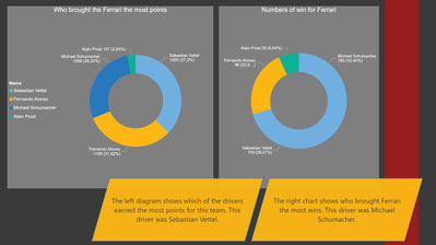
The fourth screen is 2 diagrams showing the drivers who won and brought the most points for Ferrari. The screen includes:
- 2 diagrams
- 2 explanatory cards
____________
⭐️ Fabric Group Channel
⭐️ Microsoft Fabric Community
Please join the Power BI UX/UI User Group if you need help with dashboard design and usability
Join to Data Governance User Group
Join to DENEB and Power BI Enthusiasts User Group
Join to Data Fabric Best Practices User Group
Subscribe to my medium blog
- Mark as New
- Bookmark
- Subscribe
- Mute
- Subscribe to RSS Feed
- Permalink
- Report Inappropriate Content
You should spend more time for design next time, but I can admit complete information and interesting decision to mark the text
- Mark as New
- Bookmark
- Subscribe
- Mute
- Subscribe to RSS Feed
- Permalink
- Report Inappropriate Content
Quite an interesting study for fans of F1.
- Mark as New
- Bookmark
- Subscribe
- Mute
- Subscribe to RSS Feed
- Permalink
- Report Inappropriate Content
A very interesting topic


