Party with Power BI’s own Guy in a Cube
Power BI is turning 10! Tune in for a special live episode on July 24 with behind-the-scenes stories, product evolution highlights, and a sneak peek at what’s in store for the future.
Save the date- Power BI forums
- Get Help with Power BI
- Desktop
- Service
- Report Server
- Power Query
- Mobile Apps
- Developer
- DAX Commands and Tips
- Custom Visuals Development Discussion
- Health and Life Sciences
- Power BI Spanish forums
- Translated Spanish Desktop
- Training and Consulting
- Instructor Led Training
- Dashboard in a Day for Women, by Women
- Galleries
- Data Stories Gallery
- Themes Gallery
- Contests Gallery
- Quick Measures Gallery
- Notebook Gallery
- Translytical Task Flow Gallery
- TMDL Gallery
- R Script Showcase
- Webinars and Video Gallery
- Ideas
- Custom Visuals Ideas (read-only)
- Issues
- Issues
- Events
- Upcoming Events
Enhance your career with this limited time 50% discount on Fabric and Power BI exams. Ends August 31st. Request your voucher.
- Power BI forums
- Forums
- Get Help with Power BI
- DAX Commands and Tips
- Value of measure is always 1,00 instead of calcula...
- Subscribe to RSS Feed
- Mark Topic as New
- Mark Topic as Read
- Float this Topic for Current User
- Bookmark
- Subscribe
- Printer Friendly Page
- Mark as New
- Bookmark
- Subscribe
- Mute
- Subscribe to RSS Feed
- Permalink
- Report Inappropriate Content
Value of measure is always 1,00 instead of calculating portion of amount of answers per year
Hi everyone,
I have the following table structure:
| Team | Year | Votecount | Question | Answer |
| Development | 2021 | 1 | Do you like your job? | Yes |
| Development | 2021 | 1 | Do you like your job? | Yes |
| Development | 2021 | 1 | Do you like your job? | No |
| Development | 2021 | 1 | Are you happy with your salary? | Yes |
| Development | 2020 | 1 | Are you happy with your salary? | No |
| Development | 2019 | 1 | Are you happy with your salary? | No |
Now what I would like to do in a bar chart is to display the percentage of every answer per year of the total per year. So for the first question it should be ~66,66% for "Yes" in the year 2021 and ~33,33% for "No". I can't use the build in Power BI function to calculate my percentage values since that is looking at all answers of all 3 years then calculates the percentages of that. I have a measure that surprisngly when I don't sort the table at all, but breaks as soon as I need to sort it:
Vote % =
Divide(
   count( [Answer] ),
   Calculate(
        count( [Answer] ),
        all( 'Survey'[Team] ),
        all( 'Survey'[Answer] )
   )
)
Maybe someone of you sees or knows what I might do wrong or if there is a better alternative for doing that, thanks for your time!
Kind regards
Maximilian
Solved! Go to Solution.
- Mark as New
- Bookmark
- Subscribe
- Mute
- Subscribe to RSS Feed
- Permalink
- Report Inappropriate Content
Hi,
Test this:
In my tests sort didn't affect this measure. I hope this post helps to solve your issue and if it does consider accepting it as a solution and giving the post a thumbs up!
Did I answer your question? Mark my post as a solution!
Proud to be a Super User!
- Mark as New
- Bookmark
- Subscribe
- Mute
- Subscribe to RSS Feed
- Permalink
- Report Inappropriate Content
Instead of removing the filter context on specific columns, another option is specify which columns to keep in the filter context using ALLEXCEPT. This removes the filter context on all columns except the ones you specify.
For example,
Vote % =
DIVIDE (
    COUNT ( 'Survey'[Answer] ),
    CALCULATE (
        COUNT ( 'Survey'[Answer] ),
        ALLEXCEPT ( 'Survey', 'Survey'[Year], 'Survey'[Question] )
    )
)
- Mark as New
- Bookmark
- Subscribe
- Mute
- Subscribe to RSS Feed
- Permalink
- Report Inappropriate Content
As ValterriN said I don;t see how sorting can affect a measure. Hopefully his suggested DAX works for you.
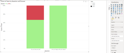
It's possible to visualise this without any DAX. You can use the 100% Stacked Column Chart and a slicer on Year to get your answer.
- Mark as New
- Bookmark
- Subscribe
- Mute
- Subscribe to RSS Feed
- Permalink
- Report Inappropriate Content
Hi,
Test this:
In my tests sort didn't affect this measure. I hope this post helps to solve your issue and if it does consider accepting it as a solution and giving the post a thumbs up!
Did I answer your question? Mark my post as a solution!
Proud to be a Super User!
Helpful resources

Power BI Monthly Update - July 2025
Check out the July 2025 Power BI update to learn about new features.

| User | Count |
|---|---|
| 25 | |
| 10 | |
| 7 | |
| 6 | |
| 6 |
| User | Count |
|---|---|
| 30 | |
| 11 | |
| 11 | |
| 10 | |
| 6 |


