Join us at FabCon Vienna from September 15-18, 2025
The ultimate Fabric, Power BI, SQL, and AI community-led learning event. Save €200 with code FABCOMM.
Get registered- Power BI forums
- Get Help with Power BI
- Desktop
- Service
- Report Server
- Power Query
- Mobile Apps
- Developer
- DAX Commands and Tips
- Custom Visuals Development Discussion
- Health and Life Sciences
- Power BI Spanish forums
- Translated Spanish Desktop
- Training and Consulting
- Instructor Led Training
- Dashboard in a Day for Women, by Women
- Galleries
- Data Stories Gallery
- Themes Gallery
- Contests Gallery
- Quick Measures Gallery
- Notebook Gallery
- Translytical Task Flow Gallery
- TMDL Gallery
- R Script Showcase
- Webinars and Video Gallery
- Ideas
- Custom Visuals Ideas (read-only)
- Issues
- Issues
- Events
- Upcoming Events
Enhance your career with this limited time 50% discount on Fabric and Power BI exams. Ends September 15. Request your voucher.
- Power BI forums
- Forums
- Get Help with Power BI
- DAX Commands and Tips
- Slicer to compare One vs All
- Subscribe to RSS Feed
- Mark Topic as New
- Mark Topic as Read
- Float this Topic for Current User
- Bookmark
- Subscribe
- Printer Friendly Page
- Mark as New
- Bookmark
- Subscribe
- Mute
- Subscribe to RSS Feed
- Permalink
- Report Inappropriate Content
Slicer to compare One vs All
Hi All,
I have a report to compare the data between ONE(1) Head/Department and ALL Head/Department.
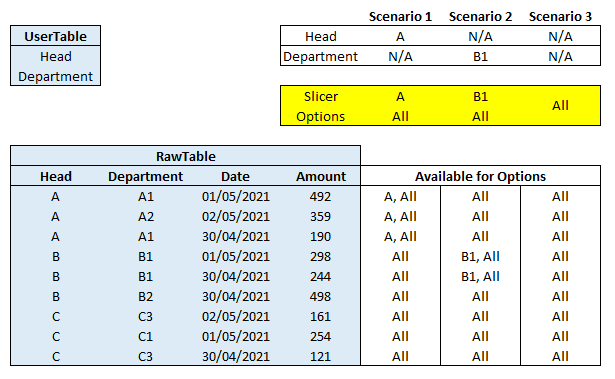
I have 2 tables: UserTable and RawTable (both are not linking any relationship yet).
I want to have a Slicer that will show like the Yellow highlighted Box when it meet different Scenarios.
For example (Scenario 1),
- When we applied Report-Level Filter for UserTable 'Head' column = A, the slicer will show 2 options: 'A' and 'All'.
- When I choose option 'A' in the slicer, it will check on data related to Head 'A' only.
- When I choose option 'All' in the slicer, it will check on all data including Head 'A' data.
For example (Scenario 2),
- When we applied Report-Level Filter for UserTable 'Department' column = B1, the slicer will show 2 options: 'B1' and 'All'.
- When I choose option 'B1' in the slicer, it will check on data related to Department 'B1' only.
- When I choose option 'All' in the slicer, it will check on all data including Department 'B1' data.
For example (Scenario 3),
- When we didn't applied any to Report-Level Filter, the slicer will show only 1 options: 'All'.
- When I choose option 'All' in the slicer, it will check on all data.
Thanks in advance!
- Mark as New
- Bookmark
- Subscribe
- Mute
- Subscribe to RSS Feed
- Permalink
- Report Inappropriate Content
Despite lots of text and nice pictures... I'm exactly as wise as I was before seeing this post. I'd kindly suggest reading this
.... and then rephrasing your problem.
To get good answers (or at all) it's good to see the problem you have through the eyes of those who have never seen it before in the first place and then think about how to phrase it. Just think that you're explaining this to people who have no idea whatsoever what you've been doing.
Helpful resources
| User | Count |
|---|---|
| 14 | |
| 12 | |
| 8 | |
| 6 | |
| 5 |
| User | Count |
|---|---|
| 28 | |
| 19 | |
| 13 | |
| 7 | |
| 5 |


