FabCon is coming to Atlanta
Join us at FabCon Atlanta from March 16 - 20, 2026, for the ultimate Fabric, Power BI, AI and SQL community-led event. Save $200 with code FABCOMM.
Register now!- Power BI forums
- Get Help with Power BI
- Desktop
- Service
- Report Server
- Power Query
- Mobile Apps
- Developer
- DAX Commands and Tips
- Custom Visuals Development Discussion
- Health and Life Sciences
- Power BI Spanish forums
- Translated Spanish Desktop
- Training and Consulting
- Instructor Led Training
- Dashboard in a Day for Women, by Women
- Galleries
- Data Stories Gallery
- Themes Gallery
- Contests Gallery
- Quick Measures Gallery
- Visual Calculations Gallery
- Notebook Gallery
- Translytical Task Flow Gallery
- TMDL Gallery
- R Script Showcase
- Webinars and Video Gallery
- Ideas
- Custom Visuals Ideas (read-only)
- Issues
- Issues
- Events
- Upcoming Events
Calling all Data Engineers! Fabric Data Engineer (Exam DP-700) live sessions are back! Starting October 16th. Sign up.
- Power BI forums
- Forums
- Get Help with Power BI
- DAX Commands and Tips
- Slicer not connecting to visualisation of calculat...
- Subscribe to RSS Feed
- Mark Topic as New
- Mark Topic as Read
- Float this Topic for Current User
- Bookmark
- Subscribe
- Printer Friendly Page
- Mark as New
- Bookmark
- Subscribe
- Mute
- Subscribe to RSS Feed
- Permalink
- Report Inappropriate Content
Slicer not connecting to visualisation of calculated column
Hi Community,
I'm fairly new to Power BI and seeking help for a project of mine.
So, the situation is:
I have company names in col1, their score in col2 (If rated). I want to create a measure that would consider the line items with a score as "Rated" and the one with blanks as "Not-rated" and visualise the count of rated and Non rated in a pie chart.
As of now, I created a calculated conditional column and visualised that column in the pie chart, but if i do that, slicers are not affecting the data on the visualisation. I want the data of my pie chart to change according to slicers, which, from my search I've concluded can't be achieved with calculated columns. I hope I've articulated my question clearly, please ask for clarification if required. Thanks in advance.
Solved! Go to Solution.
- Mark as New
- Bookmark
- Subscribe
- Mute
- Subscribe to RSS Feed
- Permalink
- Report Inappropriate Content
Hi, @Anonymous
Please check the following methods.
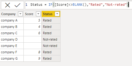
Column:
Status = IF([Score]<>BLANK(),"Rated","Not-rated")Measure:
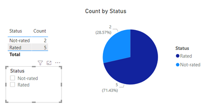
Count =
CALCULATE(COUNT('Table'[Status]),FILTER(ALL('Table'),[Status]=SELECTEDVALUE('Table'[Status])))
Is this the result you expect?
Best Regards,
Community Support Team _Charlotte
If this post helps, then please consider Accept it as the solution to help the other members find it more.
- Mark as New
- Bookmark
- Subscribe
- Mute
- Subscribe to RSS Feed
- Permalink
- Report Inappropriate Content
@Anonymous , In power Query replace null values in col2 with Not-rated . you can null (all small) to replace.
Power Query Replace Value: https://youtu.be/hkZhZbR7Kmk
If you want change legend(axis in other visuals) in pie then you need bookmarks
If you want to change the measure, you need measure slicer
measure slicer
https://www.youtube.com/watch?v=b9352Vxuj-M
https://community.powerbi.com/t5/Desktop/Slicer-MTD-QTD-YTD-to-filter-dates-using-the-slicer/td-p/500115
https://radacad.com/change-the-column-or-measure-value-in-a-power-bi-visual-by-selection-of-the-slicer-parameter-table-pattern
https://www.youtube.com/watch?v=vlnx7QUVYME
calculation groups
https://www.sqlbi.com/blog/marco/2020/07/15/creating-calculation-groups-in-power-bi-desktop/
Axis Slicer
Dynamically change chart axis in Power BI
bookmark -https://blog.crossjoin.co.uk/2018/04/20/dynamically-changing-a-chart-axis-in-power-bi-using-bookmarks-and-buttons/
https://radacad.com/bookmarks-and-buttons-making-power-bi-charts-even-more-interactive
https://www.youtube.com/watch?v=6jeSIRpjv0M
- Mark as New
- Bookmark
- Subscribe
- Mute
- Subscribe to RSS Feed
- Permalink
- Report Inappropriate Content
Hey Amit, thankls for your reply, I can't replace the score in col2 as the scores are used by other visualisations. Moreover, this table that has the company name and scores is a summarised table, hence dosen't show up in power query, is there a way to achieve these by creating a measure?
- Mark as New
- Bookmark
- Subscribe
- Mute
- Subscribe to RSS Feed
- Permalink
- Report Inappropriate Content
Helpful resources

FabCon Global Hackathon
Join the Fabric FabCon Global Hackathon—running virtually through Nov 3. Open to all skill levels. $10,000 in prizes!

Power BI Monthly Update - October 2025
Check out the October 2025 Power BI update to learn about new features.

| User | Count |
|---|---|
| 12 | |
| 11 | |
| 10 | |
| 9 | |
| 8 |


