FabCon is coming to Atlanta
Join us at FabCon Atlanta from March 16 - 20, 2026, for the ultimate Fabric, Power BI, AI and SQL community-led event. Save $200 with code FABCOMM.
Register now!- Power BI forums
- Get Help with Power BI
- Desktop
- Service
- Report Server
- Power Query
- Mobile Apps
- Developer
- DAX Commands and Tips
- Custom Visuals Development Discussion
- Health and Life Sciences
- Power BI Spanish forums
- Translated Spanish Desktop
- Training and Consulting
- Instructor Led Training
- Dashboard in a Day for Women, by Women
- Galleries
- Data Stories Gallery
- Themes Gallery
- Contests Gallery
- Quick Measures Gallery
- Notebook Gallery
- Translytical Task Flow Gallery
- TMDL Gallery
- R Script Showcase
- Webinars and Video Gallery
- Ideas
- Custom Visuals Ideas (read-only)
- Issues
- Issues
- Events
- Upcoming Events
To celebrate FabCon Vienna, we are offering 50% off select exams. Ends October 3rd. Request your discount now.
- Power BI forums
- Forums
- Get Help with Power BI
- DAX Commands and Tips
- Show the Daily Difference for Each Item
- Subscribe to RSS Feed
- Mark Topic as New
- Mark Topic as Read
- Float this Topic for Current User
- Bookmark
- Subscribe
- Printer Friendly Page
- Mark as New
- Bookmark
- Subscribe
- Mute
- Subscribe to RSS Feed
- Permalink
- Report Inappropriate Content
Show the Daily Difference for Each Item
I've looked at other solutions here and none seem to be doing the trick.
| DateTime | Item | Value |
| Dec 1 9AM | A | 1 |
| Dec 1 10AM | B | 3 |
| Dec 2 9AM | B | 4 |
| Dec 2 11AM | B | 5 |
| Dec 3 12PM | A | 4 |
So there's a few things going on here, but essentially, I need to show a graph that shows how much each Item has increased for each day.
In this case, a clustered graph would show:
- Dec 1: 0 for Items A and B (as there's no previous date to report an increase from)
- Dec 2: 0 for A (as there are no entries for Item A for Dec 2) and 2 for Item B ( ([Dec 1 for B] = 3) minus ([last entry for Dec 2] = 5) = 2).
- Dec 3: 3 for A, and 0 for B using the same logic.
Let me know if you need any more details, but this seems extremely difficult given the research and solutions I've already tried.
Thank you VERY much!
Edit: This was poorly worded, so I tried to clean it up.
Solved! Go to Solution.
- Mark as New
- Bookmark
- Subscribe
- Mute
- Subscribe to RSS Feed
- Permalink
- Report Inappropriate Content
Hi,
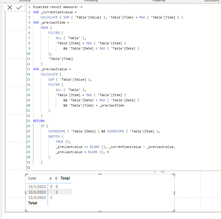
I am not sure how your datamodel looks like, but please check the below picture and the attached pbix file.
I tried to create date only column and time only column in order to show a visualization like below.
Expected result measure: =
VAR _currentlastvalue =
    CALCULATE ( SUM ( 'Table'[Value] ), 'Table'[Time] = MAX ( 'Table'[Time] ) )
VAR _prevlasttime =
    MAXX (
        FILTER (
            ALL ( 'Table' ),
            'Table'[Item] = MAX ( 'Table'[Item] )
                && 'Table'[Date] < MAX ( 'Table'[Date] )
        ),
        'Table'[Time]
    )
VAR _prevlastvalue =
    CALCULATE (
        SUM ( 'Table'[Value] ),
        FILTER (
            ALL ( 'Table' ),
            'Table'[Item] = MAX ( 'Table'[Item] )
                && 'Table'[Date] < MAX ( 'Table'[Date] )
                && 'Table'[Time] = _prevlasttime
        )
    )
RETURN
    IF (
        ISINSCOPE ( 'Table'[Date] ) && ISINSCOPE ( 'Table'[Item] ),
        SWITCH (
            TRUE (),
            _prevlastvalue <> BLANK (), _currentlastvalue - _prevlastvalue,
            _prevlastvalue = BLANK (), 0
        )
    )
If this post helps, then please consider accepting it as the solution to help other members find it faster, and give a big thumbs up.
Click here to visit my LinkedIn page
Click here to schedule a short Teams meeting to discuss your question.
- Mark as New
- Bookmark
- Subscribe
- Mute
- Subscribe to RSS Feed
- Permalink
- Report Inappropriate Content
Wow! This works! Thank you for this!
There is one extra problem. I've got thousands of entries between December 22 and January 22 (31 days). So my graph is cramped and tiny. How can I make it so that it shows the results for the day, as well as the hour?
- Mark as New
- Bookmark
- Subscribe
- Mute
- Subscribe to RSS Feed
- Permalink
- Report Inappropriate Content
Hi,
I am not sure how your datamodel looks like, but please check the below picture and the attached pbix file.
I tried to create date only column and time only column in order to show a visualization like below.
Expected result measure: =
VAR _currentlastvalue =
    CALCULATE ( SUM ( 'Table'[Value] ), 'Table'[Time] = MAX ( 'Table'[Time] ) )
VAR _prevlasttime =
    MAXX (
        FILTER (
            ALL ( 'Table' ),
            'Table'[Item] = MAX ( 'Table'[Item] )
                && 'Table'[Date] < MAX ( 'Table'[Date] )
        ),
        'Table'[Time]
    )
VAR _prevlastvalue =
    CALCULATE (
        SUM ( 'Table'[Value] ),
        FILTER (
            ALL ( 'Table' ),
            'Table'[Item] = MAX ( 'Table'[Item] )
                && 'Table'[Date] < MAX ( 'Table'[Date] )
                && 'Table'[Time] = _prevlasttime
        )
    )
RETURN
    IF (
        ISINSCOPE ( 'Table'[Date] ) && ISINSCOPE ( 'Table'[Item] ),
        SWITCH (
            TRUE (),
            _prevlastvalue <> BLANK (), _currentlastvalue - _prevlastvalue,
            _prevlastvalue = BLANK (), 0
        )
    )
If this post helps, then please consider accepting it as the solution to help other members find it faster, and give a big thumbs up.
Click here to visit my LinkedIn page
Click here to schedule a short Teams meeting to discuss your question.


