FabCon is coming to Atlanta
Join us at FabCon Atlanta from March 16 - 20, 2026, for the ultimate Fabric, Power BI, AI and SQL community-led event. Save $200 with code FABCOMM.
Register now!- Power BI forums
- Get Help with Power BI
- Desktop
- Service
- Report Server
- Power Query
- Mobile Apps
- Developer
- DAX Commands and Tips
- Custom Visuals Development Discussion
- Health and Life Sciences
- Power BI Spanish forums
- Translated Spanish Desktop
- Training and Consulting
- Instructor Led Training
- Dashboard in a Day for Women, by Women
- Galleries
- Data Stories Gallery
- Themes Gallery
- Contests Gallery
- Quick Measures Gallery
- Notebook Gallery
- Translytical Task Flow Gallery
- TMDL Gallery
- R Script Showcase
- Webinars and Video Gallery
- Ideas
- Custom Visuals Ideas (read-only)
- Issues
- Issues
- Events
- Upcoming Events
To celebrate FabCon Vienna, we are offering 50% off select exams. Ends October 3rd. Request your discount now.
- Power BI forums
- Forums
- Get Help with Power BI
- DAX Commands and Tips
- Show individual score over time and add average an...
- Subscribe to RSS Feed
- Mark Topic as New
- Mark Topic as Read
- Float this Topic for Current User
- Bookmark
- Subscribe
- Printer Friendly Page
- Mark as New
- Bookmark
- Subscribe
- Mute
- Subscribe to RSS Feed
- Permalink
- Report Inappropriate Content
Show individual score over time and add average and category specific average
Hi all,
I have difficulties with DAX and hope someone can help me.
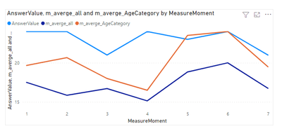
We want to show the results of an individual (using a slicer for CaseID) in a line graph and add the average of all cases and the average of all cases within their category. For example, the figure below:
(blue is scores of the individual, orange the average of the category of the individual and the dark blue line gives the average of all cases).
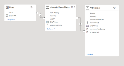
The data is organized like this, but as we work based on an SSAS model, I’m not able to change the model.
The average over all subjects was calculated as follow:
m_averge_all =
VAR newTable = CALCULATETABLE('Cases', REMOVEFILTERS())
VAR newTable2 = ADDCOLUMNS(newTable, "SUM_AnswerValue", CALCULATE(sum(Antwoorden[AnswerValue])))
RETURN
CALCULATE(AVERAGEX(newTable2, [Sum_AnswerValue]), REMOVEFILTERS())
And the average within the category of the individual:
m_averge_AgeCategory =
VAR _selectedCategory = SELECTEDVALUE(UitgezetteVragenlijsten[AgeCategory])
VAR newTable = CALCULATETABLE('Cases', REMOVEFILTERS())
VAR newTable2 = ADDCOLUMNS(newTable, "SUM_AnswerValue", CALCULATE(sum(Antwoorden[AnswerValue]), UitgezetteVragenlijsten[AgeCategory] = _selectedCategory))
RETURN
CALCULATE(AVERAGEX(newTable2, [Sum_AnswerVal
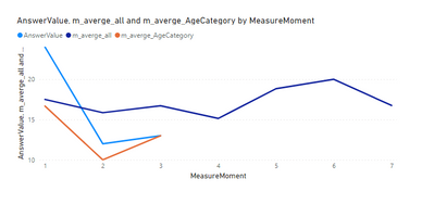
The problem we encounter is that when an individual does not have all 7 time moments, the average of their category value are also not presented for all time moments. We want to show all datapoints for the orange line as well.
An example file can be found here
Thanks!
- Mark as New
- Bookmark
- Subscribe
- Mute
- Subscribe to RSS Feed
- Permalink
- Report Inappropriate Content
- Mark as New
- Bookmark
- Subscribe
- Mute
- Subscribe to RSS Feed
- Permalink
- Report Inappropriate Content
Yeah... Access denied.
Helpful resources
| User | Count |
|---|---|
| 14 | |
| 11 | |
| 6 | |
| 6 | |
| 5 |
| User | Count |
|---|---|
| 29 | |
| 17 | |
| 11 | |
| 7 | |
| 5 |


