Join us at FabCon Vienna from September 15-18, 2025
The ultimate Fabric, Power BI, SQL, and AI community-led learning event. Save €200 with code FABCOMM.
Get registered- Power BI forums
- Get Help with Power BI
- Desktop
- Service
- Report Server
- Power Query
- Mobile Apps
- Developer
- DAX Commands and Tips
- Custom Visuals Development Discussion
- Health and Life Sciences
- Power BI Spanish forums
- Translated Spanish Desktop
- Training and Consulting
- Instructor Led Training
- Dashboard in a Day for Women, by Women
- Galleries
- Data Stories Gallery
- Themes Gallery
- Contests Gallery
- Quick Measures Gallery
- Notebook Gallery
- Translytical Task Flow Gallery
- TMDL Gallery
- R Script Showcase
- Webinars and Video Gallery
- Ideas
- Custom Visuals Ideas (read-only)
- Issues
- Issues
- Events
- Upcoming Events
Enhance your career with this limited time 50% discount on Fabric and Power BI exams. Ends September 15. Request your voucher.
- Power BI forums
- Forums
- Get Help with Power BI
- DAX Commands and Tips
- Secondary y-axis: calculated average, how not to d...
- Subscribe to RSS Feed
- Mark Topic as New
- Mark Topic as Read
- Float this Topic for Current User
- Bookmark
- Subscribe
- Printer Friendly Page
- Mark as New
- Bookmark
- Subscribe
- Mute
- Subscribe to RSS Feed
- Permalink
- Report Inappropriate Content
Secondary y-axis: calculated average, how not to display those categories in primary axis & legend
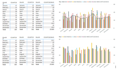
I have created a measure to calculate a monthly average for years 2018 and 2019 that I would like to visualize on the secondary axis to compare to monthly counts for more current years (2020-2024) but I don't want the bars for those years (2018-2019) included in the legend/visualized on the graph. However if I filter to exclude those years, my average line also disappears. I have tried to use ALL() and REMOVEFILTERS() on both the counts and the average measures but no dice. I'm sure someone here has a better idea! Thank you!
Solved! Go to Solution.
- Mark as New
- Bookmark
- Subscribe
- Mute
- Subscribe to RSS Feed
- Permalink
- Report Inappropriate Content
Hi, @akt
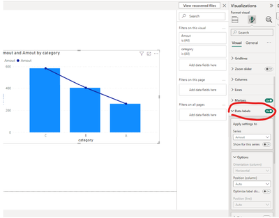
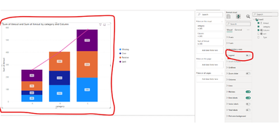
If you want not to display the values on the Line y-axis, you can turn off the display of data labels in visual >> Data label:
If the value you want to display is the value of your measure, rather than a specific month, try using the following DAX expression:
Average_2018_2019 =
CALCULATE(
    AVERAGE(Table[Value]),
    FILTER(
        ALL(Table[Year]),
        Table[Year] IN {2018, 2019}
    )
)
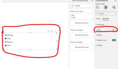
If you don't want to display COUNT1819AVG in the legend, I haven't found any switch to turn off the line Y-axis in the legend. Here is a possible alternative:
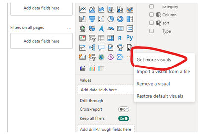
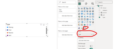
Turn off the legend field in the original chart and use an independent legend visual, so that the COUNT1819AVG field is not displayed in the legend of the chart.
How to Get Your Question Answered Quickly
If it does not help, please provide more details with your desired output and pbix file without privacy information (or some sample data) .
Best Regards
Jianpeng Li
If this post helps, then please consider Accept it as the solution to help the other members find it more quickly.
Helpful resources
| User | Count |
|---|---|
| 14 | |
| 11 | |
| 8 | |
| 6 | |
| 5 |
| User | Count |
|---|---|
| 28 | |
| 19 | |
| 14 | |
| 8 | |
| 5 |
